• Blog
  • Shop
  • Resources
  • FAQ (Ask TGS)
  • About
  • Archive
  • Contact
  • Sign In My Account
Menu

The Gentleman Stationer

Vintage Living in the Modern World.
  • Blog
  • Shop
  • Resources
  • FAQ (Ask TGS)
  • About
  • Archive
  • Contact
  • Sign In My Account

Pen Review: Sunderland MK1 Machined Pen

December 23, 2020

The Sunderland mk1 is one of the best machined pens, if not the best, I have ever used. Period. Longtime readers of The Gentleman Stationer know that I don't hand out that sort of praise lightly, but I will where it's warranted, and here I see little room for argument. Proudly made in Coopersburg, Pennsylvania, USA by Sunderland Machine Works, the mk1 is described as "tough enough for the shop," but "good looking enough for the boardroom." Sunderland takes a different approach from most makers in this space, bypassing the "tactical pen" market and instead targeting the mk1 as a "machined executive pen." It's a strategy that's a bit risky since it arguably brings a small company into direct competition with much more established makers of executive accessories, but the mk1's combination of durability and elegance makes it a formidable entry into this market segment, especially given the quality at the price point.

The main issue I have with many machined pens is the lack of writing comfort due to size and weight, as well as their tendency towards unrefined designs that look chunky and unfinished. As Sunderland implies in their description of the mk1, some of these pens appear as though they're intended to be used as glass-breakers or weapons first, and pens second. (Given the typical target market demographic, that may in fact be the case). The mk1, however, is designed to be used as a pen, and a daily writer at that, and if you're a fan of rollerballs this could easily serve as a single-pen setup.

Yes, the threads on this pen are internal, contained in the recessed area around the tip.

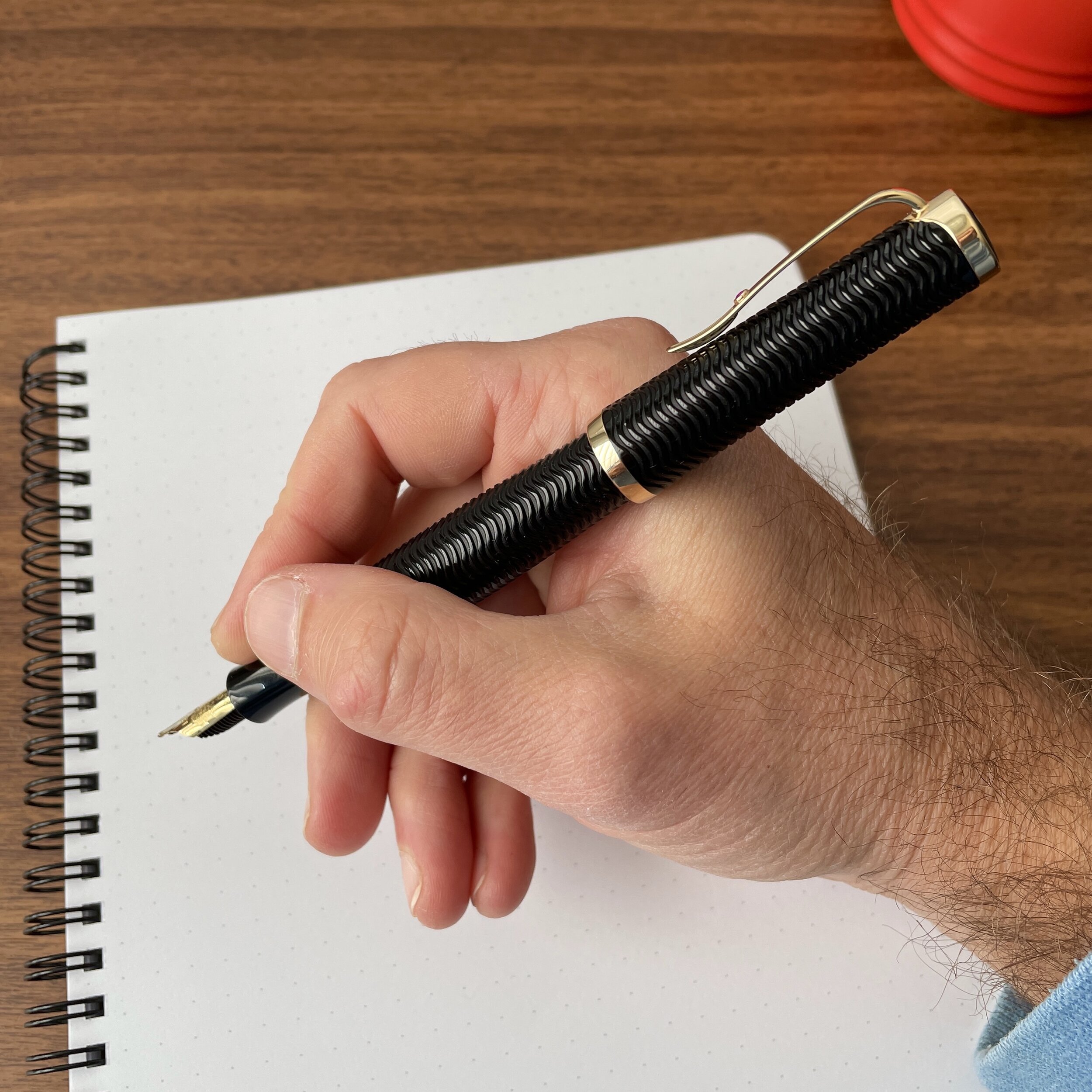
The mk1 looks and feels like a much more expensive pen than its $85 price point. The fit and finish on my pen are flawless: the threads turn smoothly, the cap posts securely, and the textured, slightly concave section offers a comfortable grip. Sunderland's key innovation, however, involves the threads: they're hidden inside the tip of the pen, so no part of the barrel can interfere with your grip. This patent-pending design offers a "third way" for securing the cap on machined pens - an alternative to sharp external metal threads that dig into your hand and friction-fit caps that inevitably loosen and rattle over time. Similarly, the placement of the threads inside the cap allows you to post the mk1 deeply and securely, without any sort of unpleasant metal-on-metal grating sound or damage to the finish of the pen.

The body of the pen is machined from 6061 aluminum, and the clip from 17-4 aerospace grade stainless steel, reflecting the professional experience of the maker, who has both engineering and machining experience in the aerospace, automotive, and medical industries.

The stainless steel clip is sturdy and has excellent tension. It’s neither too loose nor too tight, and grips a shirt pocket or notebook cover perfectly.

But all this merely serves as a setup for what I consider the best part of this pen: the refill options. Rollerball and gel refill preferences are strongly subjective, so I expect many people to disagree with me here, but Sunderland's decision to design a pen to accept both the Pilot G2 gel cartridge and Montblanc's threaded rollerball/fineliner refills instantly won me over. The Pilot G2 is great - I actually think it's a crime how many pen snobs disregard the G2 seemingly for no reason other than it's popularity, overlooking the fact that there's a reason why it's one of the most popular gel pens in the world. That said, I'll likely never use a G2 in my mk1 because Montblanc's rollerball and fineliner cartridges are some of the best on the market, especially for the clientele Sunderland is targeting. I strongly prefer Montblanc's rollerball refills over alternatives such as the Schmidt P8126/P8127, because the ink Montblanc uses feathers and bleeds far less on ordinary paper. A Montblanc "fine" refill actually writes a fine line, and the "fineliner" offers a high-quality felt-tip option if that's your preference. Montblanc cartridges are threaded to minimize tip wiggle and rattling, and the fact that Sunderland machined the mk1 to allow you to screw the refill into the barrel underscores the attention to detail and commitment to a solid experience.

The mk1 disassembled with a Montblanc Rollerball refill

Sunderland mk1, left, compared against a Montblanc 144 Classique (Petit Prince Edition) and a Caran d’Ache 849 Ballpoint (“Totally Swiss” Edition)

Takeaways and Where to Buy

Fans of more elegant EDC-style pens such as the Schon DSGN Pocket 6, Tactile Turn Gist, and the Matthew Martin OG1 should certainly check out the Sunderland mk1, especially if you are looking for a sleek, streamlined pen that won't appear out of place in a work or business environment, but at the same time doesn't sacrifice any of the durability that machined metal pens have to offer.

You can purchase the Sunderland mk1 directly from Sunderland Machine Works in their online shop. Currently, the mk1 is available in eight different anodized finishes and a handful of special editions. Starting at only $85, the mk1 represents tremendous value given the innovative design and build quality. A pen like this will last a long time, providing you with many years of reliable service.

Sunderland MK1, left, compared against a Retro 51 Tornado (“The System” edition), and a Lamy 2000 rollerball.

Disclaimer: Sunderland Machine Works provided me with this pen for review purposes, free of charge. I was not otherwise compensated for this review, and all opinions expressed here are my own.

In Pens Tags Machined Pens, Sunderland Machine Works, Sunderland MK1, Rollerball, Montblanc Rollerball Refill, Pen Review
2 Comments

Merry Christmas to Me! Esterbrook Estie "Rocky Top"!

December 22, 2020

I haven’t purchased a new pen for my own collection in a while, and I finally gave in, ordering one I couldn’t pass up: the Esterbrook Estie “Rocky Top” featuring Diamondcast Alumilite from McKenzie Penworks. Gotta show that Tennessee pride! “Rocky Top” contains swirls of Tennessee orange, silver, gold, and white that show off the depth of the material and the real reclaimed diamond dust mixed in. Read more about Diamondcast here.

As I’ve mentioned before, I love the shape of the Estie, and the standard pen has such excellent weight and balance that I’ve never had a reason to go to the oversized model (though they’re now available in nearly all materials). What’s new about this particular pen is that I added a “Journaler” nib, developed by Gena Salorino from Custom Nib Studio in collaboration with Esterbrook and offered as an add-on at select Esterbrook retailers. While I haven’t had much time with this nib, I’m liking it so far, and I would say that it writes like a soft cursive italic, with medium width.

I could’ve gone with an orange ink, but instead I decided to try Scribo Classico Seppia, and earthy brown ink that works just as well.

Journaler Nib Writing Sample, on Midori MD Cotton Paper.

Vanness Pens still has Diamondcast Esties in stock, in both “Rocky Top” and “Peacock” finishes, as well as Journaler nibs. Diamondcast pens are bit more expensive than standard Esterbrooks, given the makeup of the material, and retail for $280 for the standard version and $316 for oversized. The Journaler nib adds $50 to the price. Through December, if you order an Esterbrook from Vanness, you will also receive an Esterbrook rubber stamp (while supplies last)!

I’d share a sample of the rubber stamp but I don’t have an ink pad, unfortunately! The packaging on Rocky Top is top-notch, btw.

Disclaimer: Vanness Pens is a paid sponsor of this blog. While I purchased this pen with my own funds, for my own collection, I did receive a discount.

In Pens Tags Esterbrook Estie Rocky Top, Diamondcast, Vanness Pens, Esterbrook
1 Comment

Workhorse Pens: Pelikan M800 Stone Garden

December 13, 2020

What makes a pen an icon? Sometimes it’s a unique design and aesthetic, other times it’s utility. With the Pelikan M800, I’d argue that the latter is what makes it the very definition of a “workhorse pen.” In today’s market, which tends to place a premium on constant new releases of flashy limited edition designs, it seems that the Pelikan M800 tends to get overlooked. Sure, Pelikan has its annual special releases, but the overall design of the pen - and Pelikan’s “Souveran” line in general - hasn’t changed much over the years other than to offer different sizes of the same basic model.

From left, the Pelikan M800, the Pelikan M600, and the Pelikan M400. I’ve linked to my reviews of the other two pens. As you can tell, I enjoy them all, go back and forth on which one is my favorite, and I can see an argument as to why all of them are the “best size” for everyday use. It will come down to how large a pen you prefer for your everyday writing.

A great “workhorse pen” tends to disappear in your hand when you’re writing. As with other preferred “workhorses” like the Montblanc 146 and the Lamy 2000, the design of the Pelikan M800 doesn’t distract from the work at hand, and the pen posts deeply so you don’t have to worry about keeping track of the cap. A key feature of the Souveran line is the ability to get what is essentially the same writing experience in different sizes. If you enjoy the look of the M800, but feel that it might be too big, size down to the M600 or M400, which are not only smaller but significantly lighter. (I believe this is because the piston-filling system uses different components).

The specific model shown here is the Pelikan M800 Stone Garden Special Edition, which pairs dark blue acrylic and gold trim with a marbled cellulose-acetate barrel featuring brown, blue, and black flecks. Since Pelikan releases a new M800 every year, I try to be selective about which editions I pick up. I couldn’t take a pass on this one, especially with a color combination (navy blue acrylic!?!) that you rarely see. I purchased this pen with a standard Pelikan medium nib, which writes a line that I consider the equivalent of a steel broad. While the nib is quite round, and therefore doesn’t show much line variation, it was a smooth, consistent writer out of the box and has not been modified.

One quirk I’ve noticed on this particular pen is that the plating seems to tarnish and need periodic polishing, particularly around the cap band. I suspect this is due to high copper content in whatever alloy was used for this batch. Has anyone else had this problem, either with the Stone Garden edition or another Pelikan pen manufactured around the same time (2018)?

You can see the slight bit of tarnish on the top cap band, which I find odd. It polishes right off, but I’ve not had this happen with any other Pelikan pen in my collection.

Takeaways and Where to Buy

As I noted above, I don’t have that many Pelikan pens in my personal collection, but those I do have see a lot of use as daily writers - what I call “workhorses.” If you’re looking for a pen with a classic design and rock solid reliability, the Pelikan Souveran series has stood the test of time, and you can’t go wrong with a Pelikan M800. For more on what I look for when choosing a “workhorse pen,” I’ve put together a page featuring all the relevant articles here.

Because the Pelikan M800 Stone Garden was a 2018 special release, you will need to search for it on closeout or the secondary market. Currently, retailer Pen Boutique has both the Stone Garden fountain pen and ballpoint in stock, and at a good price for a Special Edition M800. Unfortunately, since it’s been a couple of years, I don’t recall exactly where I purchased this pen, though I believe it was acquired with my own funds for my personal collection. It’s not going anywhere anytime soon.

Disclaimer: This post does not contain any affiliate links.

In Workhorse Pens Series, Pens Tags Workhorse Pens, Pelikan Souveran, Pelikan M800, Fountain Pens
1 Comment

Pen Review: Maiora Impronte Oversize Fountain Pen

November 21, 2020

Of all the new brands that have emerged from the collapse of the former Italian pen company Delta, Leonardo Officina Italiana has received the most attention. A second penmaker, however, has emerged whose products also deserve a close look: Maiora, the maker of the superbly comfortable “Impronte” and “Impronte Oversize.”

The Leonardo Momento Zero Grande, left, alongside the Maiora Impronte Oversize, right.

Maiora and Leonardo both trace their roots to Delta. While Leonardo was founded by one of the founders of Delta, Ciro Matrone and his family, Maiora is owned by Nino Marino, the other founder. Since neither company has an official website, most of my knowledge of the respective company histories comes secondhand, and I would refer you to Glenn Marcus’s excellent website for additional background information.

Maiora’s flagship model is the “Impronte,” which comes in standard and oversized models. Here, Vanness Pens kindly sent me an oversized pen to review, in the dark blue “Capri” acrylic. From first glance, the Maiora Impronte has a lot to offer. The section features a pronounced hourglass shape that’s exceedingly comfortable to write with, and the tapered barrel allows for deep posting of the cap. This gives the Maiora Impronte Oversize a marked advantage over other larger pens, especially for those with small hands who love to post and might find a pen like the Leonardo Momento Zero Grande a touch unwieldy.

The Impronte features what is honestly one of the more comfortable sections that I’ve used. It almost feels like it cradles your fingers as you write.

View fullsize Maiora Impronte Unposted
View fullsize Maiora Impronte Posted

Design-wise, you can certainly see the shared Delta heritage in both Maiora and Leonardo pens, from the general silhouettes, to the peaked caps, to the Delta-style converter filling system that allows you to unscrew the blind cap to access the converter to fill as you would with a traditional piston, without disassembling the pen entirely. Maiora Pens use standard JoWo No. 6 stainless steel nibs.

View fullsize Maiora Impronte Blind Cap
View fullsize Maiora Impronte Converter

Takeaways and Where to Buy

I remained a huge fan of Delta Pens until the end, despite their inconsistent design aesthetic and quality control issues. Based on my experience with Leonardo Pens, and now, the Maiora Impronte, I’m happy to say that both of these new companies have taken the best of Delta and appear to be moving forward with two lines of high-quality pens that are built for writing, with a focus on comfort and sturdy build quality.

Despite the shared heritage, the Leonardo and Maiora pens have distinct differences. For example, Maiora did not continue with Delta’s “roller clip” design, and the Impronte is shorter and more tapered than the Momento Zero Grande (shown right). Maiora also uses JoWo nibs, while Leonardo uses Bock. Currently, Maiora Impronte fountain pens are only available with steel nibs.

It’s taken me a while to get my hands on a Maiora Impronte for review, as the pens were available in limited stock until recently. Our friends and sponsors at Vanness Pens were kind enough to send me the Maiora Impronte Oversize featured here, and they currently offer a range of different colors and finishes. The Maiora Impronte Oversize has a MSRP of $245, and typically retails for $196. For a quality handmade pen with this degree of fit and finish, the price is fair, though over the long term I would hope to see them come down to match the Leonardo Momento Zero, which has some models priced as low as $169, depending on the materials used.

Disclaimer: I received the pen featured in this post free of charge from site sponsor Vanness Pens, for review purposes. Many thanks to Vanness Pens for making this review possible.

In Pens Tags Pen Review, Maiora, Maiora Impronte
Comment

Worth the Hype? A Close Look at a Montblanc Writers Edition (Virginia Woolf)

November 7, 2020

Though the difference in price and hype is perhaps less pronounced than when the series was first introduced, few limited edition fountain pens attract the same level of attention as Montblanc’s annual “Writers Edition” releases. Typically, Montblanc releases a pen design inspired by the life and work of a particular novelist or poet. For example, this year’s “Homage to Victor Hugo” limited edition features a cap “decorated with gothic arches in relief, and the end of the clip, which is shaped like the clapper of a bell, recall[ing] the the bell ringer Quasimodo and the Bells of Notre-Dame.” Montblanc also engraves the writer’s signature somewhere on the pen, usually on the barrel.

The designs themselves either appeal to you or they don’t. Personally, I find most of the Montblanc Writers Edition pens either (1) too large, or (2) too gaudy, especially those released in recent years. My personal favorites are the older editions, and I have two in my collection: Virginia Woolf (2006), which I review here, and Charles Dickens (2001), which I plan to address in a separate post.

The snowcap on my pen has an off-white patina, and I don’t know whether this is by design or whether it has developed as the pen ages.

The Montblanc Virginia Woolf Writers Edition fountain pen is, to me, a perfect example of a Writers Edition pen that one can easily use for, well, actual writing. At roughly the size of a Montblanc 146, the pen itself is not too large. The Virginia Woolf edition also features a contoured barrel comfortable to use posted or unposted. When I’ve shown pictures of this pen in the past, readers have asked whether it’s a Bonheur, the so-called “pen for women,” and while it’s not, there is a resemblance, particularly with the cap. Due to the similarities, some regard this as a “gendered pen” unsuitable for a man to use, which is of course absurd.

View fullsize Montblanc Virginia Woolf Unposted
View fullsize Montblanc Virginia Woolf Posted

Finally, I appreciate the understated manner in which Montblanc incorporated references to Woolf’s life and work into the pen’s design. The black barrel is engraved with a guilloche pattern, a reference to her novel “The Waves,” and the nib features an engraving of the two elm trees under which she is buried. Her signature appears subtly engraved on the gold piston knob.

The gold blind cap with signature.

Each Writer’s Edition features a custom engraved nib.

Takeaways and Where to Buy

The Virginia Woolf Writers Edition is not just one of my favorite Montblanc Writers Editions, it’s one of my favorite Montblancs in my current collection. I have a hard time leaving this one un-inked. I’ve previously written multiple times about how Montblanc stock broad nibs tend to be stubbish, and this one is no exception. It’s also tuned perfectly, which either shows how Montblanc pays closer attention to the Writers Edition nibs before they go out the door, or that older Montblanc pens in general were subject to better quality control practices. This particular pen wrote exceptionally well out of the box, without any skipping or “baby’s bottom” issues you sometimes see with stock Montblanc nibs.

One of the more polarizing design choices on this pen is the ruby on the clip. I like it, and find that it adds a touch of color to an otherwise very traditional black-with-gold-trim design scheme.

Unfortunately, the Virginia Woolf Writers Edition dates to 2006, so if you’re looking to pick one up you likely need to search the secondary market for used or N.O.S. (new old stock) items. I found this one during a Black Friday sale last year, where a European retailer (I believe La Couronne du Comte) had several older N.O.S. Writers Edition pens available for purchase. Today, many different options exist, but in the U.S. the retailers who typically have the largest selection at any given time are Chatterly Luxuries and The Pen Show. You can always take your chances on eBay, but be aware that Montblanc pens are heavily counterfeited and you should only purchase from a reputable seller. Personally, for pens in this price range (anywhere from $600 to $1500), I would only purchase online from known pen dealers with a reputation for standing behind their products, or else wait until pen shows resume and you can inspect potential acquisitions in person.

Disclaimer: I purchased the pen featured in this review with my own funds, for my own collection. I did not receive a discount on this purchase other than coupon codes available to the public. This post does not contain affiliate links.

In Pens Tags Montblanc, Montblanc Writers Edition, Fountain Pen, Pen Review
2 Comments
← Newer Posts Older Posts →
Store Location
Visit the T.G.S. Curated SHOP
*New* Updated "Best Pens" Guide (2025)
TGS x Hinze Pens Violet Tendencies Taschenstift Fountain Pen
Hierarchies of Fountain Pen Friendly Paper
Allex Scissors arrayed on a desk showing link to desk accessories

Join Our Patreon!
Subscribe to the TGS E-mail List

Featured Posts

Featured
Yamamoto-Gray-Paper-Sampler-Set.jpeg
May 10, 2025
Discovering Unusual Paper: "Paper Tasting" Sets from Yamamoto Paper
May 10, 2025
May 10, 2025
Four-Micarta-Fountain-Pens.jpeg
Apr 19, 2025
Yes, Micarta for me! I finally got my hands on Some Micarta Pens, Plus My Own Special Edition
Apr 19, 2025
Apr 19, 2025
2025-Arkansas-Pen-Show-haul.jpeg
Mar 29, 2025
Unboxing the Arkansas Pen Show Haul! Two Nib Grinds, Inks, and a New Pen
Mar 29, 2025
Mar 29, 2025
The Gentleman Stationer RSS

© Digital Divide Media, LLC, 2014-present.

All content is the exclusive property of Digital Divide Media, LLC, d/b/a The Gentleman Stationer, including “The Gentleman Stationer” website and trademark, and should not be reproduced without express written permission.  All rights reserved.

All content containing paid advertising, affiliate links, or sponsored content will be plainly disclosed by a disclaimer when/if featured.

Contact Information

Store Shipping Policy and Return Policy

Privacy Policy

Cookie Policy

Terms and Conditions

Powered by Squarespace