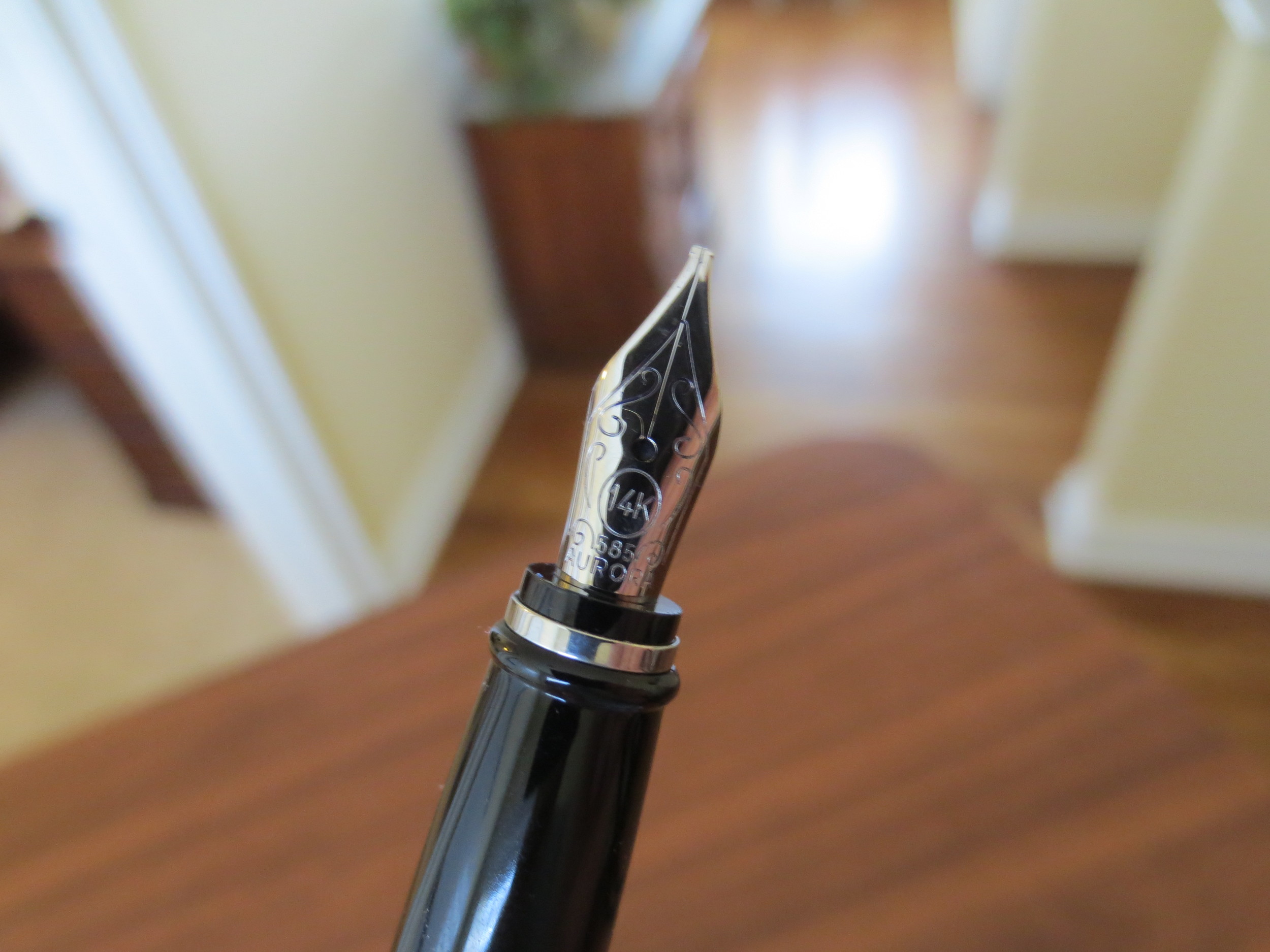
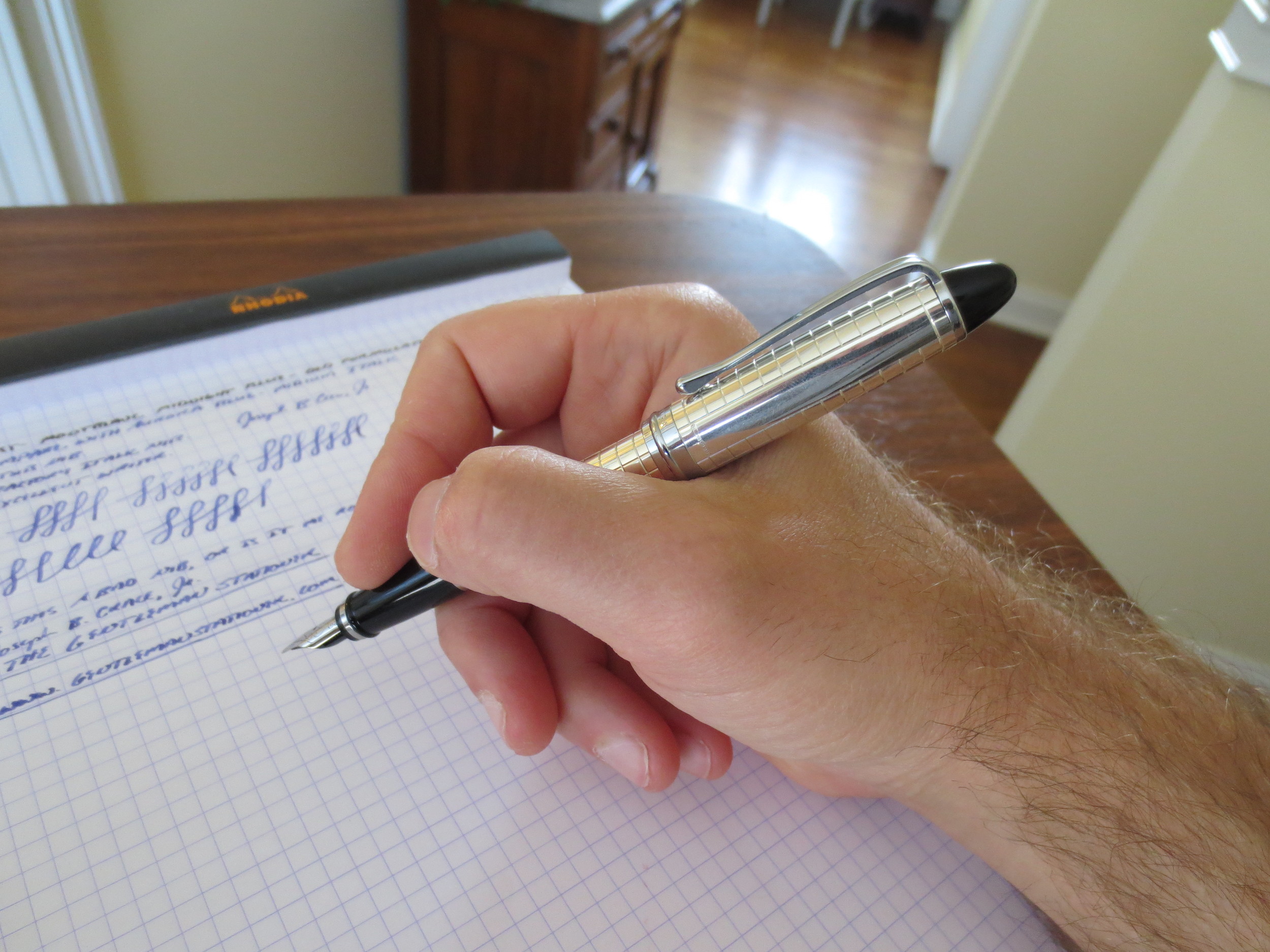
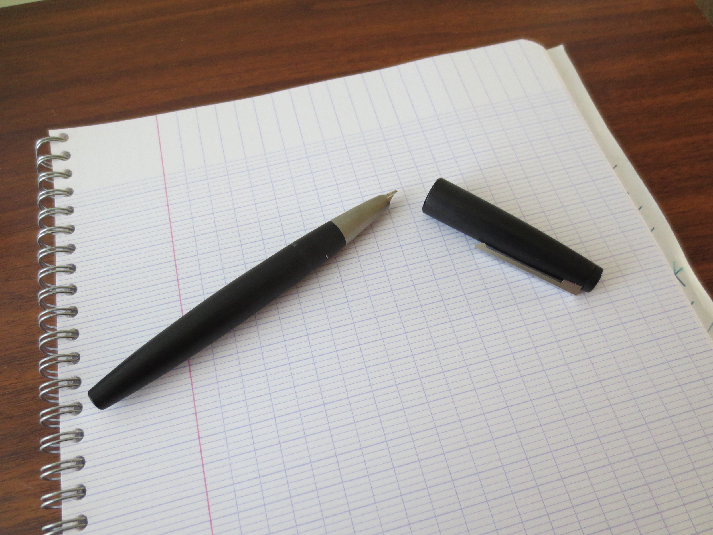
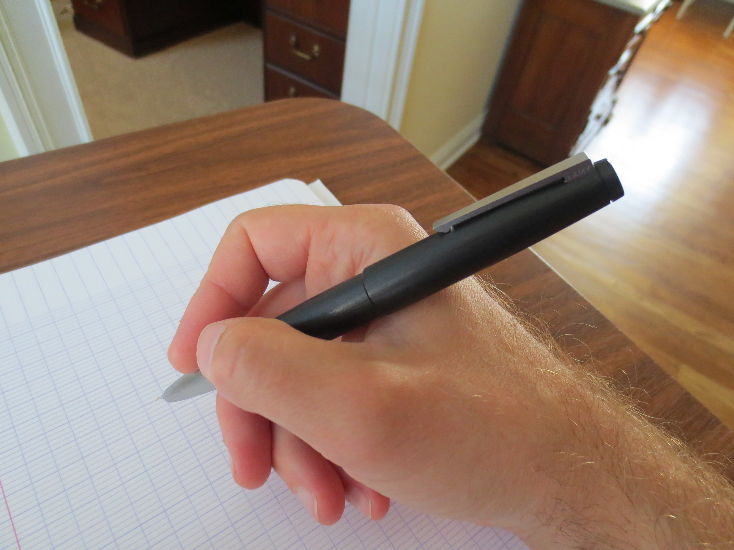
This particular pen was one of my first "expensive" fountain pens, or at least I considered it expensive at the time that I obtained it. I bought it from Goulet Pens three or so years ago, after I was about a year into this hobby. The pen originally had a medium nib, and in my zeal to "customize" every pen I owned, I had a nibmeister (who will remain unnamed) grind the medium nib to a stub. The result was a lopsided "cursive italic" so scratchy the pen could not be used. I sent the pen to Mike Masuyama to see if it could be saved, and he confirmed that it could not: all the iridium had been ground off the tip, and the pen needed to be sold for parts or retipped. Having long admired his work from afar, I pulled the nib from the pen and sent it to Greg Minuskin for a retip, who turned this into a beautiful .9mm stub. It is now one of my favorite pens, and one of my best writers.
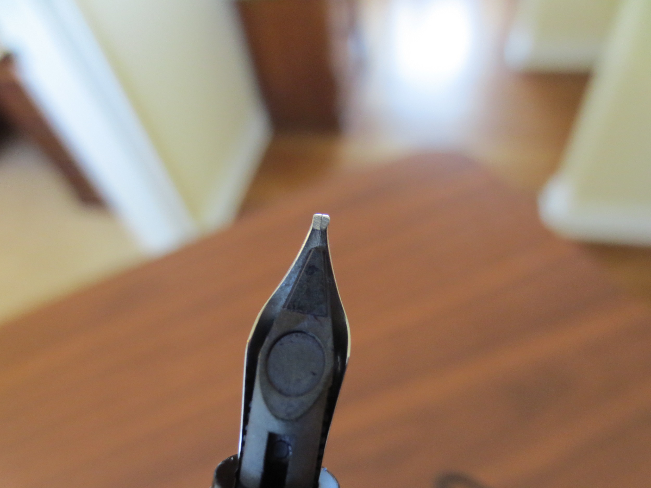
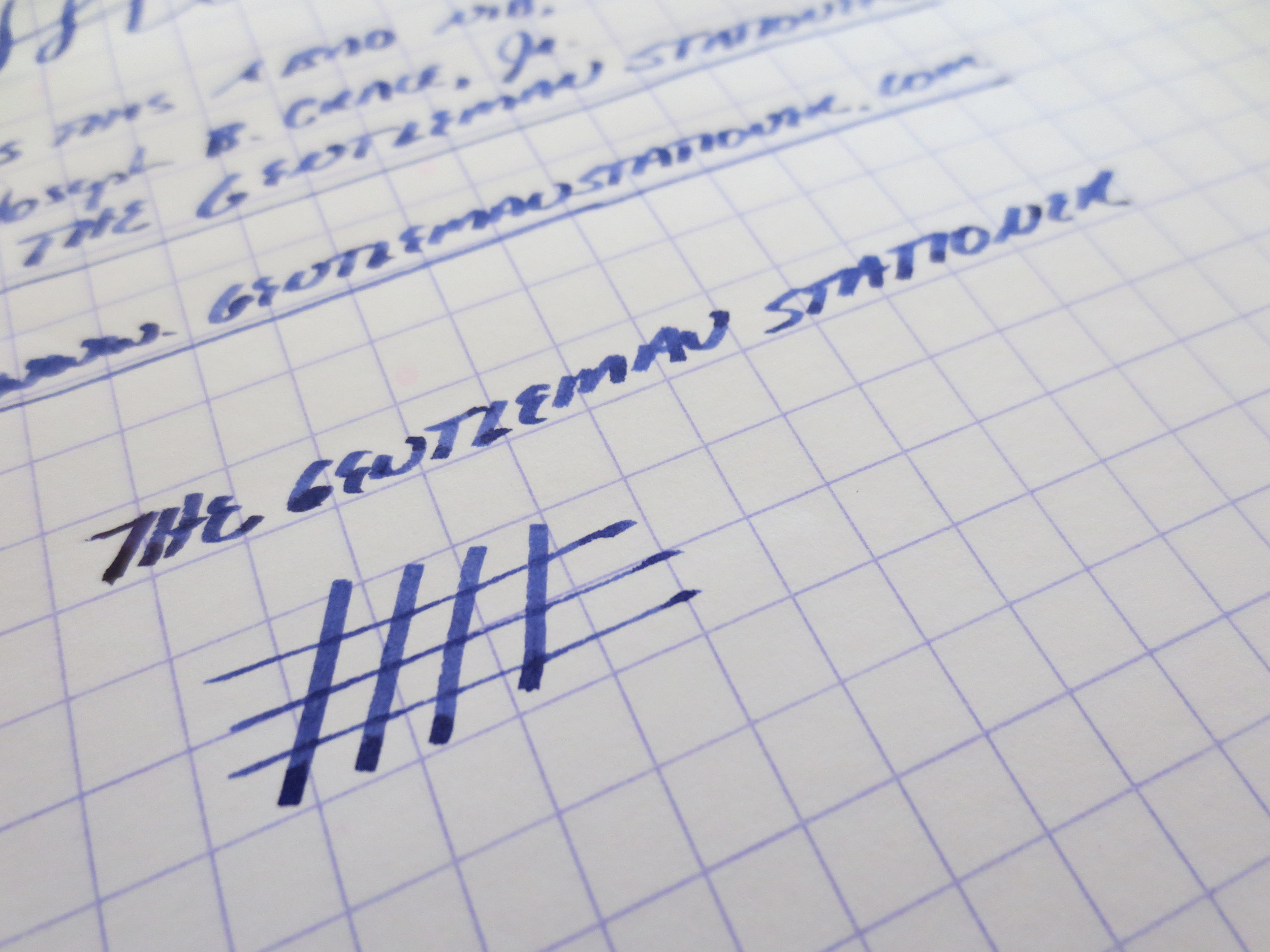
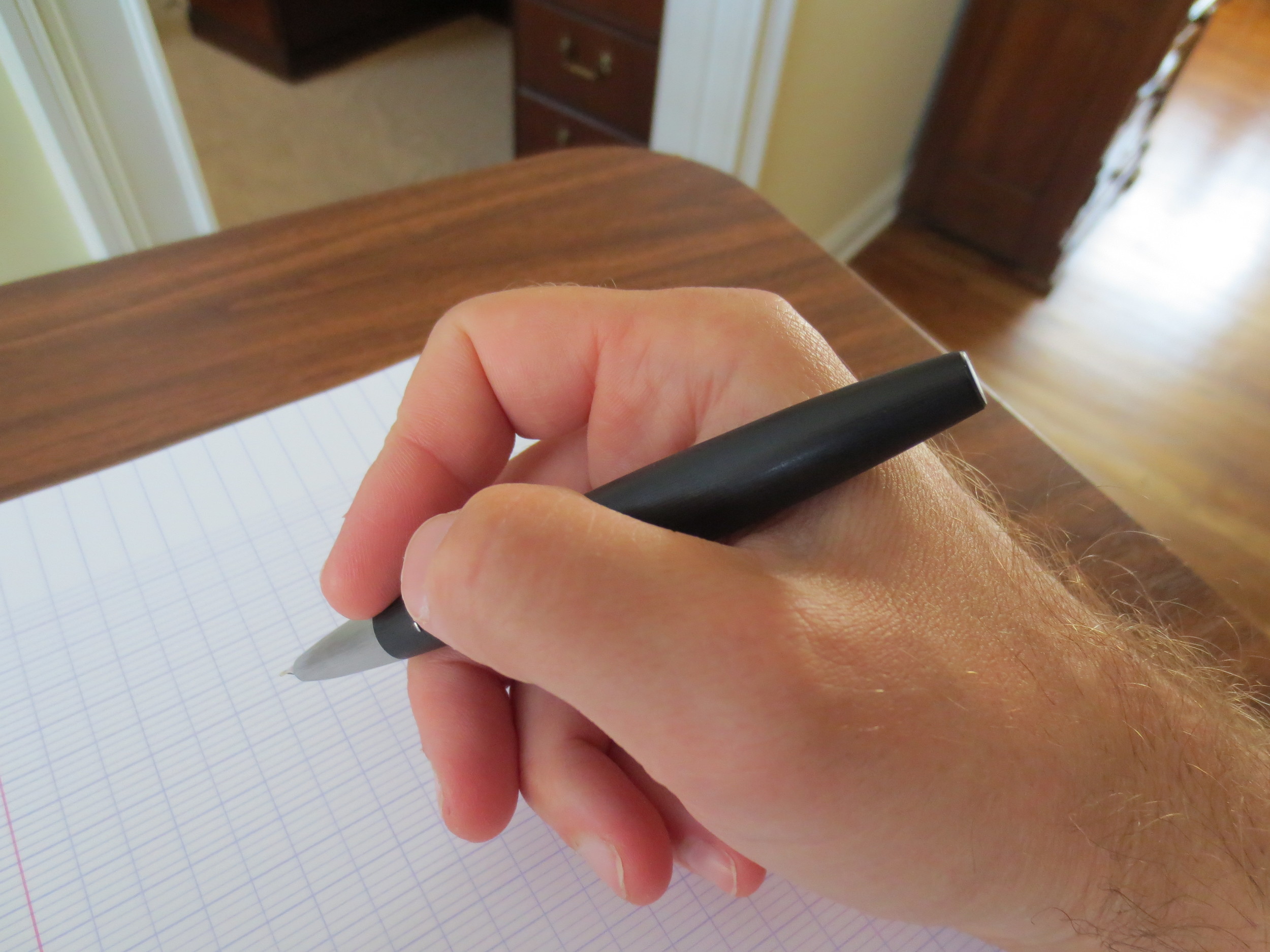
The stub is perfectly shaped, with no jagged edges to catch on the paper.
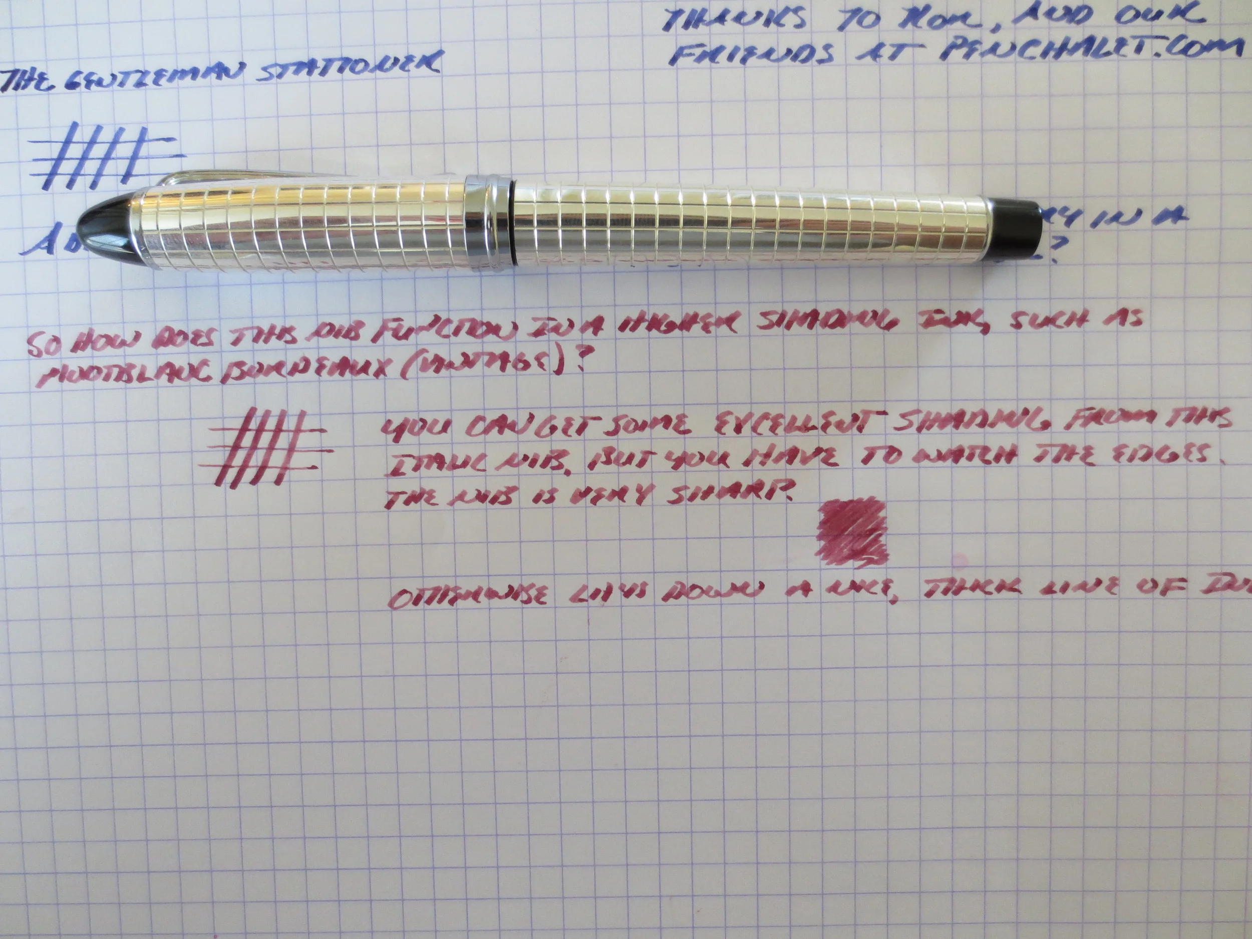
Excellent line variation on this stub nib. The ink is Akkerman's Voorhout Violet. The nib is smooth enough to use as a daily regular writer.
I would recommend Greg's work to anyone. You can reach him through his website, linked here. Greg is incredibly reasonable, and his turnaround time is two weeks for retips. He also does general pen repair and restoration (and I believe offers grinds and other nibmeister services as well). He sometimes attends the DC Pen Show, so hopefully I will get to thank him this weekend.
A few brief words about the Lamy 2000 overall (and not just this particular pen). The pen has been reviewed many, many times, and people mostly rave about it. I count myself among its fans. The Makrolon body hides scratches, and I personally love matte black finishes and flat-top ends. This pen has won numerous design awards, and I believe sits in the MOMA as an example of Bauhaus-inspired industrial design. Most criticism of the pen comes in the form of complaints about the quality control on Lamy's stock nibs (which is not an issue for this particular pen), but I also have another Lamy 2000 with an EF nib, which to me writes perfectly well and also sees heavy use. Your mileage may vary--I know that the Goulets will check the nib before they send you the pen if you ask them.
Some brief notes: I will be attending the DC Pen Show this Saturday and Sunday. Please reach out to me if you are going to be attending and would like to meet up. Also, given my travel schedule, I will not be on my regular posting schedule for Friday or Monday, though I will have some show-related special content over the weekend.