• Blog
  • Shop
  • Resources
  • FAQ (Ask TGS)
  • About
  • Archive
  • Contact
  • Sign In My Account
Menu

The Gentleman Stationer

Vintage Living in the Modern World.
  • Blog
  • Shop
  • Resources
  • FAQ (Ask TGS)
  • About
  • Archive
  • Contact
  • Sign In My Account

Pen Case Review: Dee Charles Designs Double Pen Sleeve

July 15, 2017

If there's one thing I don't lack, it's pen cases, pen boxes, pen stands, and other storage options. Once you fall deep into this hobby, you become unnaturally preoccupied with the best way to store, carry, and display your collection. As interest in fountain pens and other high-end writing instruments has experienced a resurgence in recent years, companies have not only begun to product more pens and ink, but also accessories to go along with them. Aston Leather, Franklin-Christoph, Tom Barrington, and now Dee Charles Designs, all make some excellent leather pen sleeves and pen cases. In this review, I'll look at a black leather two-pen sleeve from Dee Charles that Ron at Pen Chalet was kind enough to send me.   

Each case features the Dee Charles Designs logo branded onto the front, and comes with the option of colored thread. I opted for red, of course. 

What's perhaps most notable about the Dee Charles leather pen sleeve is its simplicity. It's basically two pieces of black leather stitched together to form a pouch, with a line of stitching down the middle to divide the case so the two pens don't touch. Unlike a more expensive case such as those from Tom Barrington, the edges on the Dee Charles pen sleeve are left rough and unfinished. There's also no lining on the inside. To be honest, when I initially received this case, the leather felt extremely stiff, and I worried that it looked a bit "plasticky."   

You can see the unfinished edges and interior of this pen case, which I guess is appropriate for the rugged style as well as the price point. 

My initial impressions appear to be wrong, and this case has "broken in" nicely. While long-term durability remains to be seen, it's held up well over the past month (during which I've carried it every day) and the leather has definitely become more supple with use. Once it accumulates the creases and scuffs that naturally come with actually using any leather product, the unfinished edges and interior blend a bit and actually lend this case a rugged charm. 

On the left, a Montegrappa Fortuna in white/ruthenium, and on the right, my Sailor Pro Gear Imperial Black. The Fortuna is a relatively fat pen, and fits. 

Another thing I appreciate is that this double sleeve can hold two big pens fairly easily. At first, the fit was tight, but now that the leather has softened up it can easily hold a TWSBI 580 and my Kanilea Pen Co. Mauna Kea. The Tom Barrington case is a touch too short to hold either of these pens.  

Takeaways and Where to Buy

This Dee Charles double pen sleeve is a sturdy option to protect your daily carry pens, and is available at an accessible price. Curiously, I've been able to find very little information about Dee Charles Designs as a company, and would be interested in learning more. From what I can tell, they're new, and their product line is currently limited to one and two-pen sleeves and a pocket notebook cover. All three products are available in black, "sunrise" (tan), or rawhide leather, and you can choose colored stitching with red, blue, or gold thread to give your case a bit of character. I immediately opted for the black leather with red thread combination, and it's sharp. 

You can purchase Dee Charles pen cases from Pen Chalet, priced at just under $20 for a single pen sleeve, $25 for a double sleeve, and $50 for the pocket notebook case. To sweeten the deal, for a limited time Pen Chalet is offering a free pen with your purchase of one of the Dee Charles cases. You will have your choice of a Lamy Logo, a Parker Jotter, or a Pelikan Belle ballpoint pen. 

Disclaimer: This product was sent to me by Pen Chalet free of charge for review purposes. This post contains affiliate links. 

In Pen Storage Tags Pen Cases, Dee Charles, Pen Sleeve, Leather, Dee Charles Designs
Comment

Photograph by Nathan Oakley, licensed via Creative Commons. 

Digital Divide Guest Post: Typewriter Reflections

July 12, 2017

Today's post is a guest submission by longtime reader David Thomson. Many thanks to David for offering us his thoughts on a subject with a lot of meaning to him: typewriters. (It makes me want to go out and order one!)

I have been a long time fountain pen user, having convinced my father to purchase a Montblanc 22 for my graduation from High School 40 years ago.  Something about writing with a fountain pen just worked better for my handwriting.  Ballpoint or gel pens do not work as well for me, and I avoid them.

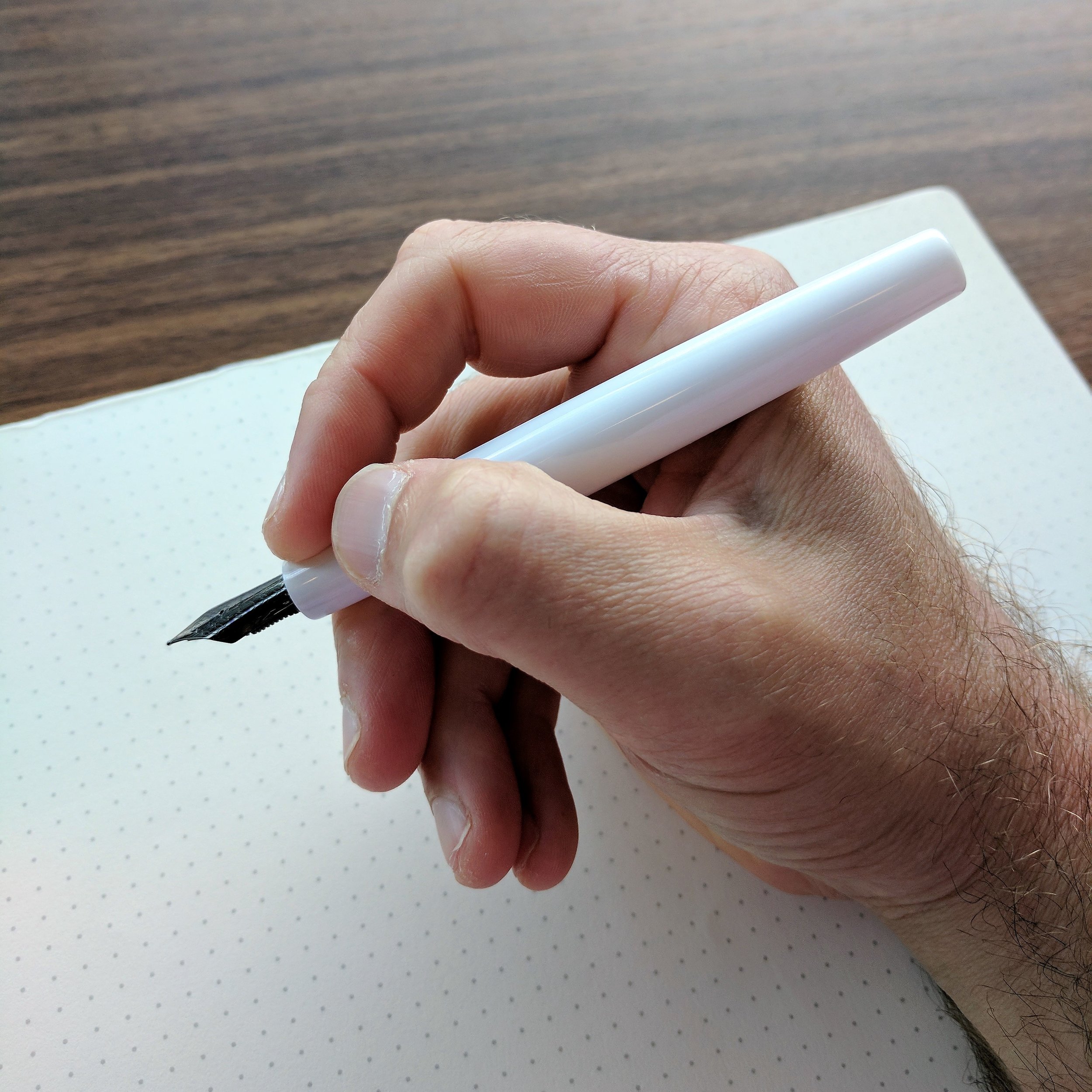
During my child-rearing years, I almost exclusively used Pilot Varsity pens.  When you have small children around, cheap, disposable, and reliable works well.  A couple of years ago, I came upon Brad’s site, and – as many of us have – fell down the rabbit hole.  After starting with the Safari, and progressing up the chain, I have found a sweet spot with Franklin-Christoph pens, usually eyedroppered with a steel stub nib or Masuyama grind.  I have bought and sold a couple of dozen pens and now have about a dozen with almost 30 inks.  Other than the F-C pens, I have a Lamy 2K, Pilot 912, Pilot CH74 (orange), Platinum Nice Pur, and a three Delta pens.  I’m pretty happy there, and remain a devoted fan of the Pen Addict Podcast, the Anderson’s Blog, and – of course – The Gentleman Stationer.

Like most of us, I have been noticing over the last several years that being a heavy user of technology can be alienating, and can lead to my days being chopped up into tiny fragments, with my attention fractured.  This is not good, since my work – I am a University Professor – requires some concentrated thinking time on a regular basis.  Grading student papers, conducting scholarly research, etc.

In today’s world, however, eschewing technology is simply unrealistic.  We now have an extraordinary research tool, communications device, and source of entertainment at our fingertips.  It would be impossible to do my job – work that I love – without using my devices many times per day.  To respond to student inquiries, to keep in touch with colleagues, to prepare for classes, and to research and write scholarship.  I am a heavy user of Mac keyboards on five different machines. 

But I have felt for some time that something was missing.  That the temptations were sometimes too great at the computer to focus on something other than my writing.  And while I am no crazy lefty or anti-government crank, I have increasingly been made to feel that anything I put into a computer’s memory is somehow immediately discoverable by whichever government (or just plain snoop) might want to drop in and look around.  While I have nothing to hide, most of us like to try out ideas before letting them see the light of day.  It is the way humans operated with ideas for thousands of years, up until the last 30 or so.

My father – also a University teacher for part of his career – wrote me letters every week for 40 years.  My parents divorced when I was young, and he spent many years in journalism after the divorce.  I saw him on Saturdays, and he wrote the letters as a way to keep in touch.  Each one of these letters - approximately 2,000 in total – were typewritten, and I kept every one.  He never converted to the PC or texting, but instead used the same Royal FP typewriter he was issued at his job in 1962 (and given when he retired).  If he had switched to email I might have lost some of them, but I still have each typewritten letter he sent to me stored in plastic tubs in the basement of my home.

My father died two years ago at the age of 89.  He lived a good life, and I miss him, but I really miss his letters.  They were newsy, about his golf game, and about the political scene (he lived in D.C., so hard to avoid that).  When I miss him, I can go get some of his letters from the basement, and hear his “voice” again.

His widow, my step-mother, has avoided cleaning out his study, and I don’t blame her.  A hard thing to do after 43 years of marriage.  But when she gets to that task, she knows I would like his old typewriter.  Just as a memento – I couldn’t type anything on it.  It has been silenced by his absence, and should stay that way.

Thinking about his typewriter got me to do some research on the subject.  And guess what?  There is a surprisingly large and devoted group of typewriter collectors and users, not unlike the fountain pen community.

Typewriters have a few advantages over computers, I have discovered.   For many of us, writing on a computer keyboard allows us to edit and correct mistakes as we write, which can interfere with the writing process.  It is generally much better to write without the ability to go backwards and correct as you go.  A typewriter makes you just keep on writing and then makes editing/reworking your writing as a fully separate step.  As a result, when using a typewriter you have to think more carefully and more deeply while you are writing, and the writing improves as a result.

Many contemporary writers still chose to use a typewriter.  Among them are David McCollough, Robert Caro, Woody Allen, and Paul Auster.  They chose to write first drafts on a typewriter very intentionally – it helps them to think and compose at a pace they believe produces better writing.  There are wonderful video clips of each of these writers describing their process, all easily found.  The actor Tom Hanks is a user of typewriters, and he has a large collection of them.  In an effort to bridge the Analog/Digital divide, he has developed an app that recreates the typewriter experience on the iPad.

There is a terrific recently published book called The Typewriter Revolution, written by Richard Polt, also a University professor and a typewriter collector and restorer.  He created The Typewriter Manifesto, which attest to the benefits of writing “old-school.”  There are Type-ins – gatherings of typewriter enthusiasts – and street poets who use a typewriter to compose poetry on-demand.

I myself now have a growing collection of typewriters, and the first draft of this post was written on an Olympia SM9, manufactured in 1966 - over 50 years ago.  It is a fine machine, all metal and precise German engineering.  I also have an earlier Olympia – the SM3 – from 1958.  And a Smith Corona from 1957 and another from 1934.  Recently I found a Remington portable in an Antique store from 1928.  It is almost 90 years old and it still works perfectly.

The parallels between the fountain pen community and the resurgent typewriter community are seemingly many.  In fountain pens, we appreciate beautiful design, and we are not afraid to adhere to and even celebrate a technology that is perceived by many to be out of date and obsolete.  We appreciate different functionality between different models, as well as designs from many years ago, items no longer made and not likely to be.  And we enjoy tinkering with and fixing up things that many would overlook or discard.  You can get beautiful examples of typewriters on eBay in great shape in the range of 50-75 USD.

There are blogs for typewriter enthusiasts, as you might suspect.  Many of them are “Typecasts” – which are actually typewritten posts of which a digital picture is taken and posted to the blog (that’s Analog/Digital right there!)  Also, there are a few bloggers that combine an interest in fountain pens and typewriters.  And I recently learned on an episode of the Pen Addict that Ana Reinert sold out a small collection of typewriters at the Arkansas Pen Show. 

Despite the growth of Typecasts, one of the great advantages for many is that a typewriter is not connected to the Internet, and thus no one can see or read or judge what you are writing unless you decide to show them or put it in an envelope and affix a stamp. 

So the resurgent typewriter community is exploring the Analog/Digital divide in a number of interesting ways, and has a lot in common with the fountain pen community.  Many fountain pen users have been discovering that sometimes it is better to make the Analog choice, and I have found – somewhat to my amazement – that turning to a typewriter to bang out first rough drafts of my writing and presentation notes to work very well.

I just wish I could tell my Dad.

Disclaimer: The thoughts and writing in this post are all David's, slightly edited by me (Joe) for length and to add links to certain web content and books that he mentions. Some of the links may be to sponsors/affiliates of this blog. 

In Guest Post Tags Guest Post, Digital Divide, Typewriters
3 Comments

Pen Review: Montegrappa Fortuna in White, Silver, and "The Mule"

July 8, 2017

Montegrappa is one of those brands that didn't make it onto my radar until relatively recently, when I was offered the opportunity to borrow one of their higher-end Passione pens in a stunning red celluloid. My positive experience with that pen got me interested in learning more about the brand, so I placed an order for a Montegrappa Fortuna in white with ruthenium trim. At the same time, Cary at Kenro Industries (Montegrappa's U.S. distributor) loaned me two additional pens: the recently released Fortuna Silver and one of last year's "it" pens, the Montegrappa Mule, which is essentially a copper and steel Fortuna. (You may recall seeing photographs from "Mule parties" on the pen show circuit.)

First Impressions

Aesthetically, the Fortuna ticks all the right boxes for me. I love the shape of this pen, which is a variant of the classic cigar shape and fits into my hand nicely. I also appreciate the classic, understated design - not always something that I can say about Montegrappa pens, especially on some of their more elaborate creations.

The coating on the brushed stainless steel Fortuna Silver reflects the light in a way that makes the pen appear to have varying shades of light and dark. The effect is very attractive and gives what would otherwise be a relatively plain stainless steel pen a more unique look. 

The build on these pens is quite sturdy - you don't have to worry about the Fortuna (and certainly not the copper and steel versions) holding up to the rigors of everyday use.  All feature very tight "rollerball" clips, and if I had one critique on the build it would be that the clips are too tight - it's often hard to get this pen to clip to a shirt pocket or a pen slot in one of my bags. 

Montegrappa Fortuna engraved cap band and "roller" clip

These pens also feature metal threads, which is likely a good thing for durability, but at least on my white Fortuna causes the threads to "squeak" a little bit when capping/uncapping. The noise is less pronounced on the all-metal pens, so it may have something to do with the black coating on the trim.  One thing I do appreciate is that while the barrel threads are metal, the internal threads (on the inside of the cap) are plastic, even on the Mule and Fortuna Silver. That way, when you post the pen the threads won't scratch the barrel, as pretty much always happens to any other pen with a metal cap. (Montblanc, take a hint here.)  

Writing Experience

All three of the Fortunas were extremely comfortable writers. The acrylic pen is a fairly light pen, and the easiest to write with for an extended period of time.  The metal threads at the front of the pen give it a nice forward balance with good control. Even the (much) heavier Fortuna Silver (made of stainless steel) and the Mule (made of copper) don't feel too heavy, due to the shape of the pen and how the weight is distributed.  I could use any of these three pens posted or unposted, which surprised me a bit because all-metal pens typically tire my hand out after about a page. Montegrappa did an excellent job of designing around an issue which could potentially make the Mule and the Fortuna Silver unusable for a lot of people. 

View fullsize Montegrappa Fortuna Unposted
View fullsize Montegrappa Fortuna Posted

While some have experienced flow issues with the Fortuna nibs, these three pens all wrote well without any hard starting or skipping.  Should you experience problems with your nib, I'd first clean the pen with a bit of soapy water (use diluted dish soap) or pen flush to rinse out any manufacturing residue (oils, debris, etc.), and if the problems continue notify your retailer or Kenro, who will take care of you.  I've not heard much about this recently, so Montegrappa may have resolved any production issues.   

Of these three pens, the white is my favorite, mainly because of the nib.  For some reason that I've not (yet) taken the time to research, black ion or ruthenium-plated nibs tend to be a touch softer than standard gold or steel nibs.  They're not "flexible" by any means, but they do have a bit more bounce to them. The standard steel nib on the Fortuna Silver and the Mule was definitely drier and stiffer than the black plated nib on the white acrylic pen.  I've noticed the same thing on my black ion-plated Sailor Professional Gear Imperial Black and Sailor 1911 Black Luster fountain pens - they're both softer than the standard Sailor gold nibs, which are notorious nails. 

Another note on the plated nibs - they have a tendency to corrode when used with inks containing iron gall.  I made the mistake of using Montblanc Midnight Blue (old formulation) and Montegrappa Blue Black with this nib, which resulted in the plating wearing away around the nib slit and at the base of the nib. Be warned. 

Montegrappa nibs, in my experience, also write narrower than their designation. The Mule and the Fortuna Silver both had broad nibs that to me were really classic mediums. I'm typically not a "broad nib" person because I do a lot of copy editing and margin annotations at work and need to write fairly small, but I could use this Montegrappa broad nib easily. Even so, I still preferred the medium nib on the white/ruthenium pen. It wrote a consistently wet line and even offered some stub-like line variation on the cross strokes.    

Takeaways and Where to Buy

Most Montegrappa retailers such as Vanness Pens and Pen Chalet will carry the Fortuna, especially since Montegrappa seems to be making the Fortuna line its primary - and certainly its most accessible - line of pens. That said, "accessibility" is relative, and these pens still come with a luxury premium on the price. The White/Ruthenium Fortuna retails for $290, and the Mule sells for $375.  The recently released Fortuna Silver is priced at $395.  Montegrappa is fairly insistent on retailers adhering to their standard pricing, and while you can sometimes find a slight discount off of MSRP, it's rare.

Are these pens worth the money? As always, it depends on what you are looking for. You can certainly find excellent writers with gold nibs for less money, and I'd personally be hard-pressed to choose the Fortuna over a Sailor Pro Gear, which can be less expensive and is possibly my favorite pen of all time. Price notwithstanding, the size and feel of the Fortuna make it an extremely comfortable pen to use, and Montegrappa has released this pen in some unique, beautiful designs and color schemes, which is the real value here. I highly encourage you to check out the Mosaico Marrakech, as well as the upcoming Fortuna "Heartwood" line.

A big thank you to Kenro Industries for making this review possible, and I look forward to seeing what else Montegrappa has in store for the Fortuna line.  

Disclaimer: I received a discount on my purchase of the White Fortuna directly from Kenro, who also loaned me the Montegrappa Mule and Silver Fortuna for review purposes. This post contains links to affiliates and sponsors.       

In Pens Tags Pen Review, Montegrappa, Montegrappa Fortuna
Comment

Ink Review: Montblanc Lucky Orange and William Shakespeare Velvet Red

July 5, 2017

I have two more Montblanc inks for you this week, both of which I picked up at the Atlanta Pen Show back in April. While Montblanc's lineup of "standard" fountain pen inks is pretty limited, they release roughly four limited edition colors per year that typically correspond to special edition pens. For example, UNICEF Blue for the Montblanc for UNICEF pens and Miles Davis Jazz Blue for the Miles Davis pen. I recently reviewed the excellent UNICEF Blue, and now I can highly recommend two more great colors: Lucky Orange and William Shakespeare Velvet Red. 

Montblanc's limited edition packaging is always worth checking out, even if you don't keep boxes. 

Highly Usable, Offbeat Colors

What I love about Montblanc inks is that they remain interesting while never straying too far from the standard color palette. For example, Lucky Orange appears to be a basic orange ink - it actually looks very plain "ink swatch" photographs you see online, but once you get this ink on paper it's much more vibrant than, say, Monteverde Mandarin Orange, and even the lighter and yellower Sailor Jentle Apricot. The William Shakespeare Ink isn't quite as unique, but I'm still a sucker for a dark red and it's somewhat close to Hitchcock, though a touch brighter and lacking the darker "blood red" undertones. 

View fullsize William Shakespeare Velvet Red Writing Sample
View fullsize Montblanc Lucky Orange Writing Sample

I've reviewed so many Montblanc inks now that I won't bore you all with an extended "review" of their properties, etc., but suffice to say performance-wise these are as good as any other Montblanc inks I've used. I've tested them out on-and-off at work for the past few months and have not had any problems with these inks bleeding through paper or feathering, extended dry times, or hard-starting in pens.  

Are These Inks Worth the Money? 

It's easy to get caught up in the hype over limited-edition-anything and the associated FOMO. Montblanc started this trend in the stationery world around 2011-2012 when it first began releasing special inks in limited quantities - Alfred Hitchcock is the first that I recall provoking ink hoarding, but I'm sure there were some others that I missed before that. Most of Montblanc's limited edition inks are priced at $19 for a 30ml bottle, but now it appears that they are moving to a $40/50ml price point. That's a pretty steep premium over the regular Montblanc ink, which sells for $22/60ml - roughly twice as expensive. 

If you're someone who burns through a lot of ink or are otherwise on a budget, there are definitely more cost-effective alternatives with equivalent quality. If you're looking for a unique color, however, or simply like the idea of owning a bottle of ink that features your favorite author or public figure as the theme, then you may be willing to pay a premium. Others hoard (or "collect") in the hope that the inks appreciate, and can be sold at a markup later once they are no longer available at retail. Whatever the reason, Montblanc seemingly has no trouble selling out their stock with each new release. 

I write a fair bit, but I change inks often, so if a limited edition piques my interest, I'll purchase a single bottle that will take me years to get through. Back in 2012, I bought four bottles of Alfred Hitchcock and ended up selling two of them because I'm only now getting near the bottom of my first. I advise people to buy the ink if they like it, but remember that with so many companies making high quality fountain pen inks these days, and the range of available colors increasing weekly, the odds that you won't be able to find something comparable somewhere else are low.

Where to Buy

Anderson Pens currently has both Lucky Orange and William Shakespeare Velvet Red in stock, but given that these are both limited runs, availability is subject to change. Both inks are priced at $19 - Lucky Orange comes in the 30ml square crystal bottle, and William Shakespeare comes in the slightly larger round 35ml Writer's Edition bottle. Anderson Pens also carries the full range of standard Montblanc Ink, and a wide selection of Montblanc Pens.     

Disclaimer: Anderson Pens provided these two inks to me at a discount as part of their sponsorship of this blog. I was not otherwise compensated for this review. All thoughts expressed here are my own. 

In Ink Reviews Tags Ink Review, Montblanc
Comment

Introducing My Guide to Pocket Pens

July 1, 2017

Sometimes you just have to get it out there.  After working on this for the better part of a year, I finally just decided to publish it, admitting that it likely will never be "complete" and will be a perpetual work in progress. Check out my new Guide to Pocket Pens, live now, and major thanks to Thomas for loaning me so many pens! 

In Guide Tags Guide, Pocket Pens
4 Comments
← Newer Posts Older Posts →
Store Location
Visit the T.G.S. Curated SHOP
*New* Updated "Best Pens" Guide (2025)
TGS x Hinze Pens Violet Tendencies Taschenstift Fountain Pen
Hierarchies of Fountain Pen Friendly Paper
Allex Scissors arrayed on a desk showing link to desk accessories

Join Our Patreon!
Subscribe to the TGS E-mail List

Featured Posts

Featured
Pilot-Iroshizuku-Yama-Budo-Writing-Sample.jpeg
May 24, 2025
Joe's Picks: Five Favorite Inks From Pilot's Iroshizuku Lineup
May 24, 2025
May 24, 2025
Yamamoto-Gray-Paper-Sampler-Set.jpeg
May 10, 2025
Discovering Unusual Paper: "Paper Tasting" Sets from Yamamoto Paper
May 10, 2025
May 10, 2025
Four-Micarta-Fountain-Pens.jpeg
Apr 19, 2025
Yes, Micarta for me! I finally got my hands on Some Micarta Pens, Plus My Own Special Edition
Apr 19, 2025
Apr 19, 2025
The Gentleman Stationer RSS

© Digital Divide Media, LLC, 2014-present.

All content is the exclusive property of Digital Divide Media, LLC, d/b/a The Gentleman Stationer, including “The Gentleman Stationer” website and trademark, and should not be reproduced without express written permission.  All rights reserved.

All content containing paid advertising, affiliate links, or sponsored content will be plainly disclosed by a disclaimer when/if featured.

Contact Information

Store Shipping Policy and Return Policy

Privacy Policy

Cookie Policy

Terms and Conditions

Powered by Squarespace