• Blog
  • Shop
  • Resources
  • FAQ (Ask TGS)
  • About
  • Archive
  • Contact
  • Sign In My Account
Menu

The Gentleman Stationer

Vintage Living in the Modern World.
  • Blog
  • Shop
  • Resources
  • FAQ (Ask TGS)
  • About
  • Archive
  • Contact
  • Sign In My Account

Tactile Turn Gist Revisited: Titanium Gist 2.0

April 13, 2019

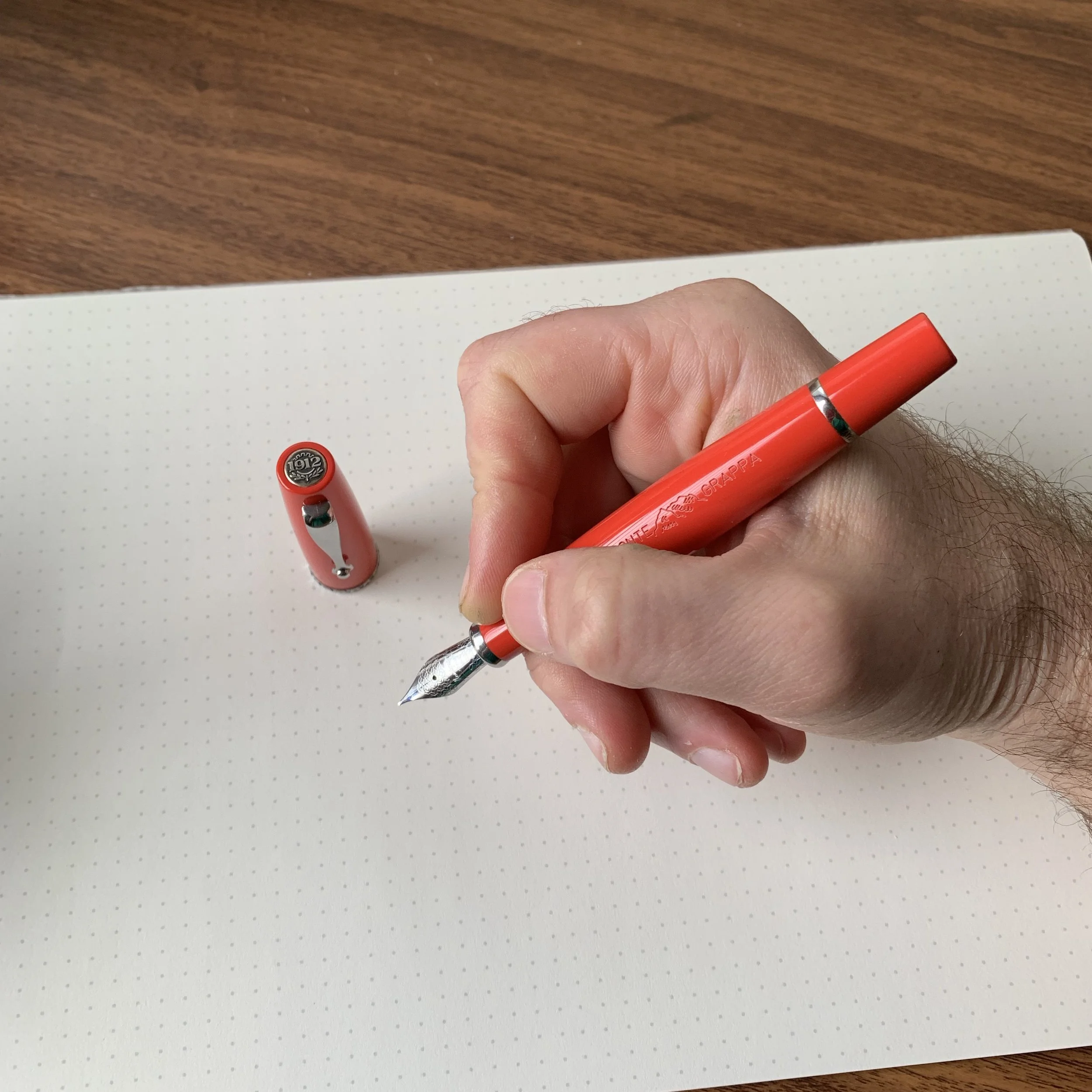
I initially reviewed the Tactile Turn Gist fountain pen back in 2016, following the close of the Kickstarter project. The Gist Kickstarter can only be considered an unqualified success for Tactile Turn, raising $129,000 in pledges and cementing their status as one of the premier manufacturers of machined “EDC-style” pens. The “Gist 1.0”, as I’ll call it, garnered generally positive reviews. Most attention focused on the Gist’s pairing of a lightweight Makrolon (polycarbonate) pen body with a textured metal section made from either common or rare metals, including copper, brass, bronze, Damascus Steel, zirconium, and titanium. All-metal versions were also available, though they could be quite expensive due to the difficulty of machining pens from certain materials (i.e. zirconium, which has a tendency to combust and do inconvenient things like destroy machinery).

Will changed quite a few things with the Gist 2.0, but the signature Tactile Turn texture remains intact!

As I noted in my initial review, the Gist 1.0 was not without a “few hiccups,” most notably the Makrolon’s propensity to crack around the cap lip, and for the nib to dry out due to some caps not sealing properly. The pen body was also too short to accept a standard Schmidt international converter, so you had to use a different one supplied by Tactile Turn which, in my opinion, wasn’t as good since it had lower ink capacity and ink flow issues. None of these issues made the Gist 1.0 a “bad pen” - to the contrary, I enjoyed the weight, balance, and overall look. I know several people who still use their Kickstarter Gist as a daily writer more than two years later, and issues are to be expected with any “version 1.0” product release. How a company progresses from version 1.0 to version 2.0, incorporating feedback from customers, is more telling about the Company’s future prospects. From my experience with the Gist v. 2.0, the future looks bright for Tactile Turn.

New Materials, Different Specs

For the next iteration of the Gist, Tactile Turn made several notable design changes:

  • No More Makrolon! Tactile Turn stopped using Makrolon in favor of Delrin, a plastic used by high-end penmakers such as Conid. According to Will Hodges of Tactile Turn, the Makrolon he was able to source was not up to his standards in terms of durability, so he made the decision to switch materials on the non-metal pens. I think the Delrin pens look great, and they’re now available in white as well as black. As of now, metal sections are not available - you either go all-metal or all-Delrin.

  • A Longer Body. The Gist now accepts a full-size Schmidt international converter, and the added body length provides better balance, whether you write with the pen posted or unposted.

  • Shorter Threads. It now takes only 1.5 turns to cap/uncap the pen, as opposed to the 3+ on version 1.0. The threads also aren’t nearly as tight, reducing the risk of cracking the cap lip.

  • Plastic Cap Inserts on Metal Pens. You can now post the cap on the metal versions of the Gist without any unwanted metal-on-metal contact. I can’t speak to the other metal options, but the titanium pen posts nicely without too much added weight.

The Gist v.2.0 features Higbee thread starts, and the pen caps/uncaps in 1.5 turns.

This particular Gist sports one of the best Bock nibs I’ve ever used. I’ve had much better luck with Bock recently. I do think they’ve upped their quality control.

You can read more about the various design choices on Tactile Turn’s website, including specific details on the machining and engineering. Fans of the first Gist will be happy to know that the Gist continues to feature Tactile Turn’s signature texture, which serves a dual purpose of making a metal pen easier to grip (no slippage!) and hiding the small scuffs and scratches that polished metal tends to accumulate through everyday use.

View fullsize fullsizeoutput_220f.jpeg
View fullsize fullsizeoutput_220e.jpeg

Takeaways and Where to Buy

My Gist is a joy to write with, and I’m happy to report that I’ve written through three straight fills of ink since acquiring this pen at last month’s Arkansas Pen Show. The Gist presents a durable, well-priced option for a daily writer, and “Version 2.0” is everything I hoped it would be. The Gist comes in both fountain pen and rollerball configurations, with prices starting as low as $99 for a Delrin pen. The titanium version reviewed here runs $219 for the fountain pen, with copper and brass versions priced at $139 and $119 respectively.

The Titanium Gist was one of my purchases from this year’s Arkansas Pen Show.

Disclaimer: Will Hodges at Tactile Turn was kind enough to provide me with a discount on my purchase of the titanium Gist featured in this review, which I purchased with my own funds. Many thanks to Will for making this review possible! This post contains links to paid sponsors and affiliates (ink notes below).

So What About this Purple Ink?

Waterman-Tender-Purple-Swatch

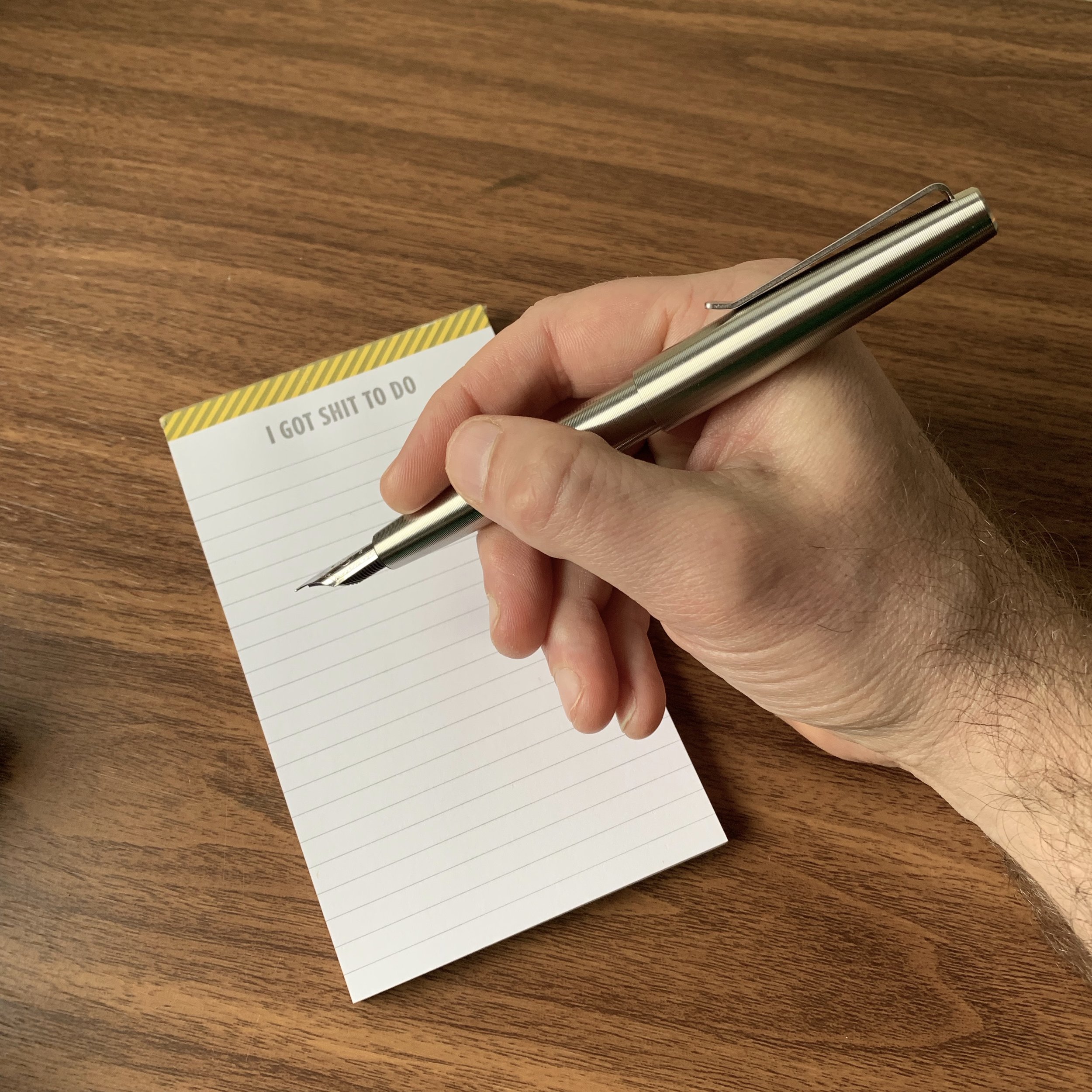
The eye-popping purple ink that appears below, and that I’ve been using in this pen, is standard Waterman Violet (or, as it’s known now, “Tender Purple”). Surprising, I know! I recently broke out my Waterman inks after a long hiatus, and love them as much as I did when I first got into fountain pens years ago. They’re currently available for the bargain-basement price of $11 per bottle at Vanness Pens, making Waterman ink one of the best buys out there. The paper pictured in this review is, of course, the “Shit to Do” notepad from Skylab Letterpress. Ink swabs are done on Col-o-dex cards, courtesy of Ana Reinert and Skylab.

One note of caution: while Waterman inks are generally regarded as “safe” inks, the purple, in my experience, will stain celluloid and light-colored acrylics, as well as demonstrators and converters if you let the pens remain inked long enough. This isn’t uncommon among purple inks, but since Waterman ink has a reputation as being "safe for anything,” it’s worth mentioning.

In Pens Tags Tactile Turn, Tactile Turn Gist, Fountain Pen, Pen Review, Revisited
Comment

“King of Pen? What King of Pen? What just happened to me?”

Recapping the 2019 Atlanta Pen Show

April 10, 2019

I don’t know where to begin with this 2019 Atlanta Pen Show Recap. Everyone always remarks that the Atlanta Pen Show “feels like family,” to the point where it seems cliched, but it’s not - that’s the best way to describe it. Alongside Baltimore, Atlanta puts on one of the friendliest, most open pen shows of the year, somehow managing to keep the physical size of the show relatively small while attracting a high-quality group of exhibitors and vendors. Be warned - this will be a lengthy recap. This year’s Atlanta Show had so much to offer in terms of new products and new vendors that I’m still not sure I managed to catch everything.

When I arrived late Thursday night, #penshowsafterdark was already in full swing!

By far one of the more anticipated releases at the 2019 Atlanta Pen Show were Pilot’s 100th Anniversary Iroshizuku Inks. Vanness had all of the Iroshizuku Inks and the Lamy Crystal inks at their table.

Show Setup and Venue

For as long as I’ve been attending, the Atlanta Pen Show has been held at the Wyndham Atlanta Galleria. The location is fine - the hotel is clean, outside the center of Atlanta so traffic is as much of a non-issue as it can be in Atlanta, and there is a reasonable variety of restaurants within walking distance or a short drive. The main drawback to this hotel is that the staff seems anywhere from indifferent to annoyed at big groups, which limits the after-hours activities somewhat because they always try to shut the bar down by 11 p.m. and this year even turned the lights off on everyone Saturday night to try to make them leave. Given this, and the fact that the show itself has now outgrown available ballroom space, I wouldn’t be surprised at a change in location over the next couple of years.

Jonathon Brooks and his new helper. If I had sold that many pens, I’d be in good spirits too!

The Leonardo Momento Zero: quite possibly my favorite pen on the market at the moment.

The Leonardo Momento Zero: quite possibly my favorite pen on the market at the moment.

Top Five Takeaways from the Atlanta Pen Show

I’ll run a vendor-by-vendor breakdown later on in the recap, but while I was taking some time to collect my thoughts on Sunday night, I put together the following list of “show highlights,” which are, of course, highly subjective.

  1. Leonardo Momento Zero. Dan Smith of The Nibsmith now carries Leonardo, and while the pens aren’t yet up on the website, I understand they’re coming soon. Dan basically had the entire line set up at his table, and I added yet another Momento Zero to my collection, this time in matte black. It’s early, but at Leonardo’s price point, this pen has the potential to kill the Sailor Pro Gear Imperial Black.

  2. Pilot Iroshizuku Inks (100th Anniversary and Standard Colors). Much of the pre-show buzz focused on the release of two new series of inks: Pilot’s 100th Anniversary Iroshizuku colors, and the Lamy Crystal inks. I picked up two of the Iroshizukus (Hoteison, a dark green, and Bishmonten, a pinkish red), and one Lamy (Topaz) from Vanness Pens. Look for reviews of these inks soon.

  3. Newton Pens. Shawn Newton has gotten me bad at these last two shows, Little Rock and Atlanta. Since he added some new machinery and lowered the price point on certain production-line pens, it’s become increasingly difficult to walk away from his table without buying something, and this show I acquired three (!?!?!) pens from Shawn: a Prospector in blue and gray ripple Japanese ebonite, and two Orvilles.

  4. New (to me) Vendors Matthew C. Martin Custom Pens and Truphae. Matthew Martin’s machined metal pens are about to take off big time, and he was clearly the sleeper hit of the Atlanta Pen Show. And while I had heard of online retailer Truphae, mainly on account of their “Inkredible” subscription box, I had not seen their collaboration with Visconti on two gorgeous Opera Masters: Stardust (featuring ruthenium trim) and Corvina.

  5. Conid. While Conid wasn’t officially present at the show, a group of enthusiasts who collectively (and maybe individually) owned ALL of the different models of the Bulkfiller set up tables to show them off and let people test the pens. Once again, I’m blown away by the generosity of the pen community, since I’ve been considering a Bulkfiller and these tables were incredibly helpful in deciding which one I want to order.

A few Shawn Newton Orvilles in some gorgeous custom acrylics that I had never seen before.

A Quintet of Conid Kingsize Bulkfillers (with a Conid Giraffe peeking out at the back).

A Quintet of Conid Kingsize Bulkfillers (with a Conid Giraffe peeking out at the back).

Visconti Opera Masters from Truphae, with the Stardust pens on the left and the “Corvina” pens on the right.

Other new discoveries included PK Custom Goods pen cases and wraps, which you can purchase from their Etsy store. I picked up Star Wars and Harry Potter-themed versions, and you’ll see a review up on the site at some point in the future. Here’s a further run-down of some other things I saw at the show, by vendor:

  • Total Fine Writing/The Pen Show. Jimmy and Suzanne Dolive once again organized a great show, and they also attended as vendors with multiple tables that included one of the show’s largest selection of Montblanc limited edition pens and inks (as well as the Penlux Snake).

  • Papier Plume. Patrick always attends the show from New Orleans, with the full range of Papier Plume’s hand-mixed ink, wax seals and stamps, and fountain pens from brands such as Cleo-Skribent that you don’t see very often. I also picked up two bottles of the exclusive inks that Papier Plume always makes for the Chicago Pen Show, which I won’t reveal quite yet.

  • Nock Co. Instagram is on fire with pictures of the “Coleman” tall-boy cozy - I mean pen case. I’m not sure whether or not Brad and Jeff plan to make these available on the site or whether they will be show exclusives, but they sold well and I definitely saw dozens of them walking around (mostly used as actual pen cases).

  • Tactile Turn. Will and his team are now attending more pen shows, and he has, IMHO, perfected the design of the Gist fountain pen, now available not only in Titanium and Delrin, but in “fireblue” Titanium! Look for a review of the “Gist 2.0” soon.

  • Carolina Pen Company. Jonathon Brooks brought tons of pens turned from his “Primary Manipulation” acrylics, and they went fast. Somebody picked up the pen I had my eye on when I was taking an initial turn around the room - one of the perils of hesitating at a pen show!

  • Franklin-Christoph. It wouldn’t be a pen show without a mad dash to the Franklin-Christoph table first thing after opening to grab the latest prototype acrylics. This year I finally picked up a Penvelope 6 pen case, which was long overdue.

  • Dromgooles. These guys can cost you a LOT of money. Dromgoole’s brought an expansive selection of Danitrios, Graf von Faber-Castell Pens of the Year, Pelikan, and Montblanc, a few of which featured custom urushi and maki-e work by Studio Bokumondoh.

  • Vintage Pen Shop/Jessica Coles. Jesi was set up directly behind the Nock Co. table with her vintage Esterbrook pens and nib testing station. If you’re interested in testing the waters with Vintage Pens, Esterbrook is THE place to start, and Jesi has you covered.

  • Kenro Industries. Cary attended with samples of Esterbrook’s upcoming line of pen cases, as well as Loclen, a new line of machined metal pens out of Italy that feature a unique design incorporating an integrated converter/piston.

  • Luxury Brands. The distributors of Platinum, Noodlers Ink, and Benu Pens had a table, where a display of updated Platinum Mix-Free Ink bottles caught my eye. If you’re unfamiliar with the concept, the Mix-Free Inks are designed to - wait for it - be mixed together to create your own ink colors. Apparently Platinum is releasing these inks in new bottles and as part of a set.

Look for this line of Esterbrook pen cases later this year!

Dromgoole’s always brings an unparalleled selection of high-end Japanese Pens, including custom urushi work from Studio Bokumondoh, Danitrio, Pilot, and more!

You rarely see Graf von Faber-Castell “Pen of the Year” editions, much less are you able to handle them. I love the size and balance of these pens, despite the fact that they are heavy, both figuratively and literally. (I’m not kidding when I say that the Dromgoole’s table can do serious damage to your wallet.)

You know the industry is truly evolving when a pen case that doubles as a tall-boy cozy becomes a reality.

Look for Loclen pens soon at your favorite Kenro retailers!

Look for Loclen pens soon at your favorite Kenro retailers!

The PK Custom Cases table on Sunday (minus the two I bought).

Other vendors included pen show staples Desiderata Pens (with Pierre’s Soubriquet pens!), Michael Sull, Nik Pang, Ryan Krusac, Bittner Pens, Toys from the Attic, and many more!

The second ballroom late Saturday afternoon. The Nock Co. table had already sold a bunch of cases!

Overall Impressions

I spent time at the show during all three days this year, and traffic seemed pretty steady in all three ballrooms, with most vendors reporting brisk sales skewed towards entry-level pens and inks. The friendly, open atmosphere of the Atlanta Show lends itself to beginners, and many people I met described how they were attending their first pen show. Their excitement is always contagious, and there was a lively after-hours crowd in the bar every night (at least until the hotel staff kicked us out by turning out the lights). You can bet I’ll be back next year!

Note: I missed the live podcast recording this year, since my family joined me in Atlanta and I spent some time with them on Saturday, visiting the Georgia Aquarium and going out to dinner that night. I did listen to the show afterwards, and you won’t want to miss this year’s special guests!

My preferred way to close out the Atlanta Pen Show.

Disclaimer: This post contains links to paid sponsors and affiliates.

In Pen Shows Tags Pen Show, Atlanta Pen Show, Atlanta Pen Show 2019
3 Comments

The Damage From Atlanta: 2019 Show Haul

April 9, 2019

My recap from the Atlanta Pen Show is going to be a doozy, so I figured I’d break it out into a couple different posts. The first one is simple: a picture of my “show haul,” since I went a little crazy this year. (Hey, I’m not attending another show until D.C. in August, right?) Pictured here, clockwise from left: Penvelope 6 from Franklin-Christoph, Wax Seal Stamp from Papier Plume, Iroshizuku 100th Anniversary Hoteison (green black) and Bishmonten (a pinkish red) from Vanness, Lamy Crystal Topaz from Vanness, a Leonardo Momento Zero in Matte Black from Dan Smith (the Nibsmith), three pens from Shawn Newton (two Orvilles and a Prospector), and two hand-sewn pen cases from PK Custom Goods! More details to come via a full recap later this week.

Disclaimer: This post contains links to paid sponsors and affiliates.

In Pen Shows Tags Pen Shows, Atlanta Pen Show, Atlanta Pen Show 2019
2 Comments

Ink Review: Taccia Ebi (Purple Red) and Uguisu (Olive Green)

April 3, 2019

Taccia is a Taiwanese brand that has grown significantly over the past couple of years, releasing some very nice pens at both a moderate and luxury price point, and just this past year releasing an entire range of inks. Today’s review will take a look at two of the inks: Ebi (described as a “purple red”) and Uguisu (described as an “olive green”). I chose these particular colors because, as you all know, I’m partial to deep reds/burgundies and darker greens. Neither Taccia ink disappoints.

I’d consider Taccia “Ebi” to be a solid burgundy/maroon option, if you prefer your burgundies with a lot of purple. Comparable colors would include Montblanc Burgundy Red (the closest match in my collection) and Sailor Oku-Yama (more pink/red and less purple). Colorverse Dark Energy has a lot more black to it.

“Uguisu” is an ink that’s going to get a lot of use. I’ve had a hard time finding a true “olive green” that isn’t too yellow and/or pale. By far the closest match in my collection is Sailor Jentle Epinard, since both inks have a slight red sheen to them, but the Uguisu is a shade lighter with enough yellow to make it a pure olive. Other comparable colors include Sailor Waka Uguisu (much lighter) and Monteverde Olivine (much darker, with nib crud issues).

Writing sample on Clairefontaine French Ruled A5 notebook. The tester pen for the Ebi was a KACO Retro, and a Parker 51 for the Uguisu.

Because Japanese pen company Sailor has made nibs for Taccia in the past, it begs the question: Are these Sailor inks? No. While these inks are made in Japan, I understand they’re manufactured by another company (Nabayashi), though the range of colors Taccia chose definitely bears some similarity to the Sailor Jentle/Pilot Iroshizuku lineup. The Taccia inks also behave somewhat differently. Both Ebi and Uguisu were slightly wetter than most Sailor inks I have used, though they still worked well on most types of paper, with the exception of the super-cheap recycled copy paper that is always loaded into one of my office printers. (Side Note: does anyone else have a situation at work where one printer has the “good paper” and other has the “terrible paper”? Apparently I have a reputation for backing up the “good printer” with print jobs because I refuse to use the bad one.)

Takeaways and Where to Buy

Burgundy reds and olive greens are always two of my favorite colors, and I found both Taccia inks to be well-behaved. I’ve heard good reports about the brand in general. With Sailor upping their prices per ml by cutting bottle sizes in half, Taccia presents an attractive alternative by selling quality ink that behaves similarly at a lower price point. Vanness Pens currently stocks the entire line, and has 12 of the 13 inks in stock at $12 per 40ml bottle. I also expect that Lisa will be bringing Taccia inks to this weekend’s upcoming Atlanta Pen Show.

Many thanks to Vanness Pens for providing me with these two bottles of Taccia Ink (in exchange for helping to work the table at the Baltimore Pen Show).

I love the box art on the Taccia inks. Ebi on the left, Uguisu on the right.

In Ink Reviews Tags Ink Review, Vanness, Taccia, Taccia Ink
1 Comment

Pen Review: Montegrappa Monte-Grappa

March 30, 2019

It’s coming up on a year since I received the Montegrappa Monte-Grappa, so after much use, a review is long overdue. This particular pen was released last year around the time of the Atlanta Pen Show, which was the first time I was able to handle one, and upon seeing the “Coral” pen I knew that this was a pen I would eventually add to my collection. I’m a sucker for vintage-inspired pen design, and was a pretty easy mark for Cary at the Kenro table.

The vintage-style stamping on the barrel is what does it for me with this pen.

Coral, which I would describe as a pinkish-reddish-orange, seems like an odd color to add to the lineup of a modern pen brand, but it has a long history with fountain pens. Many vintage pens, such as the Parker Duofold “Big Red” from the 1920s and, more recently, the Waterman Man 100 Patrician, came in a similar shade. The Monte-Grappa comes in three other standard colors, black, blue, and lavender, but the coral version is by far my favorite.

Montegrappa’s “1912” medallion denotes the history of the brand and the fact that it’s one of the older Italian pen companies (and possibly the oldest - I need to brush up on my history).

The first thing you’ll notice about this pen is that everything screams “vintage,” from the color, to the size and shape, to the barrel imprint. The Monte-Grappa is also one of Montegrappa’s more understated designs (along with the Fortuna series), and I hope it sticks around. A few of my favorite aspects of this pen:

  • Barrel Imprint. The “Monte Grappa” imprint on the barrel looks as though it were lifted directly off a pen from the 1930s. Other than the cap band, this engraving is the only adornment on the pen and it adds charm.

  • Comfortable Shape and Ergonomics. I have always found Montegrappa pens to be very comfortable in the hand. The Monte-Grappa is no exception, with an inverted hourglass shape that tapers towards the nib and the piston knob and allows most of the pen’s weight to sit between your thumb and index finger (assuming you hold the pen in a traditional manner). Balance is important here, because the piston filling system adds heft to the pen. Most people will find the Monte-Grappa most comfortable to use unposted, though I post the pen regularly and don’t have any issues.

  • Montegrappa’s “Ratchet” Piston. A key selling point on this pen was Montegrappa’s decision to incorporate its patented piston-filling mechanism that you typically see only on MUCH more expensive pens (though the Monte-Grappa certainly isn’t inexpensive, as discussed below). Montegrappa makes one of my favorite pistons, because it uses a ratchet mechanism that clicks as you turn it. Once the clicking sound stops, you know not to turn further, preventing damage to the pen.

  • JoWo Nibs! Last but not least, the Monte-Grappa was the first major release to use JoWo nibs, which I find to be a huge upgrade over the previous Montegrappa (Bock?) nibs that tended to cause problems with dryness and skipping in some Fortunas. The new nibs are much more reliable, and I experienced no ink starvation issues. These nibs are still custom-engraved with Montegrappa’s signature “filigree” pattern.

View fullsize Montegrappa Monte-Grappa Unposted
View fullsize Montegrappa Monte-Grappa Posted

Montegrappa’s new JoWo nibs are of exceptional quality and still come engraved with the signature filigree pattern. I opted for a 14k nib here, which writes a true medium line with superb ink flow.

The Monte-Grappa features stainless steel trim, including a metal cap band that has a hammered metal look to it (even though it’s not technically hammered steel).

Takeaways and Where to Buy

I love the look of the Monte-Grappa, and it’s also an excellent functional writing instrument with the potential to be a mainstream “flagship” for the brand. But, as you might expect from Montegrappa, I have concerns that the price point will prevent this pen from getting traction with a broader audience. The MSRP on the Monte-grappa with a steel nib is $395, with pens typically retailing somewhere between $275-315. That’s expensive for an acrylic pen equipped with a JoWo nib, even once you account for the piston-filler. If you want to add a 14k nib, you will pay an additional $250 or so, which is even more expensive. That said, Montegrappa is known for targeting a luxury price point and a well-heeled clientele, and apparently has had much success with their brand strategy, so I don’t expect to see much price movement unless the pen ends up being discontinued.

You can easily find the Monte-Grappa with a steel nib at most retailers who carry Montegrappa. Vanness has the Coral version with a stainless steel JoWo nib currently priced at $275.00. They also have the Blue pen (actually more of a navy and my second favorite), as well as the Lavender version, in stock. The 14kt nib is a bit more difficult to find, but you can order them through Pen Chalet.

Montegrappa has also made a few special/store edition versions of the Monte-Grappa. The first is a limited edition version “La Canzone del Grappa” with a transparent barrel, which comes in two colors, October Green and Black (both of which are more of a flecked tortoise pattern, not solid colors). Another special edition is available from Dromgoole’s in Houston, which is a stunning olive green/tortoise combination.

The Montegrappa Monte-Grappa (center) compared against some other Italian “flagship” pens. From left, the Leonardo Momento Zero in “Pietra Marina” Sea Stone, an Aurora Optima in Emerald, the Aurora 88 Unica Nera, and a Montegrappa Extra 1930 in Turtle Brown.

Disclaimer: I received this pen from Kenro Industries for review purposes, and since I enjoyed it, they kindly agreed to let me keep it.

Tags Pen, Montegrappa, Montegrappa Monte-Grappa
Comment
← Newer Posts Older Posts →
Store Location
Visit the T.G.S. Curated SHOP
*New* Updated "Best Pens" Guide (2025)
TGS x Hinze Pens Violet Tendencies Taschenstift Fountain Pen
Hierarchies of Fountain Pen Friendly Paper
Allex Scissors arrayed on a desk showing link to desk accessories

Join Our Patreon!
Subscribe to the TGS E-mail List

Featured Posts

Featured
Joe's-Journals-New-Old.jpeg
Jul 2, 2025
Time to Pick a New Personal Journal: Maruman Mnemosyne Hardcover A5 Journal
Jul 2, 2025
Jul 2, 2025
Desk-Accessoris-Unstaged.jpeg
Jun 25, 2025
Getting Personal: Five "Stationery Adjacent" Items I Can't Live Without
Jun 25, 2025
Jun 25, 2025
Pilot-Iroshizuku-Yama-Budo-Writing-Sample.jpeg
May 24, 2025
Joe's Picks: Five Favorite Inks From Pilot's Iroshizuku Lineup
May 24, 2025
May 24, 2025
The Gentleman Stationer RSS

© Digital Divide Media, LLC, 2014-present.

All content is the exclusive property of Digital Divide Media, LLC, d/b/a The Gentleman Stationer, including “The Gentleman Stationer” website and trademark, and should not be reproduced without express written permission.  All rights reserved.

All content containing paid advertising, affiliate links, or sponsored content will be plainly disclosed by a disclaimer when/if featured.

Contact Information

Store Shipping Policy and Return Policy

Privacy Policy

Cookie Policy

Terms and Conditions

Powered by Squarespace