• Blog
  • Shop
  • Podcast
  • Resources
  • About
  • Archive
  • Contact
  • Cart
  • Sign In My Account
Menu

The Gentleman Stationer

Vintage Living in the Modern World.
  • Blog
  • Shop
  • Podcast
  • Resources
  • About
  • Archive
  • Contact
  • Cart
  • Sign In My Account

Ink Review: Laban Greek Mythology Apollo Orange and Aphrodite Pink

March 4, 2023

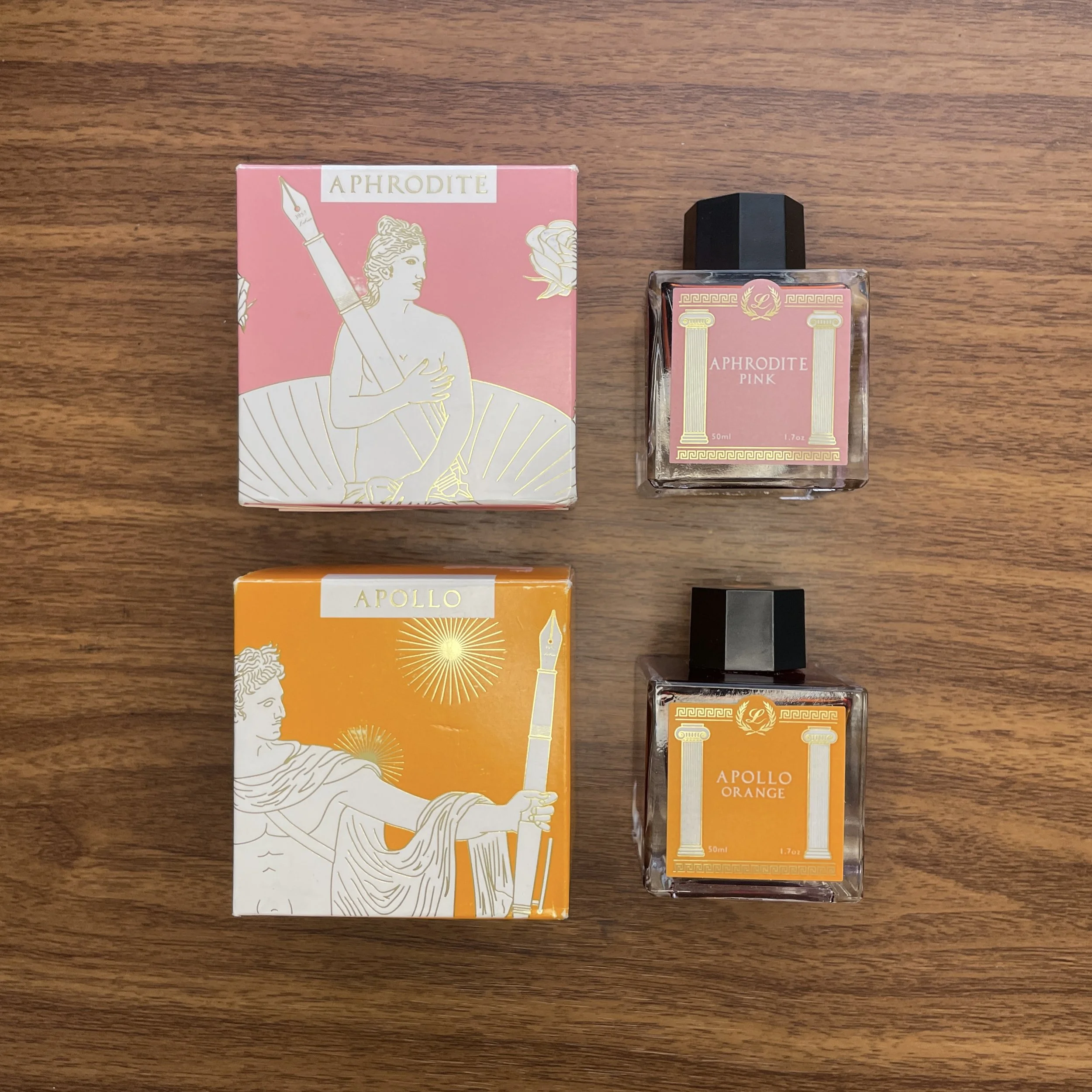
In the interest of building out a library of ink reviews similar to the current T.G.S. Fountain Pen Archive, I’m going to keep plowing ahead with my write-ups of the Laban “Greek Mythology” Ink Series. This week’s inks up for review are Apollo Orange and Aphrodite Pink. Apollo Orange is a solid mandarin orange ink that will see a lot of use as an annotator. Aphrodite Pink is a truly unique shade that’s difficult to describe and even harder to compare to anything else, but I love the muted tone for everyday use.

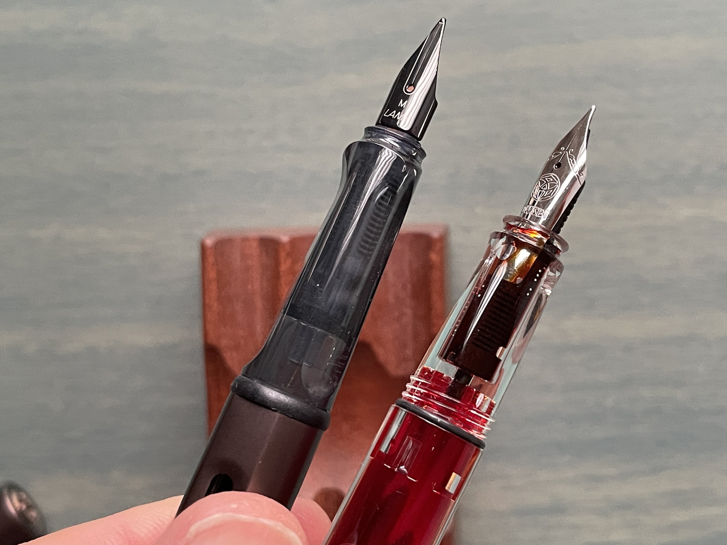
Aphrodite “Pink” and Apollo Orange, side-by-side.

This isn’t the first review of inks in this series (see below for links to the prior reviews), so I won’t spend too much time rehashing a history of Laban, but the company is based in Taiwan and has been a longstanding fixture at pen shows. I was somewhat surprised to see Laban launch this line of Greek Mythology-themed inks last year, and was pleased at the obvious level of effort that went into putting together not just excellent ink but an aesthetically pleasing product, packaging and all.

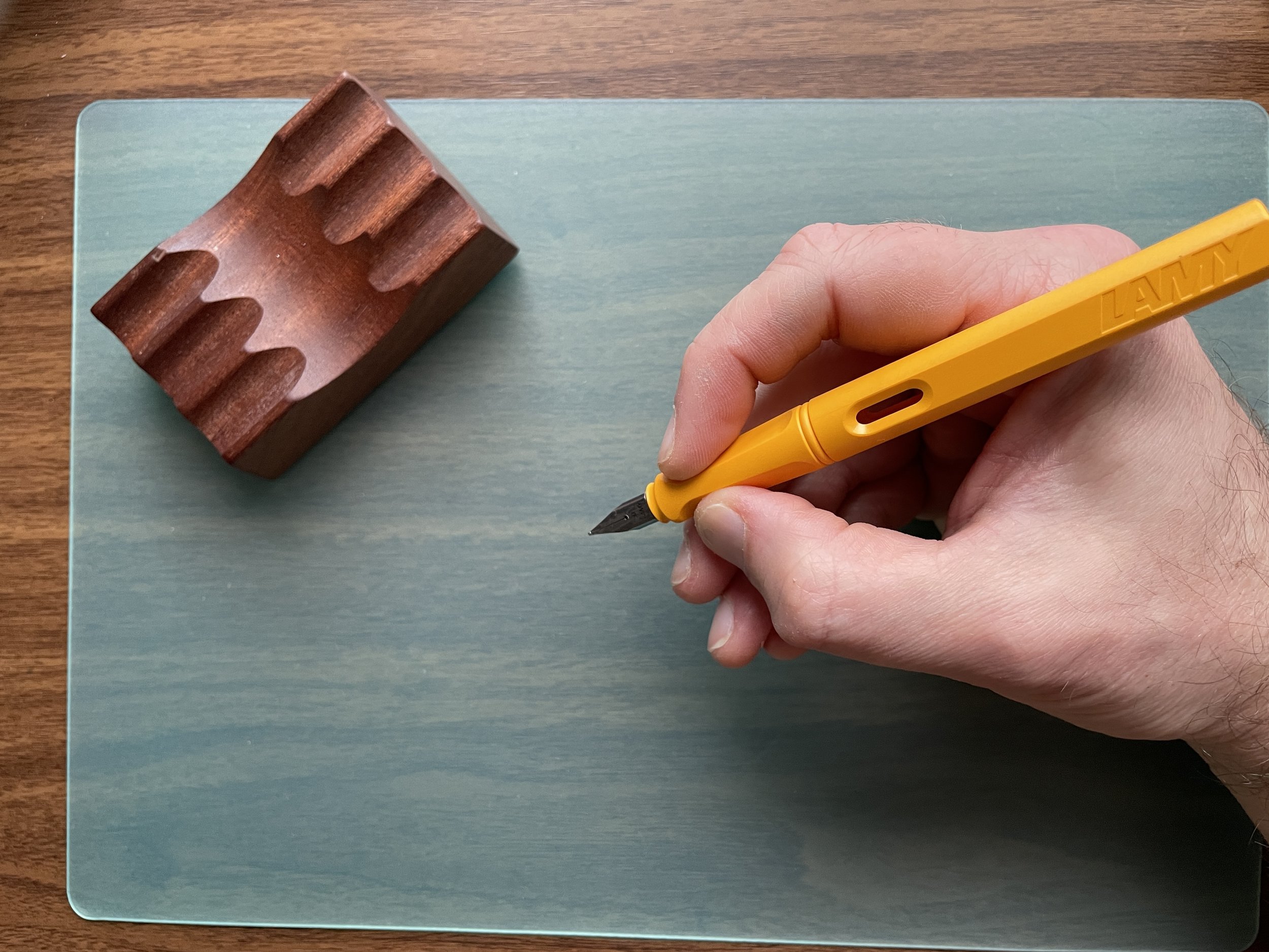
Apollo Orange with my current ink swatching tools. More on that below.

Apollo Orange Should Please Most Fans of Orange Inks

Apollo Orange is named for the Greek God Apollo, God of phrophesy, music, and healing (Roman equivalent: Phoebus), and the traditional association of Apollo with the Sun makes this pairing particularly appropriate! I would describe Apollo Orange as a classic “mandarin orange” with red tones when the ink is wet. Unlike many orange inks, Apollo Orange isn’t a particularly dry writer, so I’ve not had any issues with hard starts or nib crud. I’ve also found the ink cleans out of pens fairly easily, which is always a pleasant surprise with oranges.

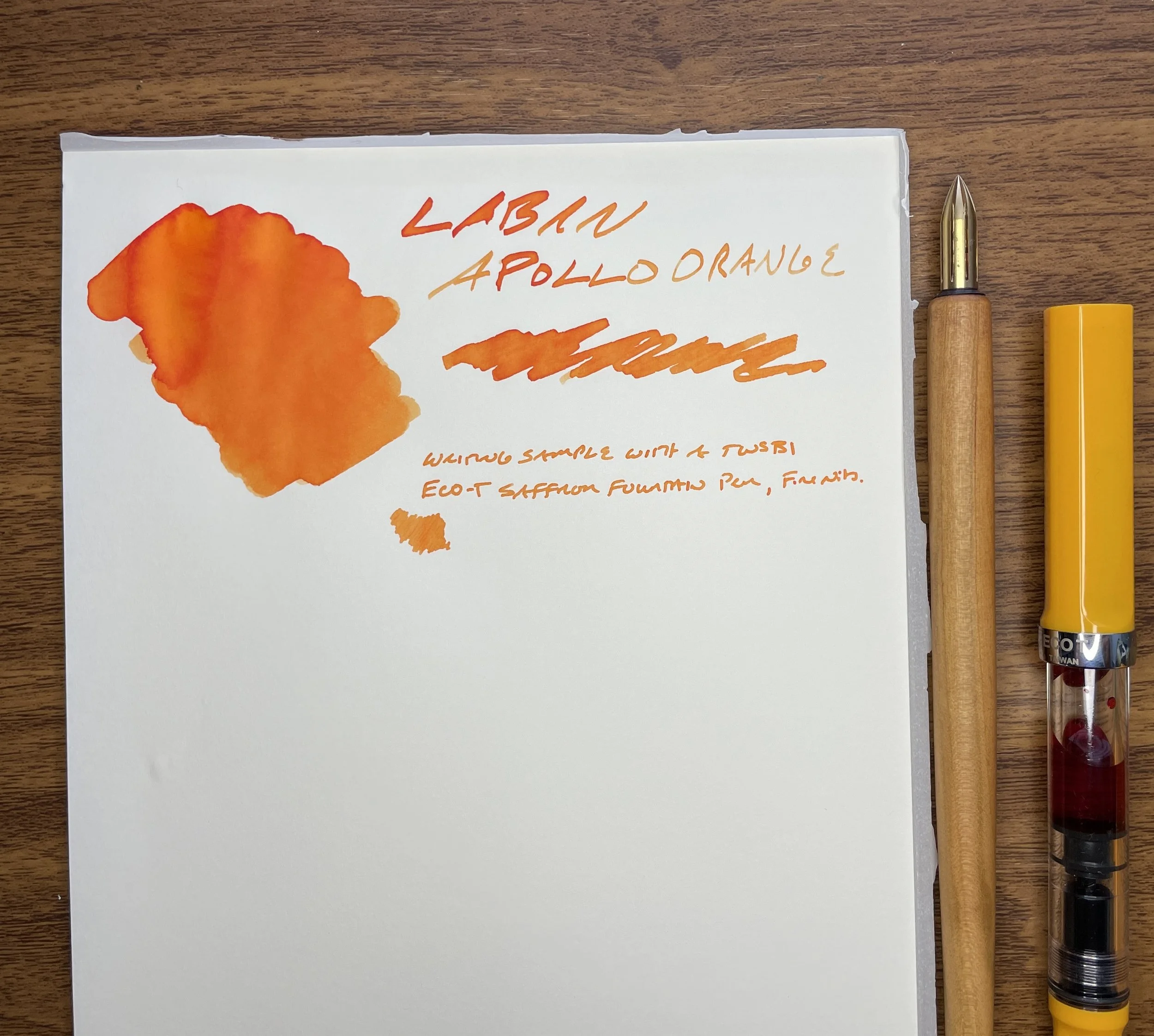
Apollo Orange is just different enough from the lighter Saffron TWSBI ECO-T fountain pen to make this pen and ink a perfect match.

Aphrodite Pink: The “Stunningly Weird” Ink From the Series, But Possibly the Best

Finally, this brings us to Aphrodite Pink, one of the most popular inks in the Laban Greek Mythology series and, in my opinion, probably the best simply because it’s so unusual. In fact, I would have to put Aphrodite Pink up there as one of my favorite discoveries over the past year, because there just aren’t that many “pink” inks in general, and certainly not many with this unique shade that falls well outside the typical “hot pink” or “electric pink” colors that companies try to release. Named for the Greek Goddess of love (Roman Equivalent: Venus), Aphrodite Pink is more of a dusty brick red with pink undertones than a true pink. At first, I thought it might be comparable to KWZ Brown Pink, but the latter has much more purple. At the end of the day it doesn’t matter - this ink simply makes for a great everyday writer that I’ve used fairly regularly over the past year, and it’s now in my Pilot Custom 823.

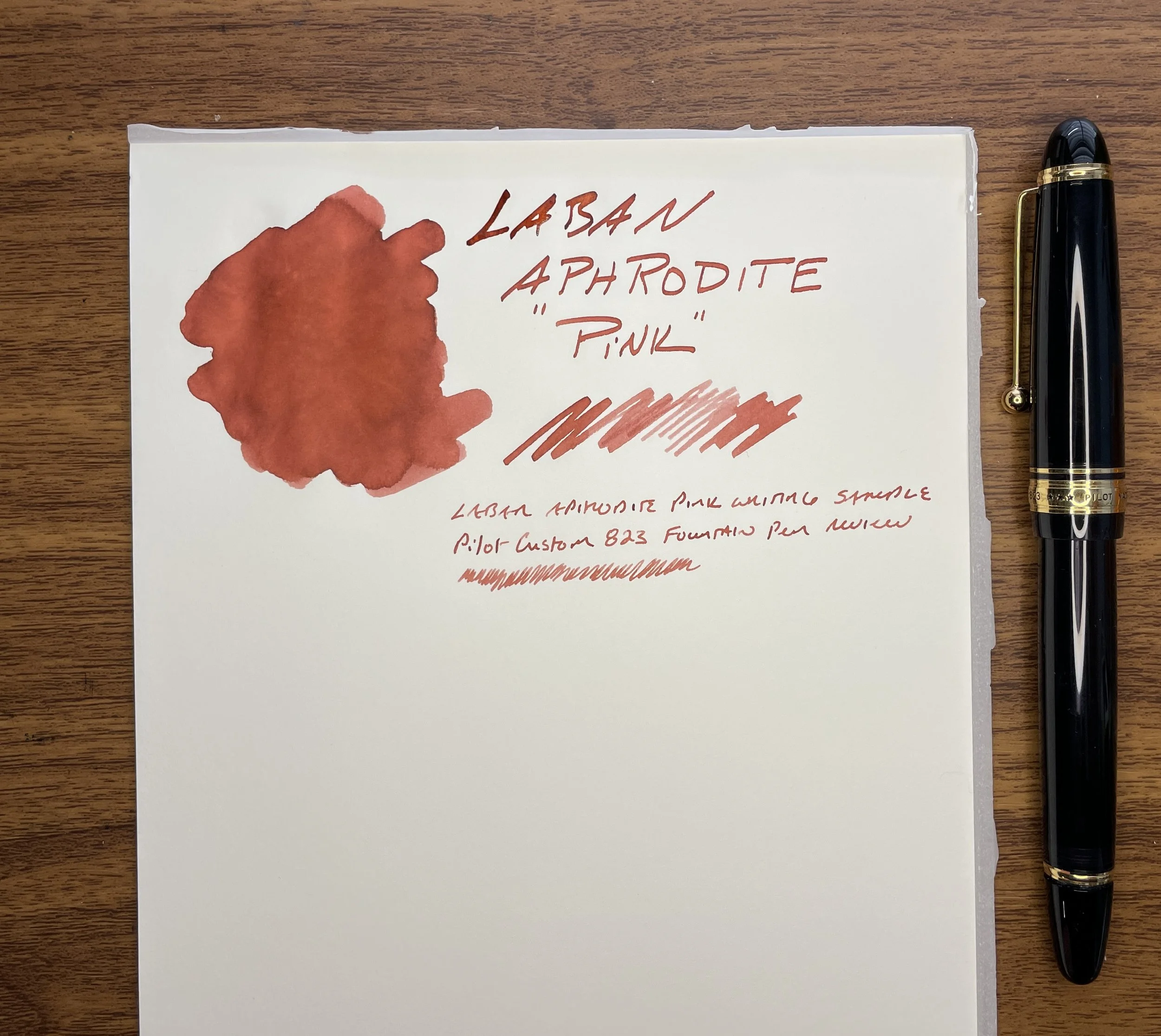
I love nontraditional, muted colors like this one. As with all of the Laban Greek Mythology inks that I’ve used, this one dries quickly and has no maintenance issues.

Takeaways, Where to Buy, and Reviews of the Rest of the Line

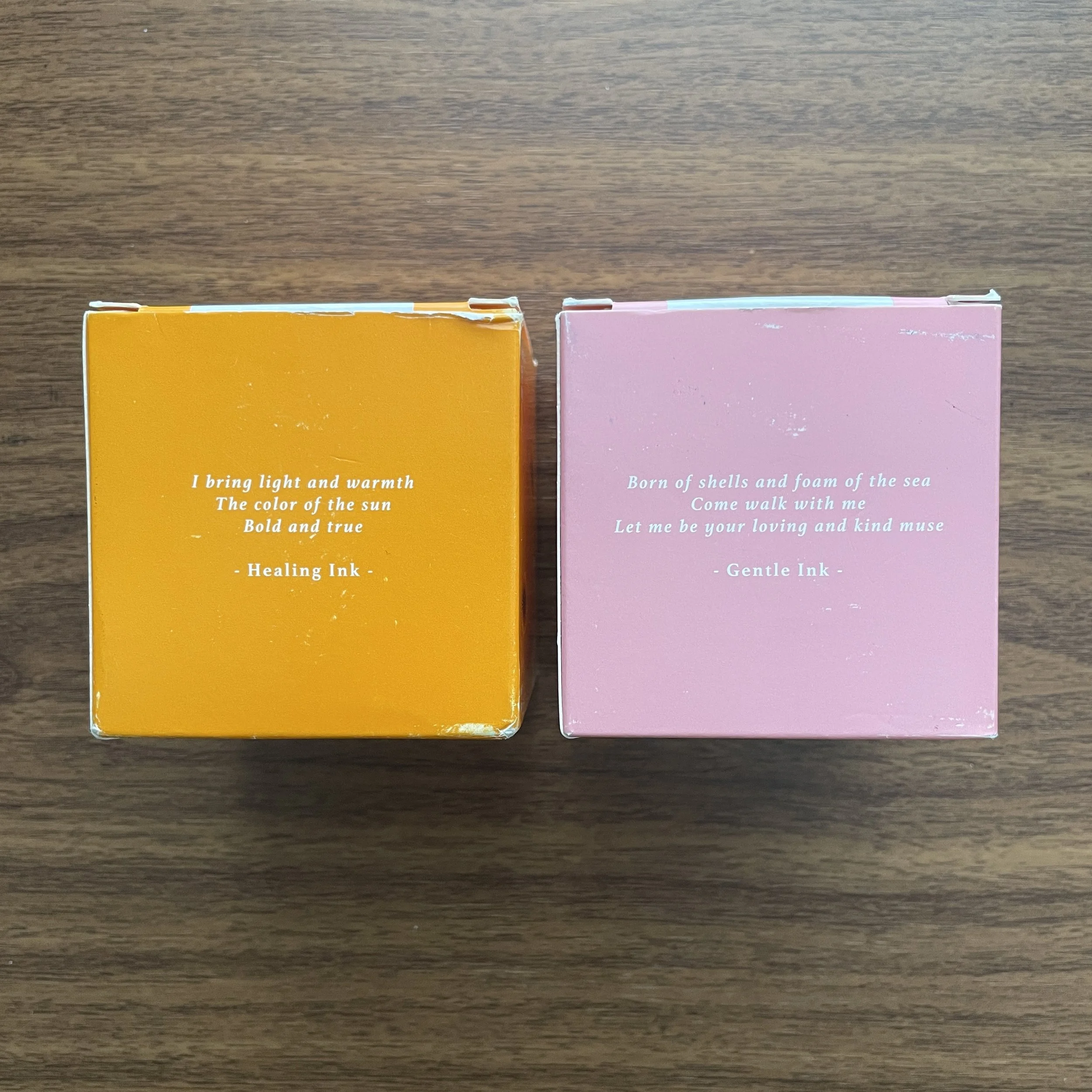
I’m currently five inks into my review of the Laban Greek Mythology Series, and I’ve not yet found one that I don’t enjoy. These inks all behave well, and I’ve personally experienced no issues with feathering, bleedthrough, staining, or slow dry times. You can check out my prior reviews of Ares Red, Artemis Navy Blue, and Athena Grey here. In fact, I enjoyed these inks so much that I purchased the entire line at last year’s Baltimore Pen Show for my personal collection, and recently brought them into our own shop. The T.G.S. Curated Shop stocks all colors with the exception of Aphrodite Pink (currently on backorder), and these Laban inks are priced at $25 per 50ml bottle. The packaging alone is a work of art, especially with the incorporation of fountain pens into the different depictions of the various gods and goddesses.

View fullsize Laban Greek Mythology Bottles
View fullsize Laban Greek Mythology Boxes

A Note on Swatching Inks and my “Organizational System”

Somebody recently asked me how I organize ink swatches (probably prompted by my Ink-o-Dex video), and what paper I use to photograph samples and organize my collection. The simple answer is that I really don’t have any sort of system. I’ve been doing this for a long time, and many different storage and sampling options have come and gone over the years.

Laban Aphrodite Pink on a Col-o-Ring Card. (Stamp courtesy of Angela at Inky Converters!)

Currently, I use a combination of Col-o-ring cards (stored in the repurposed Rol-o-dex), A5 planner paper, and a 68gsm Tomoe River notebook. Typically when I’m reviewing/archiving an ink I’ll use a q-tip and my Kakimori Brass Dip Pen to make a standard color sample on Col-o-Ring paper, which goes into the Col-o-dex. Blog posts nearly always feature ink swatches and writing samples on A5 sheets of Midori MD Cotton paper and 68gsm Tomoe River paper (while I can still get it), since these are the two papers I use the most. Lately, in addition to individual ink swatches, I’ve been creating comparison sheets so that I can easily view multiple colors from a single brand or line.

My ongoing ink comparison sheet for the Laban Greek Mythology Series

The Gentleman Stationer is supported entirely by purchases from the T.G.S. Curated Shop and pledges via the T.G.S. Patreon Program. The Gentleman Stationer is an authorized retailer of certain brands, including the Laban inks shown here. This post otherwise does not contain paid advertising or affiliate links.

In Ink Reviews Tags Laban, Laban Inks, Laban Greek Mythology, Ink Review
Comment

Thursday Drops: New Lochby Colors, Unique Highlighters, and More!

March 2, 2023

If you didn’t see our announcement from Instagram last night, Lochby has launched two of our favorite cases - the Quattro four-pen case and Pocket Journal - in new colors: Charcoal and Navy. Now you can build out a complete set of all the Lochby accessories in matching colors, if you so desire! I’ll be bringing a selection of what I still have available to the Baltimore Pen Show next week, and to the Arkansas Pen Show the week after that, so if you would like to reserve one of these cases for show (or Nashville-area local) pickup please place an order using the coupon code “615PICKUP” at checkout. (Note: This is NOT a “free shipping” code. After this code is used, we will reach out to verify where you intend to pick up your order.)

Kokuyo Beetle-Tip Highlighters are in-stock!

While we plan to have a table in both Baltimore and Little Rock, we will be constrained by space and plan to focus on cases, notebook systems, and a selection of pens, pencils, and office accessories. If there’s something specific you would like delivered to the show, please be sure to get your orders in by this weekend, and in the case of a larger/fragile item like a Sandglass or multiple notebooks/pads of paper, please reach out first to make sure delivery is feasible since I will be flying. I hope to see as many of you as possible next week!

The Gentleman Stationer is an authorized retailer of all brands sold.

  1. Lochby Quattro Four-Pen Case. Originally launched only in classic brown with the yellow honeycomb lining, the Lochby Quattro - our top selling pen case - is now available in navy blue and charcoal!

  2. Lochby Pocket Journal. Like the Quattro, the Pocket Journal now also comes in navy and charcoal colors, and we’ve restocked on the 68gsm Tomoe River Lochby Pocket Journal refills.

  3. Midori Kurashiki Pen Cases. While we’re on the subject of canvas pen cases that will age beautifully, we have received a fresh shipment of these cases, in both a flat pouch and gussetted design. These canvas cases even include a small interior pocket to hold a pencil sharpener.

  4. Lochby Field Journal. Based on the level of interest that we received at the D.C. Pen Show, I expect the Lochby Field Journal to be a big seller in both Baltimore and Arkansas, so we restocked on all colors. We also have a variety of A5 refills that are compatible with this cover, which can hold up to 6 of the Lochby-branded or similarly sized softcover notebooks.

  5. Midori MD Light Notebooks. These slimmer, softcover versions of the Midori MD A5 notebook will fit the Lochby cover, and come available in grid, blank, and lined versions. Other sizes are available as well.

  6. Midori Soft Color Notebooks. A recent discovery, these notebooks feature fountain pen-friendly blue, green, purple, or grey dot grid paper. The blue and grey refills have been living in my own Lochby.

  7. Clairefontaine Classic 1951 Staplebound A5. A slimmer version of the clothbound 1951 notebooks that are so popular. Read more about why we love Clairefontaine paper here.

  8. Kokuyo Dual-Tone Highlighter Markers. These unique highlighter pens feature a dual tip, each with its own ink supply in a different shade. This way, you can differentiate between topics, levels of importance, etc. by using the darker (or lighter) color to add emphasis.

  9. Kokuyo “Beetle-Tip” Highlighter Markers. Sold in sets of five, these particular highlighters from Kokuyo allow you to easily change the width of your line, with either a classic standard highlighter line, a double line, or a thin line that can be used to make notes. Check out the pictures in the listing for more details.

  10. Caran d’Ache Graphicolor Graphite/Yellow Bicolor Pencils. These two-in-one highlighter/annotator pencils are fixtures in the various pen/pencil cups I have scattered around my home and office. Sold individually or by the dozen.

In TGS Curated Shop Tags Lochby, Lochby Quattro, Lochby Pocket Journal, Thursday Drops
Comment

"Boring" Can Be Better: In Defense of Standard Stationery

March 1, 2023

Sometimes what’s fun from a hobby perspective isn’t always what’s best for everyday use. That multichromatic triple-shading ink with shimmer? Probably not the best choice for quick meeting notes or signing closing paperwork on your mortgage. That triple-broad double-eagle reversible stub architect nib? That’s gonna bleed through a legal pad. While most of us enjoy our crazy stationery, it can’t take us everywhere.

The most common questions I get, both here on the blog and in-person when I’m behind a table at a pen show, concern what pen/ink/paper I can use everyday, without worrying how it’s going to perform. I often recommend that those planning on using their pens for everyday writing keep at least a couple of “workhorses,” or pens designed to write, without regard to unique design, collectibility, etc. I feel so strongly about this that I’ve devoted an entire series of articles on the blog to this topic, which I’ve compiled into an archive that’s constantly being updated.

So-called “safe”- dare I say “boring” - inks don’t have to be ugly, especially if you like muted shades. It’s when you get into super-saturated colors and special properties when things get tricky.

But while pens get the most attention, more critical components of “everyday writing” are ink and paper. With fountain pens, I would say that ink is the key variable, since you often cannot control the paper you’re forced to use in a context such as the office. You therefore need to have a handful of “workhorse” inks in addition to your “workhorse” pens, that you can use knowing that they will likely perform decently on most paper options. Back in 2020, I even put together a sample pack of some of my favorite inks, including Waterman Blue, Sheaffer Skrip Red, and Lamy Black. While I may consider running that one back in the future, I’m not sure that recommending specific inks is all that helpful or necessary. For the most part, standard inks made by major pen company such as Waterman, Lamy, Sheaffer, Pilot, TWSBI, etc. will generally be “safe” to use in most pens and on most papers, and even boutique lines such as J. Herbin and Diamine - both made by ink companies that have existed for a very long time - are extremely reliable provided you stick to the water-based core lineup for your office writing, as opposed to inks with special properties such as shimmer that can be unpredictable on anything other than high-quality paper.

“Boring” is relative. I’d consider all three of the inks pictured here to be “safe” inks in the sense that they water-based inks from longstanding, well-regarded brands. The Herbin “Vert de Gris” is a new discovery that I spent all day yesterday using at the office.

Advantages and Considerations When Using So-Called “Boring” Inks

So why don’t quality, reliable inks get more attention? Honestly, the fountain pen internet and social media tends to be driven in large part by people who either don’t actually write with their pens everyday, or use their inks for art and journaling where practical considerations are less relevant. When those creating the content consider the inks “boring,” they don’t get promoted and fall by the wayside. But I’m here to tell you that sometimes “boring” has a lot to offer! Consider:

  • Ease of Cleaning. While some exceptions exist (pinks and purples in particular tend to be hard to clean no matter what), I value inks that flush out of pens quickly when you refill or change colors. Most of the brands I mentioned above take little to no effort to flush, and shouldn’t stain most materials, vintage or modern.

  • Expense. Looking for an ink that you’re going to use a lot? While ink isn’t the most expensive part of this hobby, if you write through several converters a week like I can when I’m really busy, you probably don’t want to be stocking up on ink at $50 per bottle. Most of the inks I consider workhorses are less than $20 for 30-50ml.

  • Permanence. People tend to treat “permanence” (more specifically, the lack thereof) as a negative rather than a positive when it comes to fountain pen ink, but I’ve come to believe it’s overrated. While it’s nice to have some water resistance, I can count on one hand the number of times I’ve spilled water or a drink on some notes, and completely lost what I had written. On the other hand, I’ve frequently spilled ink when filling pens, when a pen leaks during travel, or when I accidentally drag a shirtsleeve across some writing that’s not quite dry. If it’s permanent ink, it’s probably going to stain. On the other hand, a few weeks ago I spilled a sample vial of Iroshizuku Tsukushi onto the rug in my office. I ran the rug through the washing machine and the ink washed out completely on the first try. On the other hand, I spilled a bottle of permanent blue-black on some carpet several years back and had to recarpet the room. Personally, I’ll take the safe/impermanent/washable option for those inks I plan to use everyday, but I’m also a klutz.

Oops.

Now here’s the part where I sort of contradict myself: When I first entered this hobby, it used to be a reliable rule-of-thumb that if you were looking for a “safe” ink (i.e., to use in a finicky, valuable, or vintage pen) any ink made by a “pen company” was generally suitable. Today, I still get e-mails from people asking whether “X” shimmer ink is safe for vintage pens, since it’s made by “X” pen company. Having seen the rapidly expanding market for fountain pen ink, including inks that shimmer, sheen, and multi-shade, pen companies are expanding into these more specialized offerings. So while you can take the “pen company manufacturer rule” into account, it’s no longer something you can solely rely upon, and you have to do some homework. I generally advise people that if you want to purchase a particular ink for use everyday, and you want the ink to be versatile enough to use in as many different pens, on as many different papers as possible, it’s wise to avoid inks with special properties.

Come Visit Us At an upcoming pen show!

As I mentioned above, I’m getting ready to visit this year’s Baltimore Washington International Pen Show, as well as the Arkansas Pen Show the following week, and at both shows I’ll be conducting a free workshop tentatively titled “Stationery for Daily Use with the Gentleman Stationer,” in which I plan to discuss pens, inks, paper, and notebook systems appropriate for managing your daily life and work. The class will be similar to the “Everyday Writers: Choosing the Best Pens for Home and Office” seminar that I held at the last Baltimore Show I attended as a vendor, back in 2020.

We will also plan to bring a curated selection of pens, inks, and notebooks with us to both shows, so you’ll have the opportunity to test out many of the goods in our shop in person. We hope to see you there!

The Gentleman Stationer is supported entirely by purchases from the T.G.S. Curated Shop and pledges via the T.G.S. Patreon Program, and is an authorized retailer of all brands sold, including certain ink brands mentioned in this article.

In Editorial, Ink Reviews, Workhorse Pens Series Tags Workhorse Inks, Fountain Pen Inks, Inks, Editorial
2 Comments

Classic Products are Classics for a Reason: Clairefontaine and J. Herbin

February 28, 2023

While we enjoy exploring new releases, limited editions, Kickstarters, and other experimental offerings, our main interest has always been the so-called tried-and-true “workhorses” of the stationery world. Think the type of products that just work whenever you need them, without having to think much about it. Often, the companies themselves have been around for hundreds of years.

Clairefontaine Paper: An Inexpensive, Rock-Solid Choice for Everyday Writing

Clairefontaine paper is what got me interested in fine writing in the first place, as a student in France, experiencing something other than cheap American student-grade writing paper for the first time. Clairefontaine paper handles pretty much any fountain pen ink available without feathering or bleed-through, and is available in multiple formats, ranging from the classic spiral bound notebooks to the “Triomphe” series of writing tablets to the composition-style “1951” series, now available in both cloth and staplebound versions. Sibling company Quo Vadis uses Clairefontaine paper in the dot grid version of their “Habana” journal, a product that in my opinion is grossly underappreciated by the broader community. If you haven’t yet used Clairefontaine paper, you owe it to yourself to at least give it a try! Our shop stocks much of the Clairefontaine lineup, in addition to Quo Vadis Habana and a selection of Rhodia.

J. Herbin Inks: Safe, Inexpensive Fountain Pen Ink Available in a Wide Array of Colors

Today’s fountain pen ink market is arguably oversaturated (pun intended) with so many brands and colors that it’s easy to get lost, not to mention caught up in testing and trying all the various shades and formulations in an effort to find that “perfect” ink that doesn’t really exist. I’ve always enjoyed the inks made by Herbin and Waterman because these inks tend to just work. They don’t clog, dry relatively quickly, are easy to clean, and available in interesting colors (both bright and muted). We’ve decided to stock the standard J. Herbin inks in both the 30ml bottle size as well as the 10ml “sample” size, to make it convenient for you to test as many different colors as you want without running into storage issues or accumulating ink you’ll never use. Our initial selection features personal favorites from the line, with more on the way!

Please visit the shop to view our full selection of pens, inks, paper, and assorted fine writing and desk accessories! The T.G.S. Curated Shop is an authorized retailer of all brands sold.

In TGS Curated Shop Tags T.G.S. Curated Shop, Herbin, J. Herbin
Comment

Triangular Grip Pens: Love 'em or Leave 'em?

February 25, 2023

In the world of pens, there are a handful of highly polarizing products, and I’d place “molded grip” or “triangular grip” pens in the top five. The most well-known, of course, is the iconic Lamy Safari, with the Lamy AL-Star, TWSBI ECO-T, Kaweco Perkeo and others falling into this category. So why do pen companies opt for this type of design? How big of a “real world” issue is it? And how has it affected my own ability to use these pens?

The Lamy Safari’s grip gives rise to strong opinions.

Triangular Grip Pens: Origins and Purpose

Before they went hipster mainstream (j/k), pens like the Lamy Safari were intended for students - particularly students learning to write with a fountain pen for the first time. Most molded grip sections are shaped similarly to those slide-on pencil grips that teachers in the 1980s would force on those of us who refused to hold our pencils “correctly,” in order to guide our hands into the “proper” position. These days, Lamy markets the Safari/AL-Star pens to a market beyond students, billing the section as an “[e]rgonomically shaped grip area to enable writing for long periods of time without tiring,” but as with most things ergonomic, these pens don’t work for everyone. While I’ve not done any sort of survey, anecdotally, lefties tend to have more issues with the grip, since they’re designed with the right-handed majority in mind. And even those righties with nontraditional finger placement can have a difficult time with a shaped section.

The Lamy AL-Star grip section, left, vs. the TWSBI ECO-T. The AL-Star features a grip similar to the Safari, but due to the difference in materials doesn’t feel quite as sharp, at least to me. The TWSBI ECO-T has a subtly triangular shape that I don’t really notice much at all, though it is there.

My Own Personal Handwriting Struggles and Preferences

I have a history of handwriting struggles. Until I entered college, I used what could charitably be described as an “unusual” pencil grip. Nobody could understand how it worked, how I learned it, and why I continued to write that way. Despite the fact that I was generally a good student, with visually excellent script, I regularly received a “C” or “D” in “handwriting” on my report card, solely due to how I held my pencil. I had one elementary school teacher dub my grip “The Claw”, and made it their personal mission in life to change it. They failed.

I had another teacher in high school “jokingly” offer to break my right hand so that I could relearn how to write as a lefty. (I went to an all-boys high school. It was a different time.) Honestly, I’m really not sure how I ever wrote like this, much less for hours at a time. I certainly would never have been able to use a fountain pen like this.

At some point The Claw became a matter of personal pride, not to mention practicality. If you grip your pen or pencil a certain way for years, you reach a point in high school where you can’t change it because to do so would sacrifice speed. (To add some context, I graduated from high school in 1998, which dates me but it’s necessary here. I was probably one of the last classes where e-mail and internet access was available to us, but not required, and all of our examinations and most of our homework, including research papers, had to be handwritten as opposed to typed. Handwriting speed was therefore a factor. I understand that this changed at my school a couple of years after I graduated.) It wasn’t until late college/early law school, when I started transcribing most of my lecture notes on a laptop, that I was able to change my grip because I had the luxury of slowing down.

How I hold a pencil today.

So why did I change? RSI issues in my hand and wrist, as well as a semi-deformed right ring finger that had a huge, painful callous that only completely disappeared three or four years ago - nearly 20 years after I changed my handwriting style. While my current grip isn’t “textbook,” it’s closer to what’s contemplated by most molded-grip pens, and if I’m honest, probably could have saved me a lot of trouble over the long-term if I hadn’t been so stubborn.

My new grip works fairly well with the Safari and most other molded-grip pens.

How to Use a Triangular or Molded-Grip Pen

Unfortunately, the truth is that unless you’re willing to change your grip, these pens either work for you or they don’t. Some pens, like the TWSBI ECO-T and the Kaweco Perkeo, feature a “softer” triangular grip that’s much more forgiving. The sharper edges of the Safari and AL-Star tend to cause more problems for people. While the Lamy pens aren’t a perfect fit, and for this reason have never become “favorite” everyday writers, they’re not incompatible with my current grip because I can rest my index finger on the top ridge, similar to how I’m able to rest my finger atop the clip of a Pilot Vanishing Point and Decimo. The good thing is that these pens are relatively inexpensive to test out, coming in at $35 or less. If you’re considering a more expensive pen like one of the retractable nib Pilot pens, I’ve found that how one’s hand holds the Safari approximates how you would have to grip a Vanishing Point or Decimo, so if you can’t get to a pen show and try one of these in person, picking up a less expensive pen with a triangular grip might save you from a more costly mistake.

A shot of the TWSBI ECO-T (right) vs. the standard TWSBI ECO (left). You can barely make out a ridge (more like a ripple) on the ECO-T, which shows you how subtle the shape is. Honestly, I might prefer the ECO-T to the ECO, but again that’s personal preference.

I’m interested in hearing: How many of you can’t use these types of pens at all? Also, I rarely hear from anyone who purchases a pen with a shaped grip specifically for that section, but does anyone particularly enjoy this feature? Personally, I’ve really been enjoying the the ECO-T, which has a much more subtle grip shape, and I have plans to get my hands on another Kaweco Perkeo soon.

The Gentleman Stationer is supported entirely by purchases from the T.G.S. Curated Shop, and pledges via the T.G.S. Patreon Program. While this post does not contain third-party affiliate links or paid advertising, the Gentleman Stationer is an authorized retailer of certain brands discussed in this article. Please view the shop for the full range of brands sold, which is subject to change.

In Editorial, Pens Tags Lamy Safari, Triangular Grip Pens, Handwriting
14 Comments
← Newer Posts Older Posts →
Store Hours and Location
Visit the T.G.S. Curated SHOP
Updated 2026 "Best Pens" Guide
No results found
On the Paper Trail Podcast
TGS_25 Roterfaden New Stock Available
Hierarchies of Fountain Pen Friendly Paper

Join Our Patreon!
Subscribe to the TGS E-mail List

Featured Posts

Featured
Five-Foundational-Fountain-Pens.jpeg
Apr 22, 2026
T.G.S. 12th Anniversary: 5 Fountain Pens Everyone Should Experience
Apr 22, 2026
Apr 22, 2026
Pilot-Custom-Series-Pens-overview.jpg
Mar 14, 2026
The Pilot "Custom" Series: An Overview of Some of My Favorite Fountain Pens
Mar 14, 2026
Mar 14, 2026
Pentel-Sign-Pen-Cover.JPG
Feb 28, 2026
Pen Review: The Pentel Sign Pen (Craft Design Technology Version)
Feb 28, 2026
Feb 28, 2026
The Gentleman Stationer RSS

View Cart

© Digital Divide Media, LLC, 2014-present.

All content is the exclusive property of Digital Divide Media, LLC, d/b/a The Gentleman Stationer, including “The Gentleman Stationer” website and trademark, and should not be reproduced without express written permission.  All rights reserved.

All content containing paid advertising, affiliate links, or sponsored content will be plainly disclosed by a disclaimer when/if featured.

Contact Information

Store Shipping Policy and Return Policy

Privacy Policy

Cookie Policy

Terms and Conditions

Powered by Squarespace