• Blog
  • Shop
  • Resources
  • FAQ (Ask TGS)
  • About
  • Archive
  • Contact
  • Sign In My Account
Menu

The Gentleman Stationer

Vintage Living in the Modern World.
  • Blog
  • Shop
  • Resources
  • FAQ (Ask TGS)
  • About
  • Archive
  • Contact
  • Sign In My Account

Introducing the New and Improved T.G.S. Review Archive

September 25, 2021

One thing that has frustrated me beyond compare is the inability of readers (and myself) to easily search the eight years’ worth of T.G.S. review content. I finally couldn’t take it anymore, and for the past month I’ve been working on building an organized archive of past T.G.S. pen reviews. I’m happy to let you know that the new archive is now available to search, and I plan to do the same with non-fountain pens, inks, and paper in the future.

I have organized this review archive by brand, albeit with most small-batch and artisan makers grouped into their own section, which sits at the top of the page. My recommendation is that you go there first, as that’s where the most exciting stuff is happening these days. Enjoy!

You may notice that some brands are missing from this list. That is either because I have not yet reviewed pens made by the brand in question, or I haven’t yet located the past content. The archive is, and will forever remain, a work in progress as I don’t aim to stop reviewing anytime soon!
In Editorial Tags Editorial, Content Archive
1 Comment

Today’s review pens: a Scriptorium Balladeer and Schon DSGN Ultem Fountain Pen.

Spotlight On: The Nib Tailor, Featuring Architect + Inverted Architect Nib Grinds

September 18, 2021

I’ve known J.C. Ament for years, from way back when he was attending shows as an enthusiast, to when he started dabbling in nib work under his previous brand, Nibs on Point. I wanted to take a moment today to let everyone know about his latest endeavor, in which he’s embarked on nib work full time as “The Nib Tailor.” Before he took a break from pen shows, J.C. sent me two examples of his work for review: a broad “standard” Architect nib that has since lived in my Scriptorium Balladeer, and what J.C. calls an “Inverted Architect,” a nib that I’ve swapped between a bunch of different pens but which now lives in my Schon DSGN Ultem.

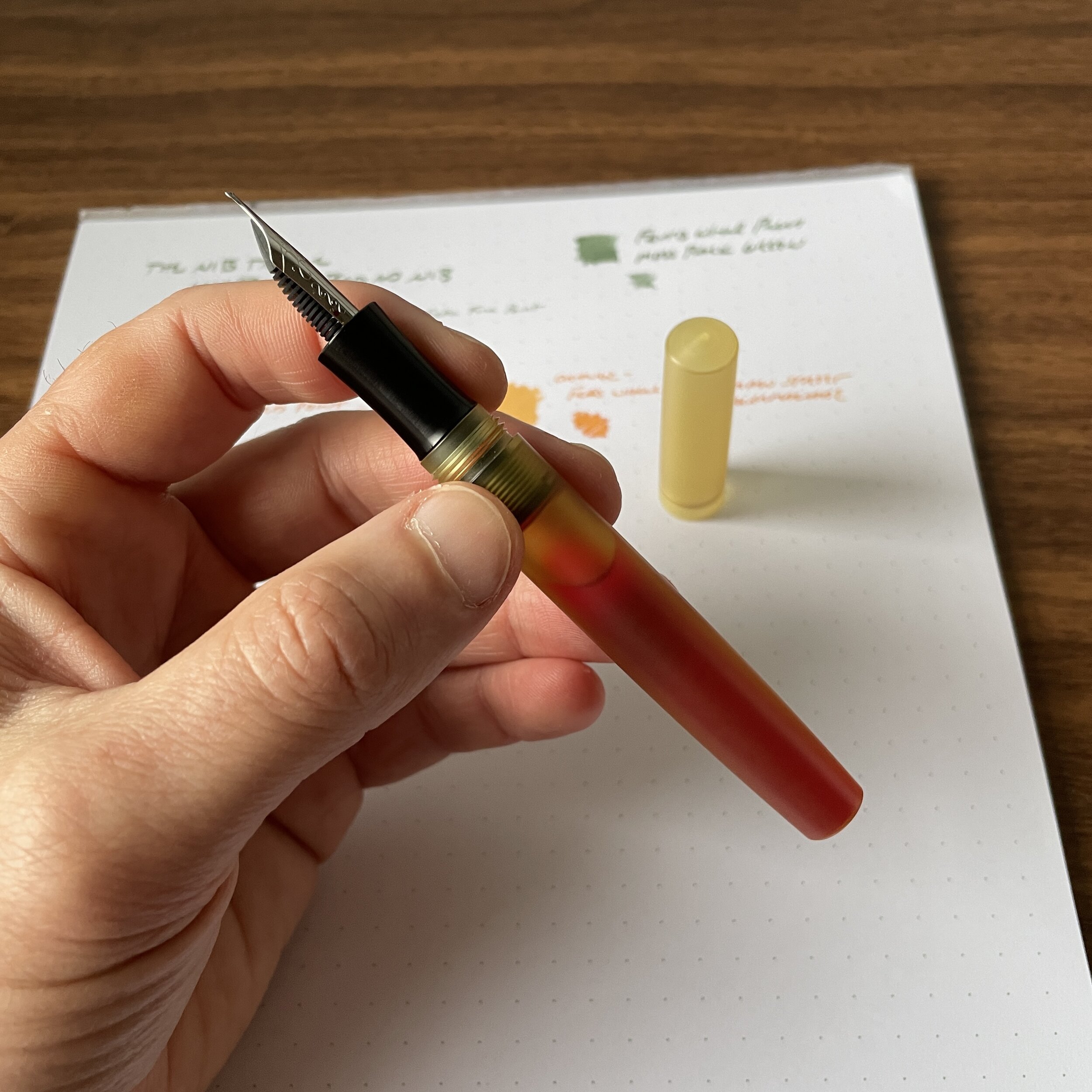
Before we get started looking at nib grinds, check out this eyedroppered Schon DSGN Ultem fountain pen, which is shown here holding a full 4ml ink sample!

Before we get started looking at nib grinds, check out this eyedroppered Schon DSGN Ultem fountain pen, which is shown here holding a full 4ml ink sample!

Standard Architect Nib vs. Inverted Architect Nib

For newer readers, or those unfamiliar with specialty nib terminology, an Architect nib (also sometimes referred to as a “Hebrew Italic”) is the reverse of your classic stub or italic-style nib in that an Architect has broad cross-strokes and narrow downstrokes. If the grinder is skilled, you can usually use the reverse side as a needlepoint, or ultra-extra fine, nib.

Architect’s Nib Grind, with the signature blade-like shape. Turn the nib over and write with the tip for an extra-fine line.

Architect’s Nib Grind, with the signature blade-like shape. Turn the nib over and write with the tip for an extra-fine line.

An “Inverted Architect” is, well, the inverse: it’s basically a needlepoint/extra-fine nib with an Architect grind on the top, which you can use if you invert the pen. For my particular writing style and use case, the Inverted Architect serves a unique purpose: annotation and highlighting. I can use the extra-fine tip to take notes in the margins of documents, and the Architect side for highlighting/underlining, provided I select an appropriate ink color such as a bright orange or green.

“Inverted Architect” Nib Grind, with the needlepoint tip and “flat top.”

Writing samples for both a standard Architect nib (top, in Ferris Wheel Press Moss Park Green), and an Inverted Architect (bottom, in Ferris Wheel Press Main St. Marmalade), both inks courtesy of Vanness Pens.

A Word of Caution: If you’re new to fountain pens, or have never used an Architect nib, I would strongly advise you to consider borrowing one from a pen friend or visit a pen show prior to ordering this particular grind. Architect grinds can be a bit temperamental, in the sense that they can go from smooth to scratchy very quickly depending on the angle at which you hold your pen (and they’re not “butter smooth” writers to begin with, since you’re essentially making cross-strokes with a blade). It’s extremely important that the nib grinder understands your writing angle, so if you cannot visit in person, I would send multiple photos of how you hold the pen and the angle at which the nib hits the paper. That said, if you do decide that an Architect nib is for you, this grind gives your writing truly unique character. For those interested in reading further, I’ve previously written posts about various options for nib customization.

View fullsize Ferris Wheel Press Main St. Marmalade
View fullsize Ferris Wheel Press Moss Park Green

The Nib Tailor - Available Grinds and Pricing

The two nibs shown here are just a small selection of what The Nib Tailor has to offer. You can choose from pretty much any custom nib grind, and J.C. has a detailed form for you to complete alongside your inquiry. In addition to custom work (i.e., where you send in your pen), you can purchase pre-ground nibs in various styles depending on availability. Visit the Nib Tailor website for additional details. Pricing is standard, running from $25 for a simple tuning to $55-60 for more complex grinds. In addition to mail-in work and pen shows, J.C. occasionally grinds nibs in-store at Bertram’s Inkwell, and I believe he will be there this weekend. Check out his Instagram for details.

Disclaimer: This is NOT a paid advertisement. That said, I can’t recall whether J.C. gave me these nibs for free, or whether I paid for them. Either way, he’s a friend of mine but I still think he does good work. Given the increased demand for nib work, especially at pen shows, it’s great to see new faces entering the market. It keeps nib work accessible, and ensures that future generations will have the same opportunity to enjoy customized writing experiences!

In Editorial, Unusual Stationery, Pens Tags The Nib Tailor, Architect Nibs, Inverted Architect Nib, Nib grinding, Custom Nibs, Custom Grinds
1 Comment

Vintage Pen Primer, Part V: What About Just Opting for a Vintage Nib?

September 8, 2021

Many pen enthusiasts love the styling of vintage pens, enjoy tinkering with their unique (and sometimes temperamental) filling systems, and look forward to the routine maintenance and occasional repair as part of a vintage pen’s charm. Others focus on the nibs, preferring the performance and feel of vintage 14k and 18k nibs that often write (much) better than their modern equivalents, sometimes at a lower price point. If, like me, you fall into the latter group, there’s an option that doesn’t get as much attention as it should: using vintage nibs in a modern pen body, which allows you to avoid certain inconveniences of vintage while enjoying the unique writing experience.

Custom pens from my collection. On the left are the two Peyton Street Pens customs with vintage nibs that I picked up at this year’s San Francisco Pen Show (discussed further shown below). On the far right is a Newton Shinobi; Second from right is a Scriptorium Balladeer with a custom Architect nib from The Nib Tailor.

There are a couple of different ways you can go about using vintage fountain pen nibs in a modern pen. A few years back, my friend Leigh Reyes, who regularly scouts pen shows for loose vintage nibs, wrote an excellent article on fitting vintage nibs into modern pens such as Kaweco Sports and Franklin-Christoph Model 45s. This approach takes some leg work, as you have to pay close attention to things like stress and wear on the nib over time if the modern housing, feed, and/or section aren’t a perfect fit for the nib. (Please read the article and do as much research as you can before you try this - as Leigh points out, it’s possible to damage both your pen and your nib if you’re not careful.)

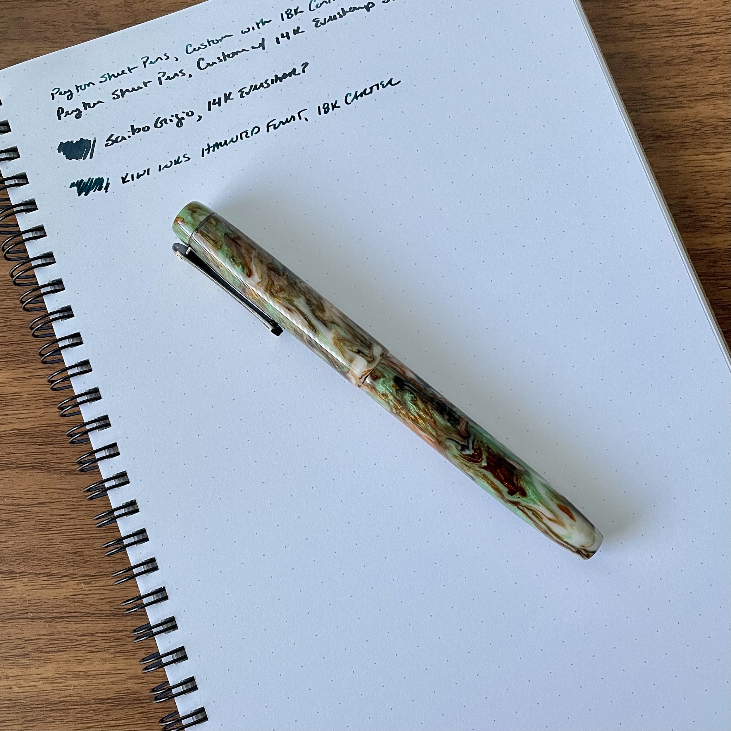
View fullsize Peyton Street Pens Custom
Peyton Street Pens Custom
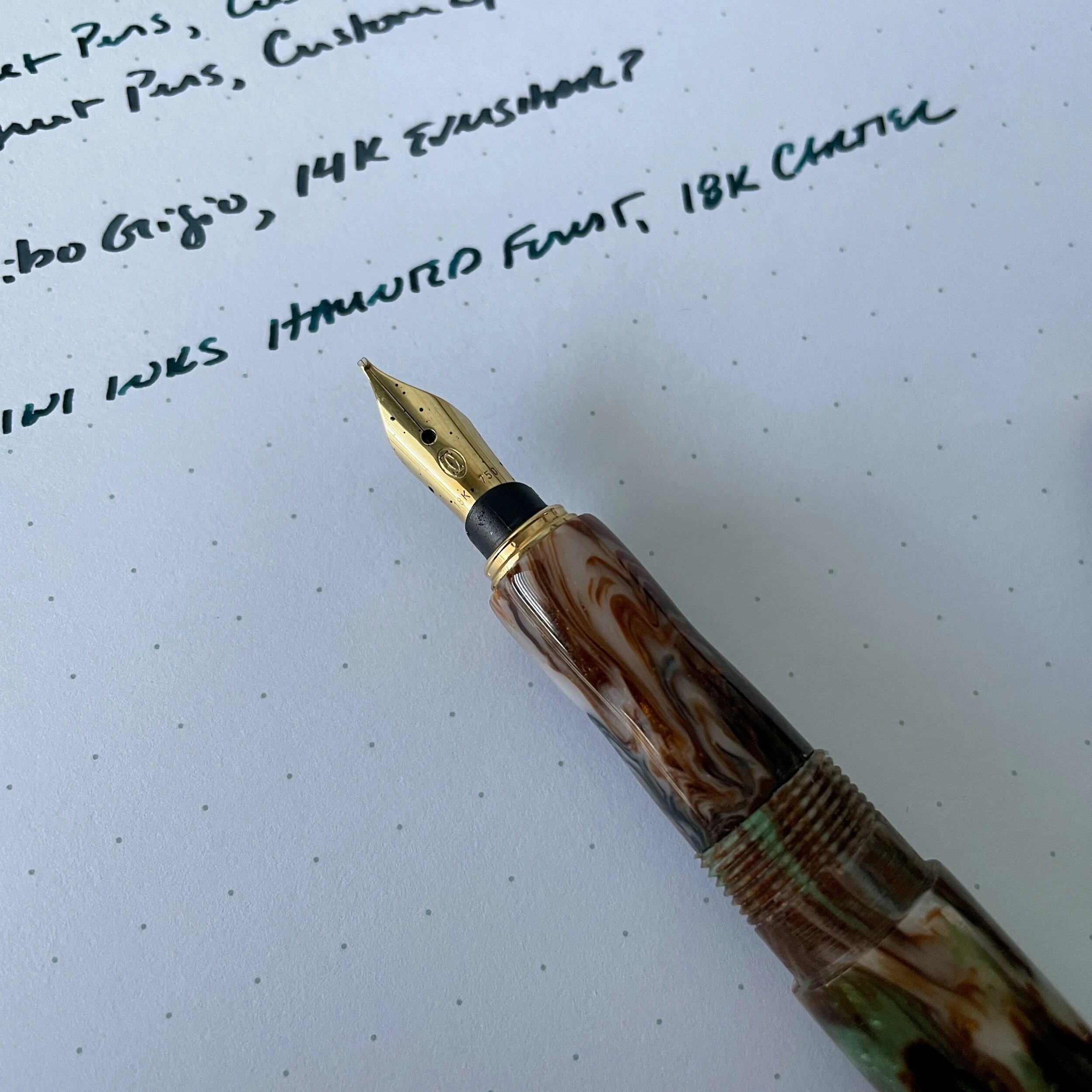
View fullsize PSP Custom with 18k Cartier Nib
PSP Custom with 18k Cartier Nib

The other option is having a brand new pen or section custom made to fit a specific vintage nib (or, like my friend Thomas, having one pen made with multiple different sections sized to fit different nibs). While you will have to discuss with your penmaker of choice whether this is even a possibility, Shawn Newton (Newton Pens) has done this sort of work in the past, as has Jonathon Brooks of Carolina Pen Company. Teri Morris of Peyton Street Pens also regularly makes pen bodies to house vintage nibs from companies such as Sheaffer, Cartier, and Eversharp.

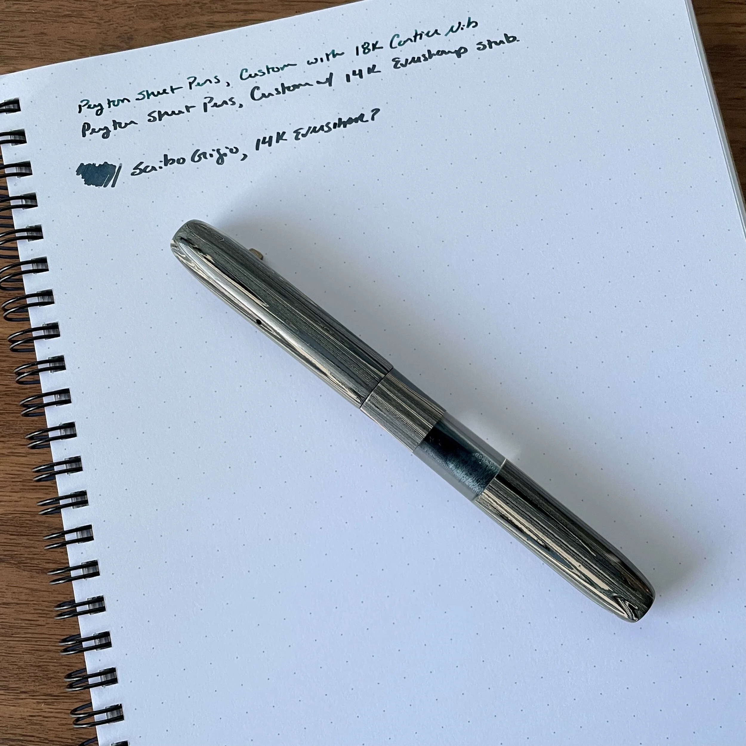
View fullsize Peyton Street Pens Custom Ebonite
Peyton Street Pens Custom Ebonite
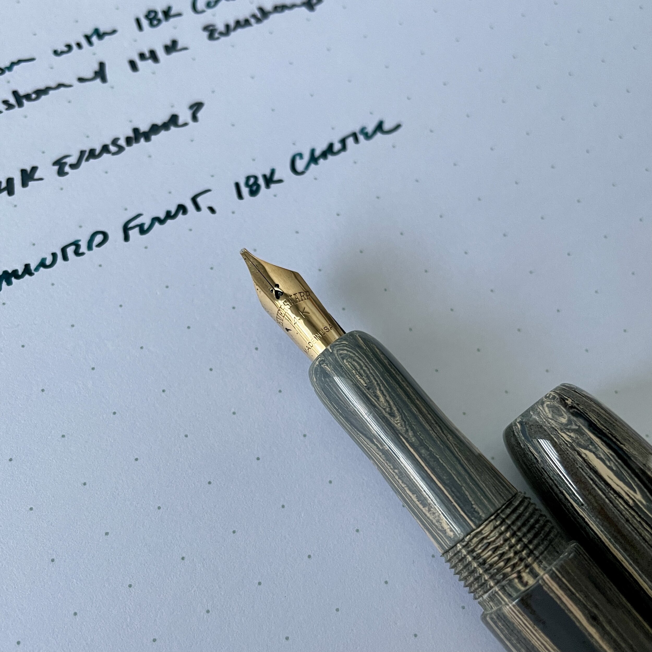
View fullsize PSP Custom with 14k Eversharp
PSP Custom with 14k Eversharp

When I was in San Francisco, I had the opportunity to visit the Peyton Street Pens table and picked up two new additions to my collection that feature excellent vintage gold nibs: an 18k Cartier nib ground to a smooth cursive italic, and a 14k Eversharp stub that’s slightly springy in a way you only really see in vintage nibs. Both are on original feeds, so I’ve experienced zero issues with ink flow. Peyton Street Pens currently has some similar offerings for sale in the “Peyton Street Exclusives” section of their store.

Many vintage nibs are set to write much wetter than what modern pen users are accustomed to, especially if you’ve been using standard stainless steel nibs from JoWo and Bock. For the best experience, be sure to use fountain pen friendly paper. Writing sample shown here is on a Write Notepads Spiral Notebook

As is always the case with vintage anything, your mileage may vary based on the specific pen and/or nib at issue. I highly recommend visiting a pen show, if circumstances allow, so that you can inspect and/or write with the nib you’re considering. Of course, this may be impossible when you’re buying a loose nib that’s not currently installed in a pen, or when you’re asking someone to build a custom pen for you. Often, however, penmakers at shows will have examples of their work at their tables, and will work with you if you have problems with your pen. Sometimes it takes a few tweaks and adjustments to get things writing perfectly.

Further Reading

I’ve previously written several posts on dabbling in the vintage world. I’m far from an expert, but have owned many vintage pens over the years, and I enjoy talking about them from the perspective of someone who doesn’t necessarily “collect,” but rather uses them for everyday writing. Several years ago I started a multi-part “Vintage Pen Primer” series, which lay dormant until today. I you enjoyed this post, you can read the previous articles here: Vintage Pen Primer, Part I; Part II (The Parker 51); Part III (Inks for Vintage Pens); Part IV (The Parker Vacumatic).

Disclaimer: This post does not contain paid affiliate links. Going forward, T.G.S is supported entirely by purchases from the T.G.S. Curated Shop and the T.G.S. Patreon Program, which offers access to online meetups, exclusive discounts and pre-orders, and more!

In Vintage Pens, Editorial Tags Vintage Nibs, Vintage Pens
1 Comment

Back to Work Check-In: What I'm Using (2021 Edition)

August 25, 2021

Despite it becoming clear over the past several weeks that the pandemic is not over, due to work circumstances beyond my control I’ve found myself working outside my house regularly for the first time in over a year. As a result, I’ve had to adjust my stationery “work rotation,” so I thought it would be interesting (for both me and the readership) to do a back-to-work/back-to-school check-in since I assume many of you are in the same boat. I also get a lot of regular questions about what notebooks I carry on a daily basis, so I wanted to be responsive to those who are interested. This post only discusses my notebooks and pen cases, so while my pen and ink usage has changed as well, that’s a topic for a separate post.

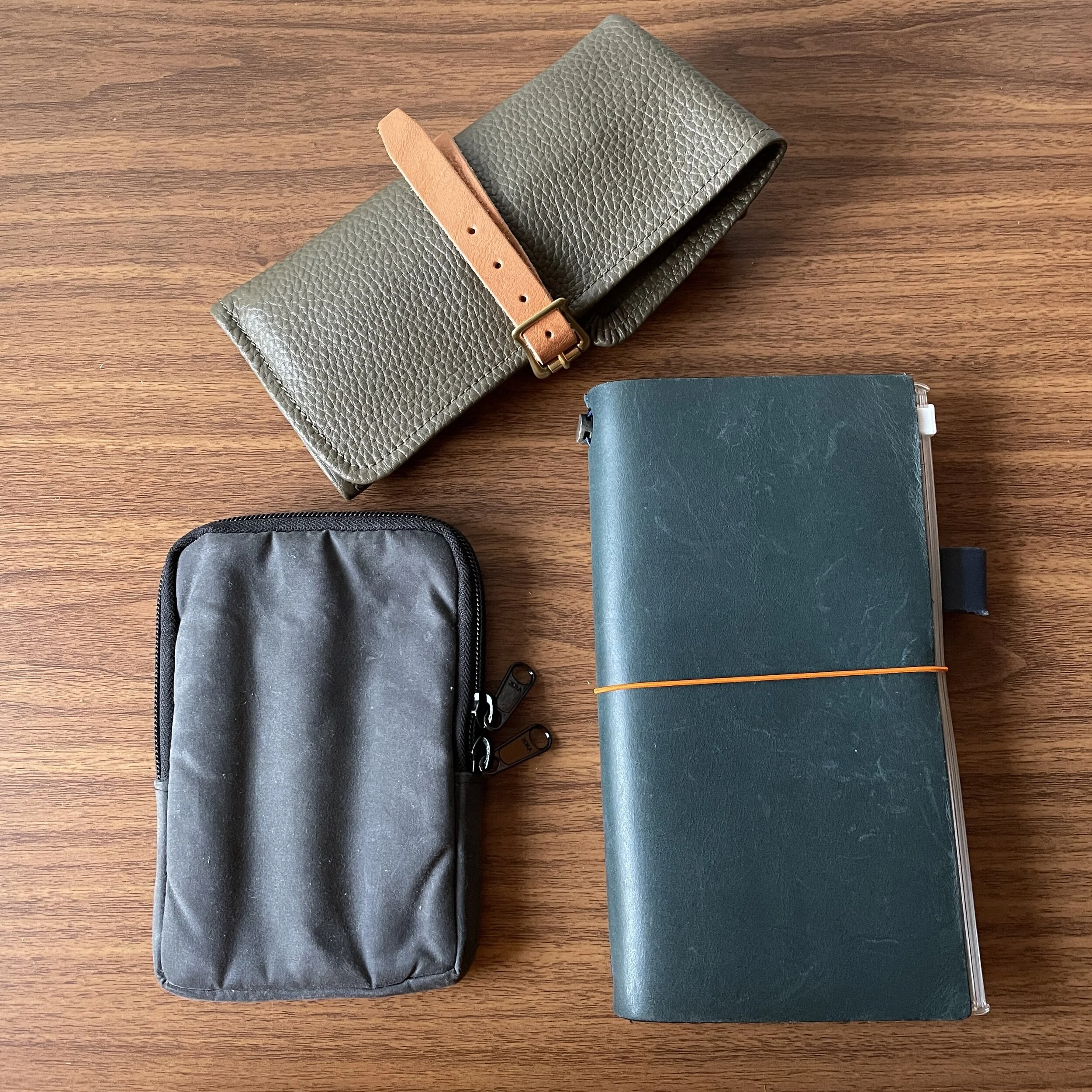
View fullsize 2021 Daily Carry (Spread)
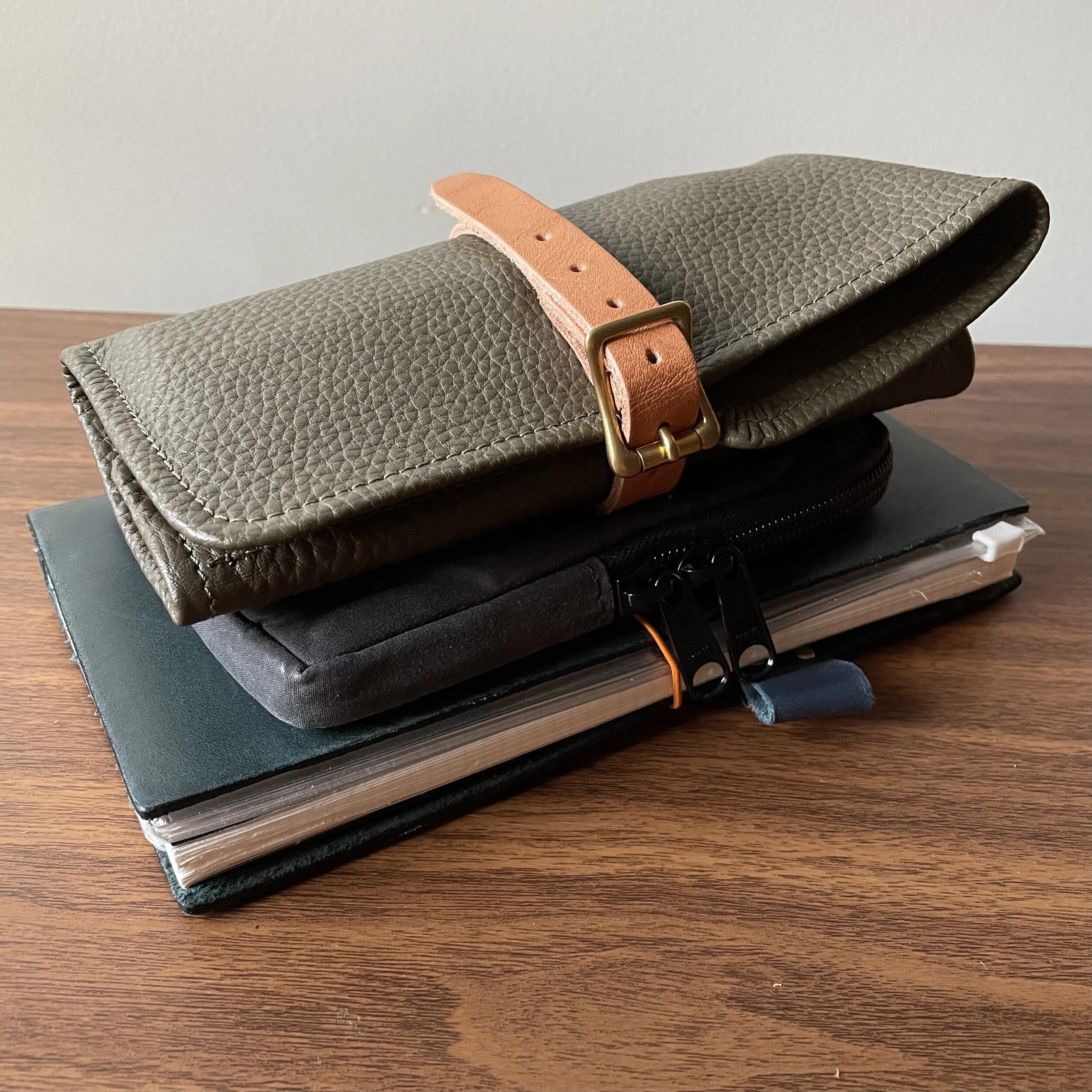
View fullsize 2021 Daily Carry (Stacked)
  1. Main Work Notebook: Standard Traveler’s Notebook in Blue. My primary work notebook remains the Traveler’s Notebook standard-size cover. The various refills and accessories that I use can vary depending on exactly what’s going on at the moment, but the “Slim A5” format of the Traveler’s Notebook system tends to fit my style of planning and notetaking perfectly because I make a lot of lists. I use a heavily modified bullet-journal system to take notes, which is idiosyncratic and probably makes sense only to me. I’d show you here, but a lot of my notes are confidential and can’t be photographed.

  2. Stalogy 1/2 Year Graph Notebook (Cut Down to Traveler’s Size). Before this year, I had not used Stalogy paper, and it took some getting used to, but now I’m a convert. I’ll definitely do a full review at some point, but Stalogy paper manages to be both extremely thin and more absorbent than Tomoe River while still handing fountain pen ink relatively well. Yes, there’s can be some show-through with very wet fountain pens, but the trade-off is a much quicker dry time and, in my opinion, softer texture and a better writing feel. Please note that I have modified this notebook to fit the Traveler’s Notebook cover. You can read more here.

  3. Traveler’s Company Undated Planner Refill. I’m a die-hard fan of undated planners, since I don’t necessarily use a paper planner every month - just when it gets busy - and I hate wasting paper. I filled up a Traveler’s Notebook Weeks + Memo insert during the first half of the year, but when I moved to the Stalogy because I needed more room for notes, I incorporated an undated monthly calendar so that I could do more high-level overviews of my schedule.

  4. Superior Leather Co. Pen Roll. A new addition to my collection that I absolutely love, this olive green leather pen roll from Superior Labor was purchased from Baum-kuchen in Los Angeles. It might be the softest leather pen roll that I’ve ever used, and since it matches my Filson bag perfectly, it has not come out of rotation. I also tuck document flags, post-its, and other miscellaneous stationery items into the larger pocket.

  5. Nock Co. Sinclair Three-Pen Case. Perhaps the most consistently featured piece of stationery in my arsenal, this particular black waxed canvas/burgundy piece (an Atlanta Pen Show pickup from several years ago) has become a true ride-or-die item. I’ve told Brad for years that the waxed canvas Sinclairs are a winner, and now they’re back!

Yes, I’m still using favorites such as the Nanami Paper Cafe Note in B6 slim and the Write Notepads Spiral notebook, but those tend to stay home as I use them more for journaling and personal writing. My personal journals (I keep several) are ANOTHER topic that warrant a separate post, but the “system” I use is kind of complex, so I’m struggling a bit to describe it coherently. Stay tuned….

This post does not contain affiliate links. The Gentleman Stationer is supported by purchases from the T.G.S. Curated Shop and reader donations. If you would like to support us even further, please consider checking out the T.G.S. Patreon Program, which offers access to online meetups, exclusive discounts and pre-orders, and more.

In Editorial Tags Editorial, Back to Work, Back to School, Notebooks
1 Comment

Mini Collections, Part II: All the Red Inks

July 21, 2021

My stationery “collection” doesn’t really have a central theme, in that it’s not built around a specific brand. Rather, I tend to accumulate what I like to use, which has given rise to what I refer to as “mini-collections.” The first of these that I wrote about includes several models of the Parker Sonnet, what I consider a vastly under-appreciated pen. The second is on the ink side, which revolves around a rather large stable of red inks, mostly dark reds and burgundies.

Why Red Inks, You Might Ask?

It’s pretty simple. Dark red is just one of my favorite colors. It’s no coincidence that one of the first bottled fountain pen inks I ever purchased was Noodler’s Antietam, that the main color scheme of the T.G.S. website is burgundy and black, that I review red pens whenever I have the option, and that both of the exclusive editions I’ve released through the shop include red somewhere, whether it be the “Aged Red” Penwell or the recent Sunderland mk1. As you can imagine, I have accumulated a LOT of red ink over the years.

I don’t subscribe to the stigma that writing in red ink is somehow too loud, or should be considered “angry” or offensive. There are various shades of red, and I’ve always enjoyed a darker burgundy or red-black for everyday writing. My favorite, of course, is Montblanc’s legendary Alfred Hitchcock, a limited edition ink that many have tried to duplicate over the years. My personal “grail quest” hasn’t necessarily involved a pen, but rather finding a suitable replacement for this favorite ink, given that I only have half a bottle remaining. What I’ve never done, however, is swab ALL of my current stable of red inks and compare them side-by-side, to get a sense of whether I’ve accomplished my goal (or even whether I still want/need to).

The Process for Standardizing My Ink Samples

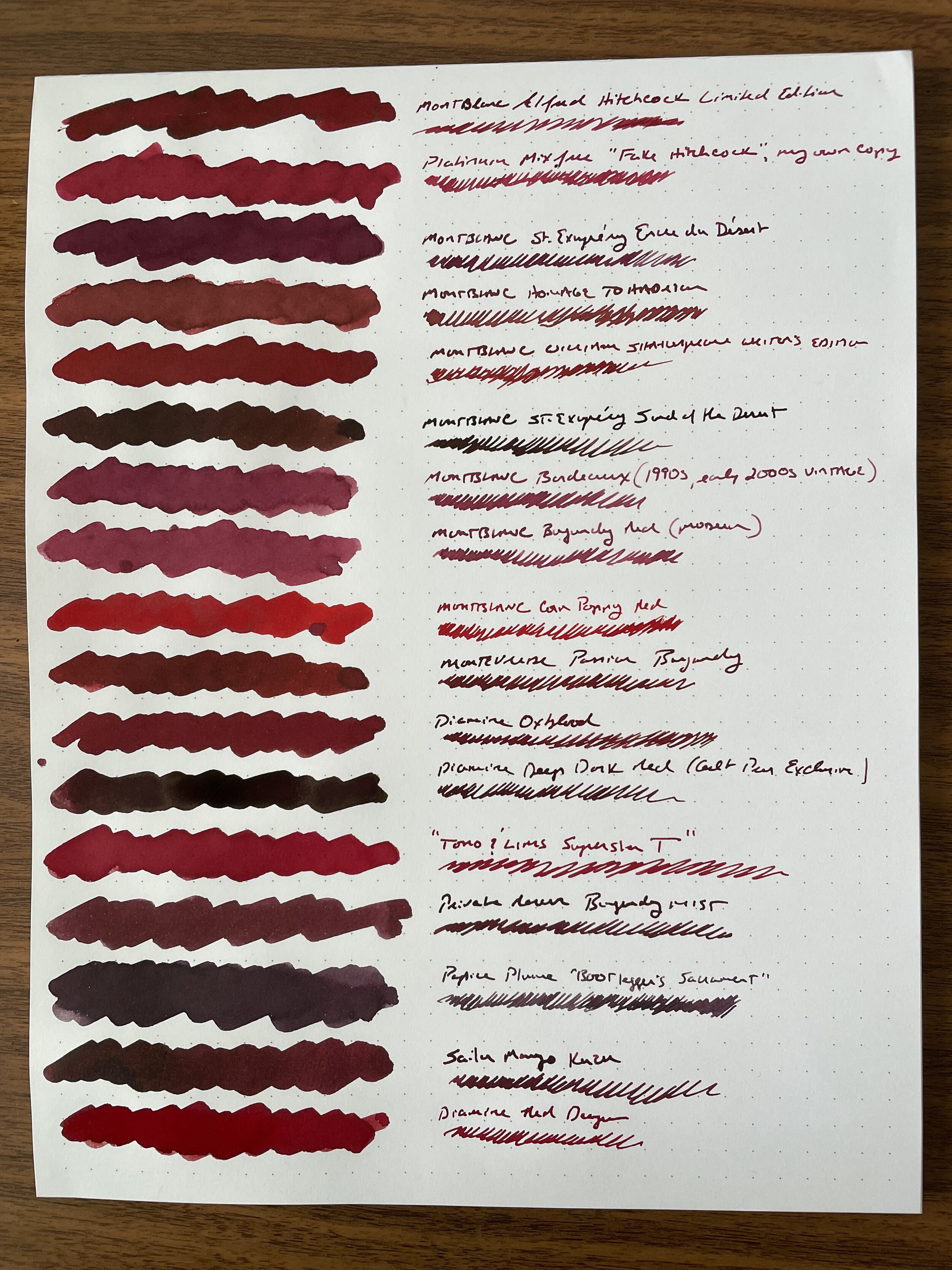
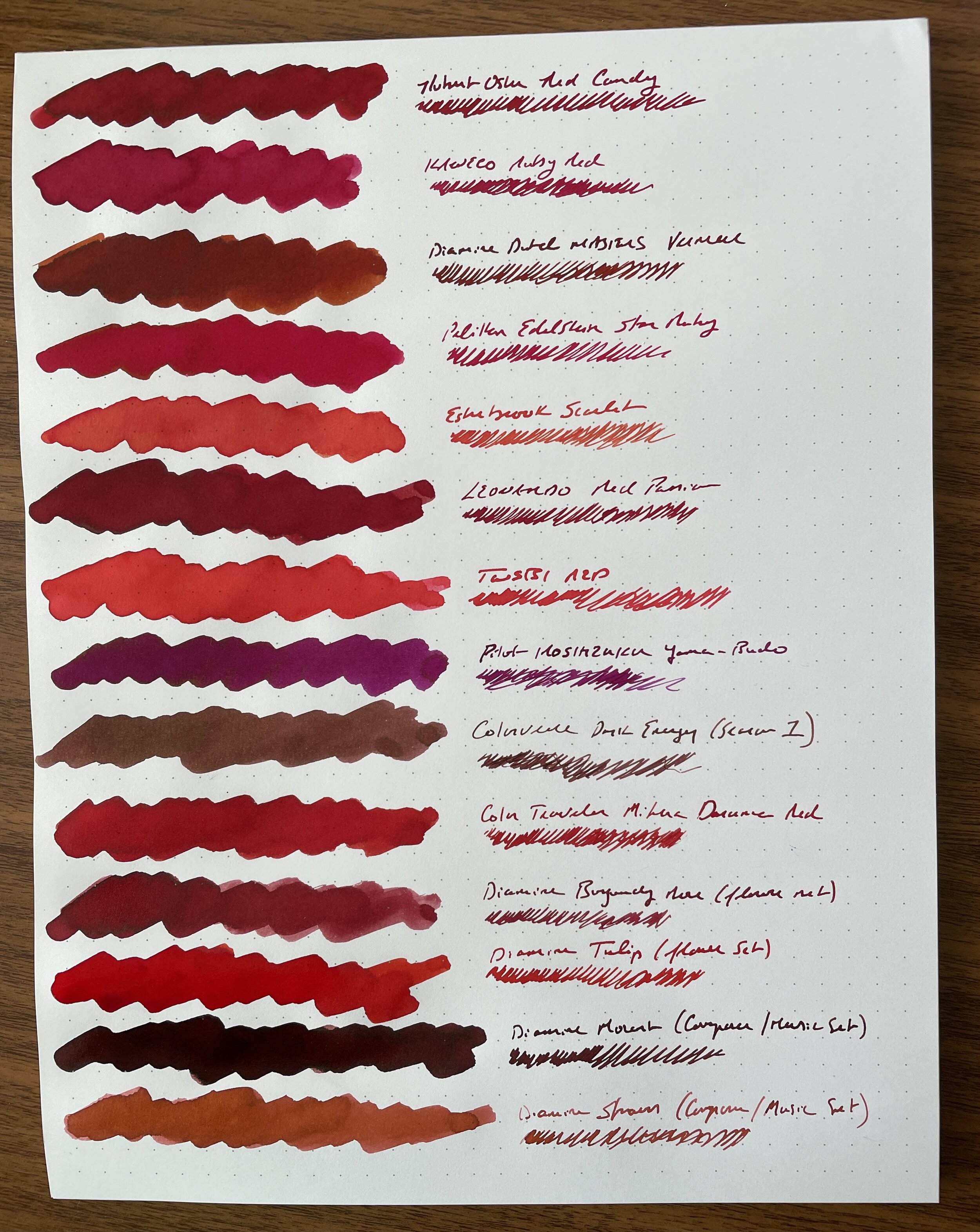
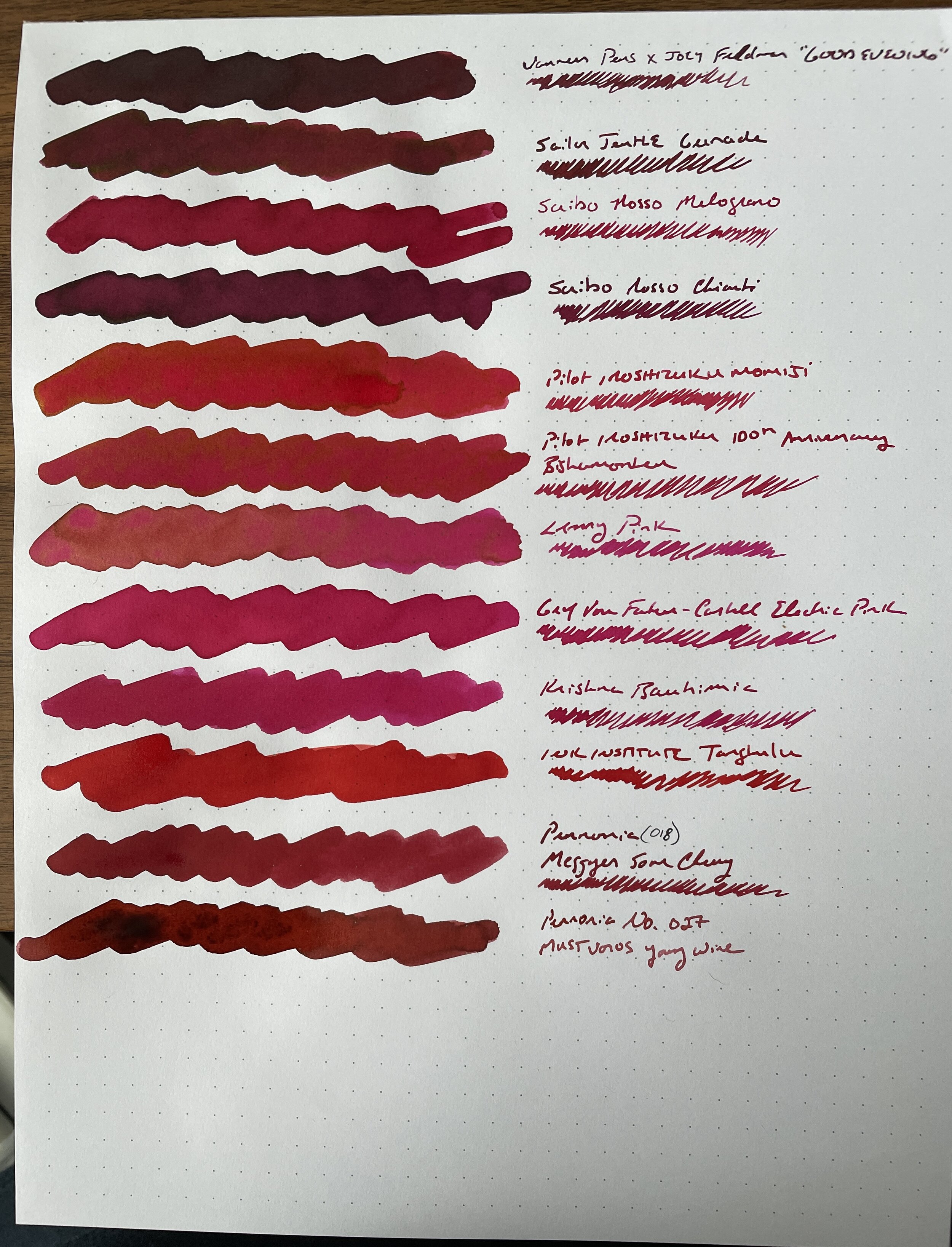
Taking inspiration from Anthony over at UK Fountain Pens, I wanted to use a menu-style format for the comparison with a simple cotton swap + dip pen writing sample combination, on bright white paper from a Write Notepads dot-grid memo pad. I chose this paper because it showcases the ink color quite well, including any shading and sheen, and absolutely will not feather or bleed even with most very wet ink swabs. The whole process took me approximately three hours on a Saturday, and I wound up with three sheets containing 43 different red inks. I laminated these sheets for posterity, and plan on doing similar comparisons with other ink colors in my collection.

View fullsize Red Inks, Sheet 1
View fullsize Red Inks, Sheet 2
View fullsize Red Inks, Sheet 3

Takeaways from My Red Ink Collection, Including Replacements for Hitchcock and Other Cult Inks

I’ve spent a few days thinking about this, and there’s a lot to unpack here, not least that I have more red ink than I can ever use in my lifetime, including a lot of similar shades. Here are my takeaways.

  1. Hitchcock Replacement. So far, no one has been able to come up with what I’d consider a true match. In terms of reasonably priced “everyday writers,” both Diamine Oxblood and Monteverde Passion Burgundy are very close. Vanness and Joey Feldman collaborated on “Good Evening,” an attempt to develop a similar shade of dark red, but I find it to be a touch darker (though still a great ink). The trouble with matching Hitchcock is that the color tends to look much different in wet writers than it does in narrower nibs. I managed to come up with a Platinum mix-free combo that looks very similar in a fine or medium nib writing sample.

  2. Other Matches for Limited Edition or Discontinued Montblanc Inks. Montblanc makes excellent inks, but their best colors tend to be limited or special editions that are made for a year or so and then discontinued. When I was live-posting this project on Instagram in real-time, I received questions about potential matches for Corn Poppy Red, William Shakespeare, and Bordeaux (the predecessor of “Burgundy” in the standard lineup). For Corn Poppy Red, consider Color Traveler Mihara Daruma Red. For William Shakespeare, consider Leonardo Red Passion or Robert Oster Red Candy. And while I don’t think the old Bordeaux is that far off from current Burgundy (maybe slightly darker), Diamine Burgundy Rose (from the “Flowers” set) and Pennonia No. 27 “Mustvoros Young Wine” are close.

  3. My Overall Favorite Red and Burgundy Inks for Everyday Writing. While this category keeps changing, since I’m constantly finding new shades that interest me, I’ve also rediscovered a bunch of inks in my collection that I had forgotten about. The ones that basically leapt off the page were Leonardo Red Passion (Leonardo makes exceptionally good but under-appreciated inks), Montblanc Corn Poppy Red, and Robert Oster Red Candy. You will likely see more of these in my rotation in the future.

  4. I’m Not Going To Use Certain Colors and Need to Purge Some Ink. It’s been over a year since my last ink sale, and I need to let 10 or so of these bottles go. I don’t use pink inks or reds that lean heavily pink, including many of the Pilot inks other than Iroshizuku Yama-Budo. Now that I have these inks swabbed for posterity on a laminated sheet, there’s no need to keep them around solely for comparison purposes. As always, Patreon subscribers will get first crack at whatever I decide to sell off, via the Patreon Sale page, and if anything’s left it will move over to the “Gently Used” stationery page, which is separate from the T.G.S. Curated Shop but can be combined with shop orders for free shipping purposes.

This was a highly satisfying project, and as I mentioned, I plan to repeat with other colors in the hopes of identifying my favorites, (re)discovering some hidden gems, and letting go of a bit more excess. Stay tuned for more fun! If anyone is interested in viewing these sheets in person, I will bring the color sheets with me to the D.C. Pen Show, where I will be behind the Vanness Pens table.

Disclaimer: This post does not contain paid affiliate links. Going forward, T.G.S is supported entirely by purchases from the T.G.S. Curated Shop and the T.G.S. Patreon Program, which offers access to online meetups, exclusive discounts and pre-orders, and more!

In Editorial, Ink Reviews Tags Editorial, Red Inks, Montblanc Ink
8 Comments
← Newer Posts Older Posts →
Store Hours and Location
Visit the T.G.S. Curated SHOP
*New* Updated "Best Pens" Guide (2025)
TGS x Hinze Pens Violet Tendencies Taschenstift Fountain Pen
Hierarchies of Fountain Pen Friendly Paper
Allex Scissors arrayed on a desk showing link to desk accessories

Join Our Patreon!
Subscribe to the TGS E-mail List

Featured Posts

Featured
Levenger-Annotation-Pad.jpeg
Sep 20, 2025
Five Boutique Paper Brands I'm Watching Closely and Why
Sep 20, 2025
Sep 20, 2025
Playing-ink-MD-Cotton-Glass-Pens.jpeg
Sep 17, 2025
What's On Your Desk? My Personal Favorite Papers for Fountain Pens, 2025
Sep 17, 2025
Sep 17, 2025
San-Francisco-Pen-Show-Hotel-view.jpeg
Sep 3, 2025
2025 San Francisco Pen Show Recap: Still The Best "Big" Show!
Sep 3, 2025
Sep 3, 2025
The Gentleman Stationer RSS

© Digital Divide Media, LLC, 2014-present.

All content is the exclusive property of Digital Divide Media, LLC, d/b/a The Gentleman Stationer, including “The Gentleman Stationer” website and trademark, and should not be reproduced without express written permission.  All rights reserved.

All content containing paid advertising, affiliate links, or sponsored content will be plainly disclosed by a disclaimer when/if featured.

Contact Information

Store Shipping Policy and Return Policy

Privacy Policy

Cookie Policy

Terms and Conditions

Powered by Squarespace