• Blog
  • Shop
  • Resources
  • FAQ (Ask TGS)
  • About
  • Archive
  • Contact
  • Sign In My Account
Menu

The Gentleman Stationer

Vintage Living in the Modern World.
  • Blog
  • Shop
  • Resources
  • FAQ (Ask TGS)
  • About
  • Archive
  • Contact
  • Sign In My Account

Pen Review: Pilot Custom 912 with FA Nib

March 8, 2017

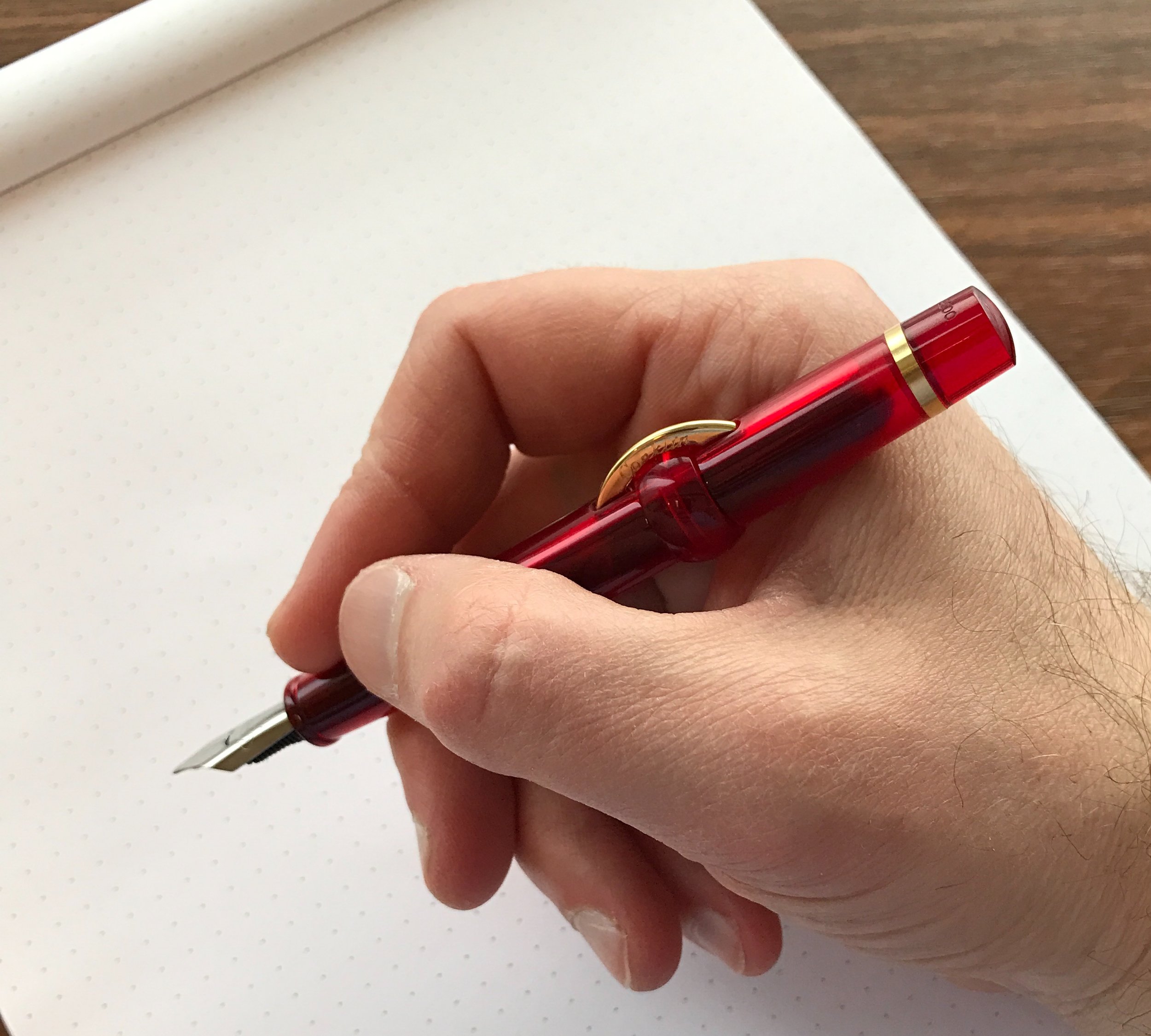
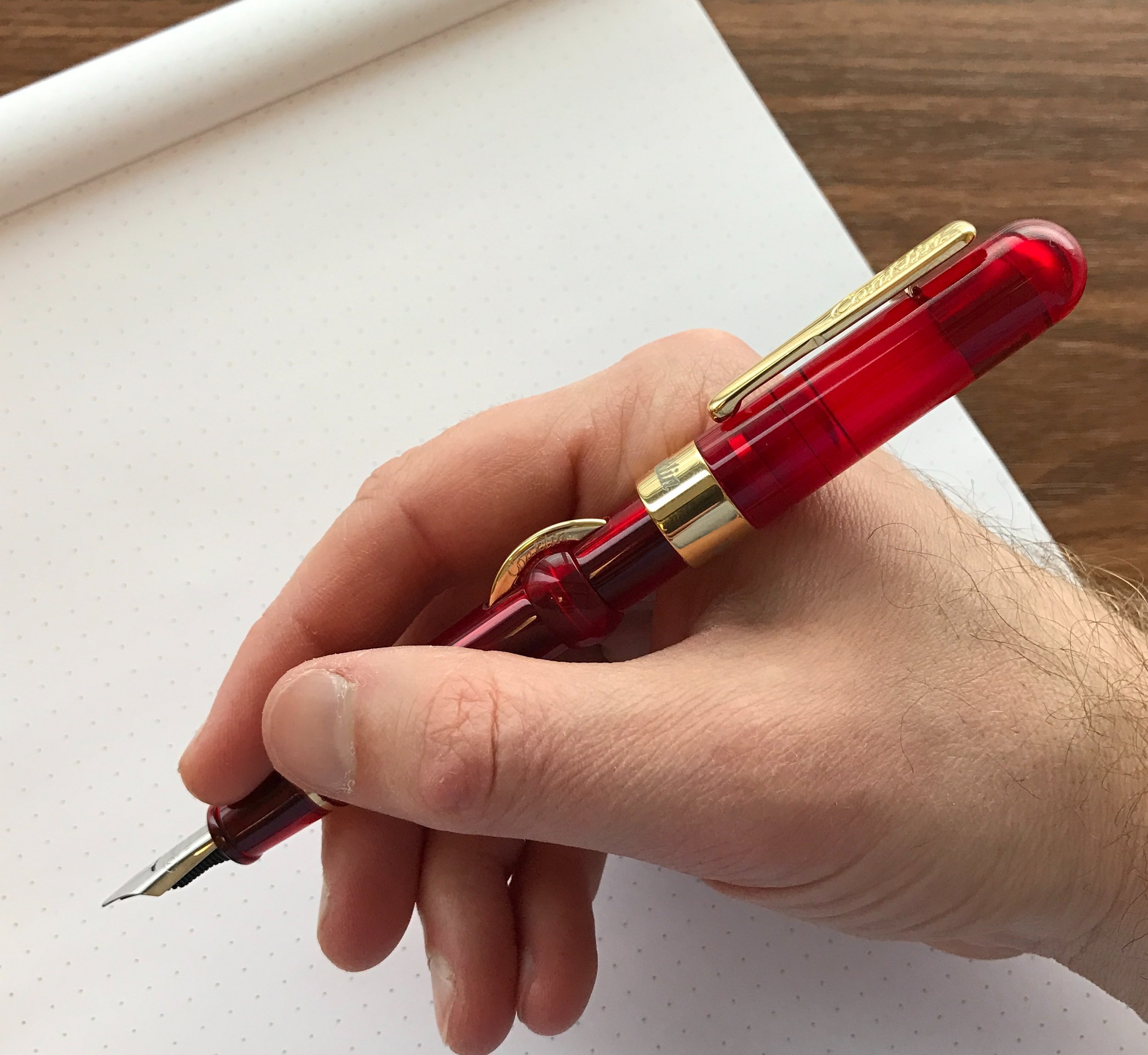
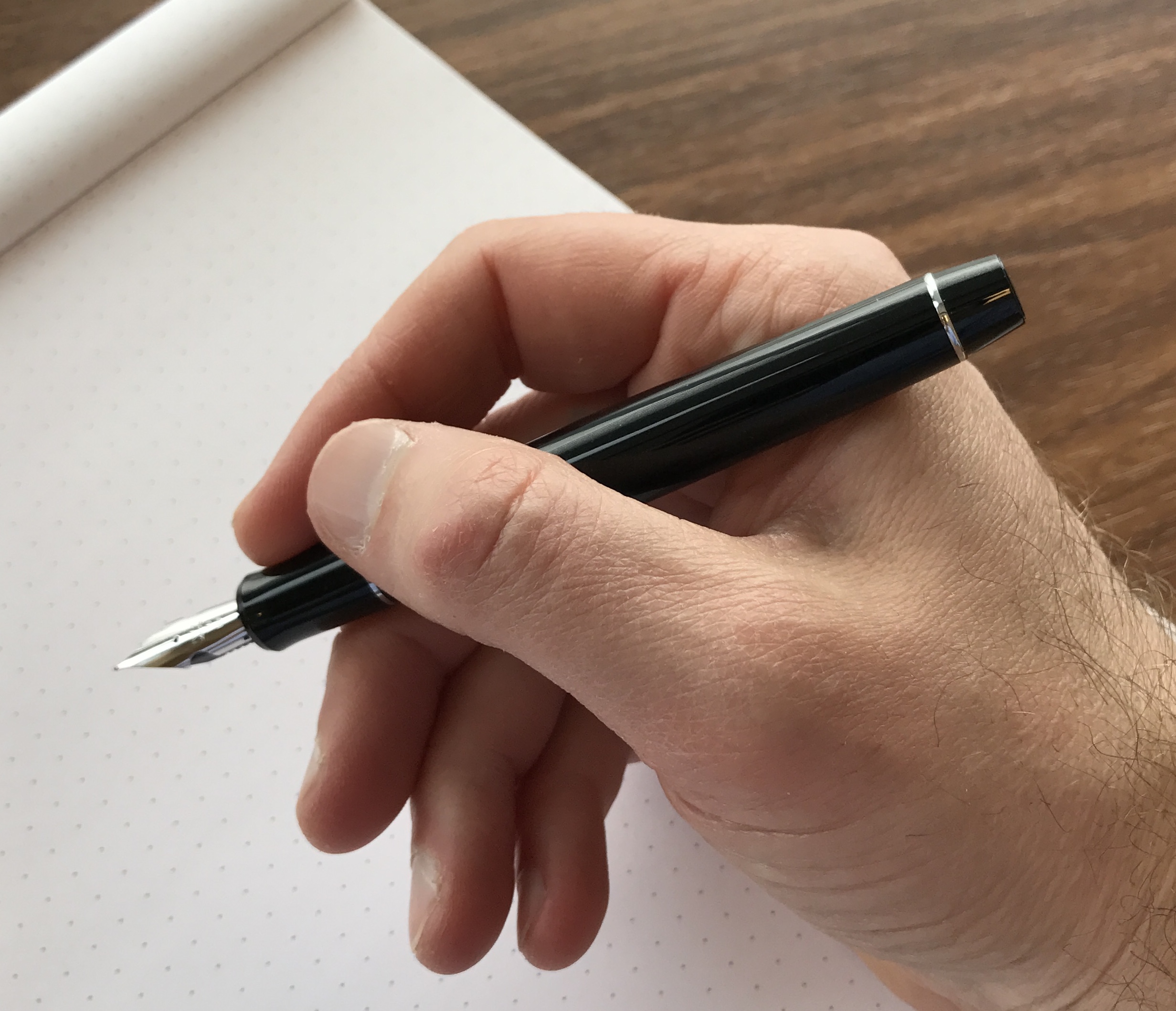
The Pilot Custom 912 is one of those pens that's attractive in that distinguished "black pen with rhodium trim" kind of way, but it's main purpose is to act as the showpiece for Pilot's specialty nibs, including the stub (SU), the Waverly (WA), Posting (PO), Music, Soft Fine (SF), and the Falcon (FA) nibs. The pen featured in this review sports Pilot's semi-flex Falcon (FA) nib, which is the first that I've had the opportunity to try for an extended period of time. While I can see why many people really like this nib, it doesn't work so much for my personal handwriting style.  

Note the "wings" cut out of the sides of the nib, which adds to the springiness of the nib. As with the Pilot Custom 74 and the Pilot Custom 823, Pilot adds a nice engraving to the Rhodium cap band.

Build

The Pilot Custom 912 is a sturdy, well-built pen that could easily serve as your daily driver (provided, of course, you find a nib that works for your writing style). It's on the larger side (5.5 inches unposted and 6.25 inches posted), but still fits very comfortably in the hand. The Custom 912 uses Pilot's Con-70 high capacity pump-style converter, which is the same one that comes with the Custom 74 and which I always enjoy. The barrel is made of black resin, and since the pen is a cartridge-converter filler, it's a light pen, making it suitable for longer writing sessions (again, assuming you have the appropriate nib). Rhodium plated trim and a 14k gold nib lend a classic look, if a somewhat unexciting one.  

View fullsize Pilot Custom 912 Unposted
View fullsize Pilot Custom 912 Posted

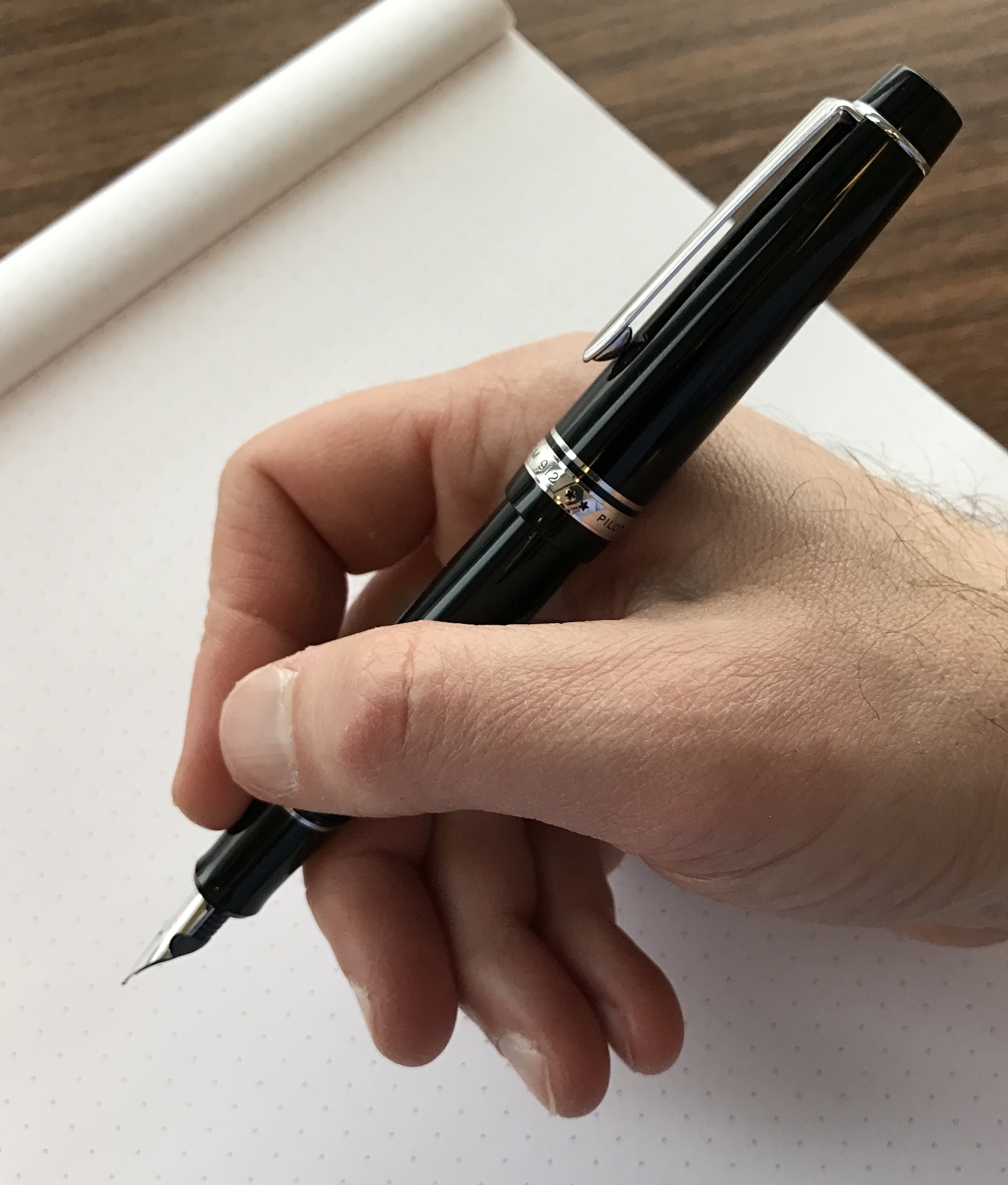
The Pilot Falcon (FA) Semi-Flex Nib

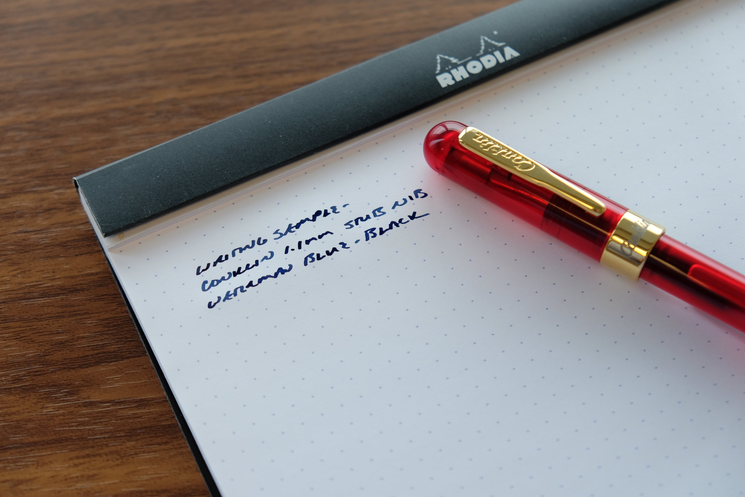
The nib is plainly intended to be the star of the show on the Custom 912. I wrote with a Pilot Metal Falcon many years ago, and wasn't blown away. For whatever reason, my print-cursive hybrid style of handwriting doesn't lend itself to the Falcon/FA nib's flex.  (To be more accurate, I should say semi-flex - the FA nib is not a "flex nib" in the vintage sense, but it's more than just "springy"). As you can see below, you can coax some very nice line variation out of this nib, but I didn't find it to be the smoothest writing experience when printing, as opposed to writing cursive. This past weekend I had the opportunity to test drive Aurora's new vintage-style flex nib, which, in my opinion, seems more versatile in terms of easily switching between cursive and script. I should have a review of that nib up on the blog in the near future.

Takeaways and Where to Buy

I will definitely purchase a Custom 912 at some point, but it probably won't be a model with the Pilot FA nib. This past weekend I also had the chance to write the Pilot's PO nib, a super-stiff, extra-fine Japan-only specialty nib that would probably be my first choice. (NOTE: being able to test rare and hard-to-find nibs is one of the many benefits of visiting pen shows!) That said, I know many people who enjoy writing with flex and semi-flex pens who love the Pilot FA nib and can make it do wonderful things with their handwriting.  

Many thanks to Ron at Pen Chalet for loaning me this pen for review purposes.  Pricing on the Pilot Custom 912 is currently $224, minus whatever coupon code or discount Ron is running. As of the time of this review, Ron currently has the Custom 912 in stock with Extra Fine, Soft Fine, Stub, Music, Falcon (FA), and Waverly nib options. The PO nib still seems to be unavailable stateside, so if you're interested in that option you'll have to take your chances buying internationally.   

Disclaimer: This pen was loaned to me by Pen Chalet for review purposes and returned to Pen Chalet after completion of my review. This post contains affiliate links. 

In Pens Tags Pilot Custom 912, Pilot FA Nib, Flex
4 Comments

Pen Review: Conklin Mark Twain Crescent Filler

March 4, 2017

The "new Conklin" has been one of those pen brands that's flown under my radar, because the pens typically sit in that odd $50-150 price range. While I had heard good things about Conklin's nibs, the designs at the lower end of that price range didn't really appeal to me enough to get me to pull the trigger on a blind purchase, and I was similarly hesitant to spend $150 (or more) on a pen with a steel nib from an unfamiliar brand. A few weeks back, Ron at Pen Chalet asked whether I'd be interested in reviewing the Mark Twain Crescent Filler, and I have to say that I've been pleasantly surprised with both the aesthetics and overall quality. 

American Heritage, Italian Design

Those familiar with vintage pens know Conklin as one of the original American fountain pen companies, which was based in Toledo, Ohio and rose to prominence with its patented "crescent-filler" mechanism around the turn of the century. The filling mechanism is an early take on the button or lever-filling fountain pen, and consists of a crescent-shaped piece of metal that you depress in order to collapse the sac. When you release the "crescent," the pen fills with ink. The crescent does double duty as a roll-stopper, and there's a plastic guard that you can rotate to lock the filling mechanism in place and prevent you from accidentally squeezing the sac and squirting ink all over the place. 

Red demonstrator pens appeal to me, especially when they have a unique filling system that makes for interesting viewing. 

The original Conklin Pen Company went out of business in the late 1940s, but the brand was resurrected in the 1990s and eventually sold to Yafa Pens, which owns brands like Monteverde and is the U.S. distributor for the Italian pen companies Delta and Stipula. I understand that Stipula currently manufactures the Conklin pens for Yafa. (Some new limited edition Mark Twains are being released in materials such as Ambrosia celluloid and red and black striped ebonite - materials previously used to make limited runs of the Stipula Etruria.)

My Experience with the Mark Twain

Let's be honest, the Mark Twain Crescent Filler isn't the most streamlined of pen designs, but I found it attractive and fun to use nonetheless. There's definitely a sort of steampunk aesthetic going on here, combining the antiquated crescent-filling mechanism and vintage-style Conklin clip with the modern colored acrylic used to make the demonstrator pens. The construction is solid, and I had no problem whatsoever with the filling system. Do note, however, that eventually you may have to replace the sac, though I believe these modern pens use silicone sacs which are much less prone to failure than the latex sacs used in vintage pens. 

Conklin's steel stub on the Mark Twain Crescent Filler. Conklin's non-stub nibs are two-toned steel and gold plate, but the stubs are all stainless. 

Where this pen really impressed me was with the nib. This pen features Conklin's steel 1.1mm stub nib, which is excellent. I experienced zero hard starts or skips, and the nib was super smooth. While I haven't tried multiple pens and can't personally vouch for consistency across the various Conklin lines, I don't think this is a one-off experience. Many people have raved to me in the past about Conklin's stubs, especially on their lower-priced pens such as the Duragraph. 

Conklin Mark Twain Crescent Filler writing sample with what else? Waterman vintage-style blue black ink (or, "Mysterious Blue") as it's now called.

Conklin Mark Twain Crescent Filler writing sample with what else? Waterman vintage-style blue black ink (or, "Mysterious Blue") as it's now called.

Takeaways/Where to Buy

Conklin now has my attention. I'm probably going to pick up one of these crescent fillers at some point in the future, because after I sent the pen back to Ron I found myself missing having it around. It may not be the most practical everyday writer for pocket carry, etc., but if you want a vintage-style pen without having to worry about tinkering with fragile materials and vintage parts, this is a good option. Pen Chalet currently has the Mark Twain Crescent Filler on sale in red, blue, and clear demonstrator models, marked down to $125 and subject to further discount with one of Ron's various coupon codes. (Last I checked, there were only a couple of these pens left at his sale price, but other models of the Crescent Filler are available). 

View fullsize Conklin Mark Twain Unposted
View fullsize Conklin Mark Twain Posted
View fullsize Limited Edition Numbering

NOTE: It's unclear whether Conklin will continue to manufacture this particular demonstrator fountain pen, as its currently on clearance at multiple retailers. Since stock may run out fast, here are a few different options if you have trouble finding the particular pen/nib combination you are looking for: Pen Boutique; Fountain Pen Hospital; Fahrney's Pens.

Disclaimer: Pen Chalet loaned me this pen for review purposes at no cost. The pen was returned to Pen Chalet following the review. This post contains affiliate links. Pricing and availability are current as of the time of publication of this review. 

In Pens Tags Conklin, Mark Twain Crescent Filler, Pen Review
Comment

Announcing the Baron Fig "Alphabet" Squire Limited Edition

February 22, 2017

Last week, Baron Fig released the "Alphabet": their first limited edition Squire rollerball/ballpoint pen featuring a new matte black finish with the alphabet etched in white down the side. It's a cool looking pen, and I'm glad to see that Baron Fig went the "understated" route, rather than the somewhat over-the-top approach taken by other companies with their limited editions. 

The finish on the "Alphabet" version of the Squire is "grippier" than the finish on my standard model. I think I prefer the matte black over my standard charcoal, though both are great. 

The finish on the "Alphabet" version of the Squire is "grippier" than the finish on my standard model. I think I prefer the matte black over my standard charcoal, though both are great. 

The "Alphabet" is available as part of the Squire subscription service, in which you can sign up to receive a new limited edition pen each quarter. So far, Baron Fig has more than met my expectations with their subscription service offerings, having released two versions of the Confidant (the Work/Play II and the Askew), one of the Vanguard (the Black Box), and now the Squire. Of all their existing product categories, the Squire was the one that gave me the most heartburn as part of a subscription service. It's Baron Fig's priciest product at $60, and I suspect it might be a hard sell to get many people to commit to pre-purchasing four of them per year. That said, the Alphabet makes for a great start: it maintains the classic style of the standard Squire while offering two new design elements, the "A to Z" detailing and the matte finish. It's distinct enough to convince existing Squire owners to pick up another, and for those who don't have a Squire already, well, it's a great pen. Personally, I'd take the Squire over the Retro 51 Tornado any day, but that's a matter of personal preference.     

If you're inclined to keep the packaging, it makes for a great desktop stand for your pen. 

You can purchase the Squire "Alphabet" limited edition directly through Baron Fig's website. A single pen is $60, but the price drops to $50 per pen if you subscribe and pre-pay for four quarterly limited editions. Baron Fig fans should keep a hand on their wallets: I have it on good authority that the second Vanguard edition will be released shortly, and I suspect the first limited edition set of Archer pencils will follow. Stay tuned! 

Disclaimer: Baron Fig sent me this product free of charge for review purposes.

In Pens Tags Baron Fig, Squire, Limited Edition
Comment

Pen Review: The Pilot Custom 74

February 11, 2017

I've reviewed a lot of Pilot pens on this blog, but for some strange reason I've never taken the opportunity to review what I consider one of their best, and certainly one of their more accessible, fountain pens. The Custom 74 is one of the first higher-end Pilots that I purchased, and I recently added another to my collection. I'm glad I did!

This blue demonstrator might be one of the prettiest pens in my collection. 

Pilot makes several versions of the Custom 74, but only the demonstrators are available on the North American market, to my knowledge. The Japanese market offers some lower-cost pens in solid acrylics, including Dark Blue, Black, Deep Red, and Dark Green. (You can sometimes find these Japanese pens with in-between nib sizes, like SF (soft fine) or FM (fine medium).) Along with the Vanishing Point, you'll often see the Custom 74 marketed as the "entry level luxury" Pilot fountain pen, and it's a great option for those looking to buy their first $150+ fountain pen, or upgrading from a steel nib to 14k gold. 

An older photo of the Custom 74 violet demonstrator (far left) that I no longer have. This picture offers a good size comparison of the Custom 74 to the (from left) Pilot Vanishing Point, Sailor Pro Gear Imperial Black, Sailor 1911 Large, Nakaya Portable Writer, and the Pilot Metropolitan.

The Custom 74 is a good size pen, but at the same time there's no excess length or girth, and the transparent acrylic weighs very little. I can use this pen comfortably posted and unposted, though some might find it a touch too long posted. As I mentioned, I've owned two of these colored demonstrators over the years - the blue and the violet - and both pens were stunning to look at. The sapphire-blue acrylic featured here is a personal favorite, and pairs perfectly with Sailor Bungubox Sapphire ink.

I've always found Pilot nibs very tastefully engraved. I especially like the rhodium-plated version. 

The Custom 74 color demonstrators feature a relatively stiff, rhodium-plated 14k Pilot nib that offers a super smooth writing experience. I would say these nibs (which come in fine, medium, and broad) correspond more to western sizing, as opposed to traditional Japanese nib sizes that tend to run narrower. The pen shown here has a wet medium nib that writes a fairly broad line for a Japanese pen, but on a brightly colored pen like this one, I prefer a nib that lays down some ink. Fortunately, the Custom 74 comes paired with Pilot's high capacity CON-70 push-button converter, which only works with Pilot's larger pens. (Make sure you check compatibility before purchasing a CON-70 for another pen.)   

The Pilot Con-70 converter on the Custom 74, showing the length. Be sure to check compatibility.

A final note on the Custom 74 nibs: these nibs tend to have a lot of tipping material, which make them excellent - and relatively inexpensive - options for nib customization. Before my next pen show, I may try to pick up a couple of Custom 74s with broad nibs to take with me, just to make sure I have a good option to give to Mike Masuyama or Mark Bacas....

The nib on this Pilot Custom 74 writes a nice fat medium line.  

Takeaways and Where to Buy

The color demonstrators are by far the most popular options in the Custom 74 line, and are available in transparent blue, orange, smoke, and violet. This pen, in my opinion, is one of the better buys in the fountain pen world at $176 (as of 2023, available directly from us in the T.G.S. Curated Shop). You get an incredibly attractive pen with an amazing nib and a high-capacity converter. For these reasons it's made my list of Best First Fountain Pens over $100. Personally, I think the color models are attractive enough to justify the extra money, especially with the rhodium trim, but it's a matter of personal preference.    

The Gentleman Stationer is supported entirely by purchases from the T.G.S. Curated Shop and pledges via the T.G.S. Patreon Program. We no longer participate in third-party advertising or affiliate programs.

In Pens Tags Pilot, Pilot Custom 74, Pens
6 Comments

Pen Review: Visconti Homo Sapiens Dark Ages

February 4, 2017

Some of my favorite pens in my collection are what many people refer to as “blacked out” or “stealth” pens. I’m not sure where the trend originated, but I suspect it started with Pilot’s Matte Black Vanishing Point. That’s the earliest “stealth pen” I can recall receiving a lot of attention. Next, I purchased the Sailor Pro Gear Imperial Black fountain pen, which remains a personal favorite to this day. I like this pen not just because of the ion-plated trim, but because of its compact size. The Pro Gear is the perfect pen to stick in a shirt pocket and take to work: it’s portable, but when posted expands to a comfortable length for longer periods of writing. 

But I still found myself looking to add a larger pen that would spend most of its time at my desk at home, for journaling and the occasional letter writing. I’d been eyeing Visconti’s Homo Sapiens line of pens for a while, and had come close to pulling the trigger on the “Steel Age” model but never loved the overall look enough to do it. Then, last year, Visconti introduced the Homo Sapiens “Dark Ages,” and I finally jumped. 

The Homo Sapiens Dark Ages features a blacked-out version of Visconti's trademark "arc" clip, plus "Homo Sapiens" engraved around the barrel. If you look closely, you can see that the lava-resin composite material is porous. 

First, a bit about the Homo Sapiens line in general. Visconti markets these pens as being made from hardened volcanic lava from Mount Etna in Sicily, which is mixed with a proprietary resin to create what most vendors describe as a “virtually unbreakable” pen. Much like celluloid and ebonite, the pen warms to the touch as you write with it, and absorbs moisture from your hands. Originally, the Homo Sapiens only came with bronze trim (the “Bronze Age” pen), but Visconti has since released the HS with steel (“Steel Age”) and the all-black (“Dark Age”) furniture. 

View fullsize Homo Sapiens Unposted
View fullsize Homo Sapiens Capped

The Homo Sapiens pens are sold in two sizes: Maxi and Midi. The Maxi size - what I have here - is a large pen that realistically can only be used unposted. It features Visconti’s 23ct Palladium “Dreamtouch” nib with Visconti’s “Power Filler” filling system. I love the nib, but I’ve found the “Power Filler” to be a bit overrated. I understand that the slightly smaller Midi pen also features a Palladium nib and a piston-fill mechanism. 

The Nib and Writing Experience

The "Dark Ages" Dreamtouch 23ct Ruthenium-plated Palladium nib, with classic Visconti engraving. You can also see Visconti's "locking" threat system, which allows the cap to attach securely, 

If you like soft, wet nibs, then you’ll love Visconti’s Palladium nibs. Once these nibs are set up properly (more on this in a minute), they write with almost no pressure. “No pressure” is key: apply too much and you could end up springing the nib or gushing ink onto the page. I purchased this pen at the 2016 DC Pen Show, and immediately had Mike Masuyama grind this nib down to an EEF and attempt to reduce the ink flow as much as possible, yet this pen will bleed through even very thick paper if I bear down too hard. That said, once you get the hang of writing with little to no pressure, this is a very pleasant and comfortable pen to use. 

The ink in this writing sample is Montblanc Leo Tolstoy Sky Blue. You can tell how wet this nib is from how dark the ink appears. 

The Puzzling “Power Filler”

The filling system on this pen merits extended discussion. I’m not sure what the purpose of Visconti's “Power Filler” is, because it doesn’t seem to hold a lot of ink, which, to me, is what the name would imply. It's a vacuum-fill system, similar to the Pilot Custom 823, where to fill the pen, you place the nib and section in the ink bottle and depress the plunger. From a normal ink bottle, I’ve found the usual fill holds just over 1ml of ink. (Supposedly, you can get a bit more into the barrel using Visconti’s “Traveling Inkwell,” but I don’t have one and don’t particularly fancy spending more $$$ just to get a couple ml more into the pen.) For a pen of this size, that’s not a huge ink capacity, and certainly seems to fall well below what my other similarly sized pens (i.e., the Pilot Custom 823, Pelikan M800 or Montblanc 146) can hold. Given that most Visconti pens are very wet writers, you'll probably find yourself refilling your Power-Filler pen more than you’d expect. 

Takeaways and Where to Buy

Of all the Visconti’s I’ve had the opportunity to try at pen shows, etc., none of them spoke to me more than the Homo Sapiens Dark Age. It’s a great-looking pen, and as modified, the nib is a very nice writer. That said, my experience with this pen doesn’t have me jonesing to go out and buy another Visconti without careful consideration. This pen was a temperamental and inconsistent writer out of the box, and if I hadn’t had Mike Masuyama there to work on the nib immediately, this experiment definitely would’ve ended in frustration. If you’d like to add a Visconti to your collection, I’d recommend purchasing at a pen show or from an online vendor who is willing to check the nib prior to sending it to you. 

I purchased this pen from Bryant Greer of Chatterly Luxuries at the 2016 D.C. Pen Show. I’ve made several purchases from Bryant in the past, and have nothing but good things to say about him and his company. (I've heard that Bryant will also ship new pens directly to Mike Masuyama for nib customization/tweaking.) If you have a relationship with another major pen retailer, most of those who carry Visconti keep the various Homo Sapiens models in stock. For example, both Pen Chalet and Anderson Pens have the Dark Ages available on their website. I’ve not seen anything to suggest that this pen is a limited or special edition, and will likely be available as part of the regular Homo Sapiens lineup for the foreseeable future. 

Disclaimer: I purchased this pen with my own funds for my own collection. While certain links in this post are affiliate links, I have not otherwise been compensated in any way for this review. 

In Pens Tags Visconti, Black Pen Society, Stealth Pen, Homo Sapiens
5 Comments
← Newer Posts Older Posts →
Store Hours and Location
Visit the T.G.S. Curated SHOP
Updated "Best Pens" Guide
On the Paper Trail Podcast
TGS x Roterfaden TGS_25
Hierarchies of Fountain Pen Friendly Paper

Join Our Patreon!
Subscribe to the TGS E-mail List

Featured Posts

Featured
Cover On the Paper Trail Intro Clip.jpeg
Dec 3, 2025
Introducing "On the Paper Trail," a New Podcast/Video Collaboration with Lisa Vanness of Vanness Pens!
Dec 3, 2025
Dec 3, 2025
Iro-Utsushi-Fine-Dip-Pens.jpeg
Oct 1, 2025
The Pilot Iro-Utsushi Dip Pen (and in General, Simple vs. Fancy Dip Pens)
Oct 1, 2025
Oct 1, 2025
Levenger-Annotation-Pad.jpeg
Sep 20, 2025
Five Boutique Paper Brands I'm Watching Closely and Why
Sep 20, 2025
Sep 20, 2025
The Gentleman Stationer RSS

© Digital Divide Media, LLC, 2014-present.

All content is the exclusive property of Digital Divide Media, LLC, d/b/a The Gentleman Stationer, including “The Gentleman Stationer” website and trademark, and should not be reproduced without express written permission.  All rights reserved.

All content containing paid advertising, affiliate links, or sponsored content will be plainly disclosed by a disclaimer when/if featured.

Contact Information

Store Shipping Policy and Return Policy

Privacy Policy

Cookie Policy

Terms and Conditions

Powered by Squarespace