• Blog
  • Shop
  • Resources
  • FAQ (Ask TGS)
  • About
  • Archive
  • Contact
  • Sign In My Account
Menu

The Gentleman Stationer

Vintage Living in the Modern World.
  • Blog
  • Shop
  • Resources
  • FAQ (Ask TGS)
  • About
  • Archive
  • Contact
  • Sign In My Account

The Ultem-ate EDC? Reviewing the Schon DSGN Ultem Pens in Black and Amber

October 27, 2021

By far my biggest prizes from this year’s pen show season have been my two newest additions from Schon DSGN: Ian’s first full-size fountain pens made from the engineered plastic Ultem. This material is increasingly popular in penmaking, so you may have seen a bunch of pictures of Ultem pens in recent month, both from Schon DSGN and other makers, and wondered, what the heck is it?

Ultem is a “semi-transparent high-strength plastic” that is capable of being machined thinner than most other plastics or acrylics, so when used in penmaking you get a pen that is not only resistant to cracking and breaks from accidental drops, but chemical and stain resistant as well. (Source: Curbell Plastics). You read that last part right: If you’ve been dreaming of eyedroppering that transparent fountain pen with Noodler’s Baystate Blue, you can fill your Schon DSGN Ultem pen with Baystate or any other high-maintenance ink with a clean conscience, since it will neither stain nor disintegrate! This makes sense once you understand that in “real life”, Ultem is so durable that it is typically used to make medical, industrial, and other scientific equipment.

Schon DSGN Ultem Fountain Pen Swapped Parts

I swapped the sections on my two Schon DSGN fountain pens as soon as I got them. It looks great and adds just enough variation to make them interesting without looking overly mismatched.

I admit that I was a touch skeptical when these pens were first released, not because I doubted that Ian Schon would make a great full-size fountain pen, but rather because I didn’t understand how the properties of Ultem justified the somewhat hefty price tag. Ultem as a material isn’t cheap, so a cartridge-converter Ultem fountain pen with a steel nib starts at $250. But as with most things Schon DSGN, once you get the product itself in your hands, you realize that you get what you pay for. Here’s a short list of what I love about the Schon DSGN Ultem fountain pen:

Schon DSGN Ultem Eyedropper
  • Lightweight Design. Ultem’s key selling point - its extremely light weight - translates well to pen design. For example, you can post the cap on the end of the pen with no perceptible change in weight or balance. I’ve never had an experience like this posting a fountain pen before. To me, it’s the epitome of well-considered and creative pen design: using the properties of a specific material in a way that actually enhances the user experience.

  • Eyedropper Capability. I generally don’t eyedropper standard cartridge-converter fountain pens, as they tend to burp ink into the cap (and eventually, onto your hand) due to air pressure and temperature shifts. Unless you use a Japanese-style system that includes a “shutoff valve,” or skillfully apply o-rings and silicone grease to minimize potential leakage, you could end up with a real mess on your hands. Here, Schon DSGN has already included at least five o-rings into the design of the Ultem fountain pen (I count four in the section and one in the cap), making it eyedropper-ready. I’ve flown with these pens twice and have had no serious “ink-cidents.”

  • Comfort. The Ultem fountain pen is designed for comfort. Not only is it lightweight, but the concave section provides a nice grip, and the threads are high enough on the barrel to stay out of the way. Ultem as a material has a nice grippy texture that doesn’t get slick over the course of longer writing sessions.

  • Durability. I’ve carried this pen in a traditional pen case, loose in a bag, and in my pocket, and have had no issues with scratches, cracks, or other damage. Given the industrial uses for Ultem, it’s highly unlikely that the average fountain pen user could stress this pen to the degree necessary to cause damage. While not marketed as a “pocket pen,” I would carry the Schon Ultem in my pocket with confidence.

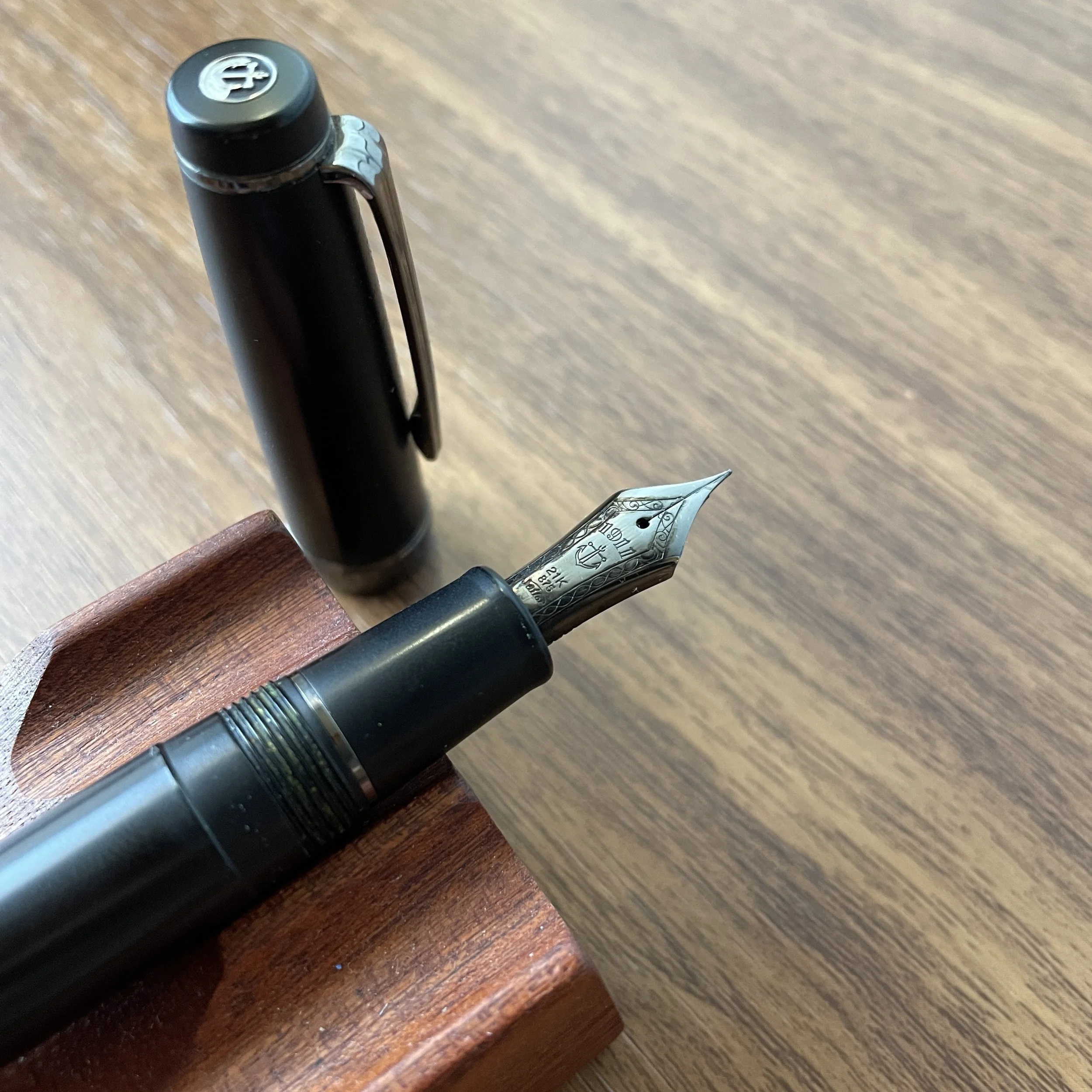
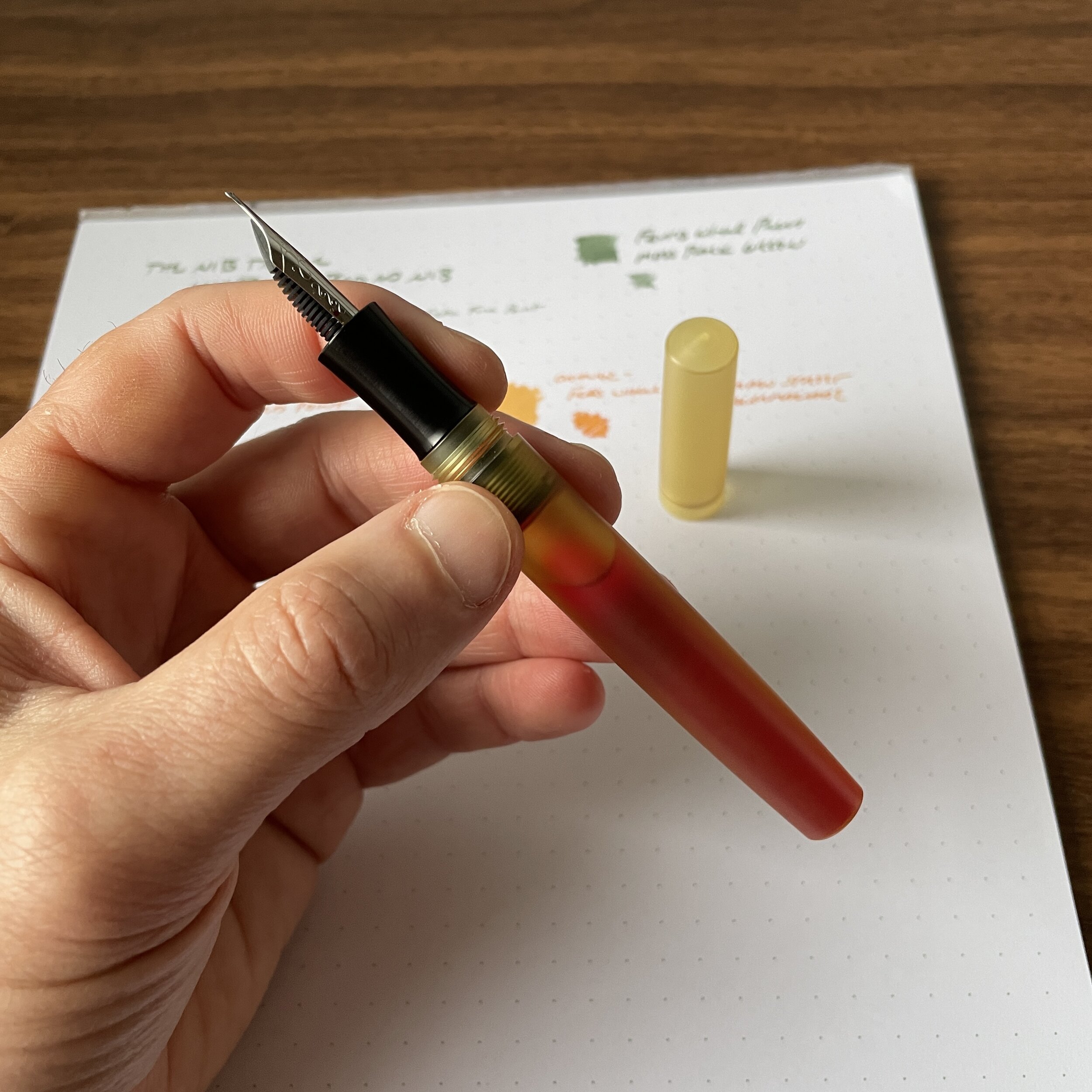
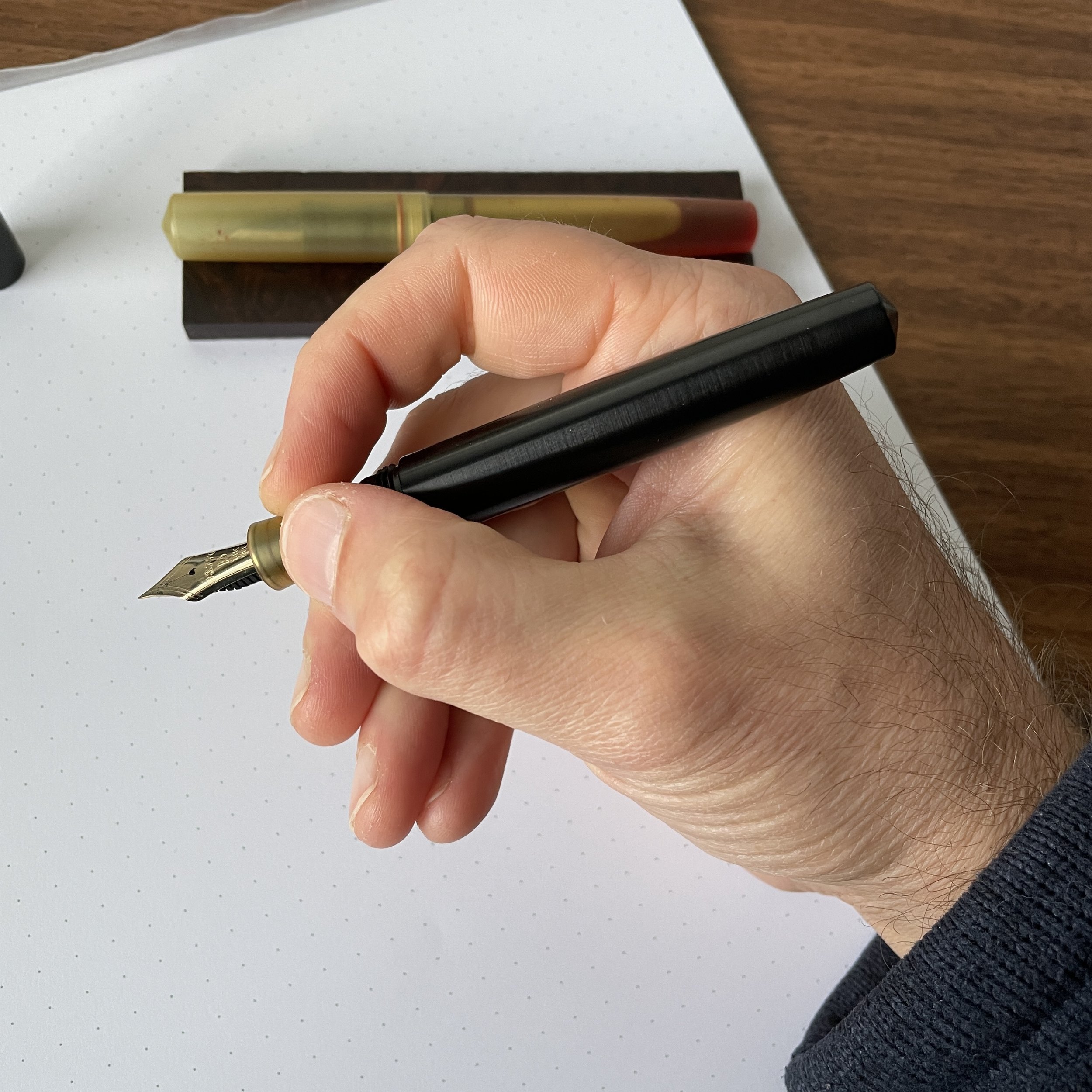
  • Nib Versatility. Designed to take a JoWo No. 6 nib unit, this opens the door to all sorts of customization, as I discussed in a separate article a couple of weeks ago. Currently, I have an “inverted architect” nib in my amber Ultem fountain pen, and a Platinum UEF nib in my Black Ultem (courtesy of specialty housings available from Flexible Nib Factory). Another fun fact: the parts and sections on the Schon Ultem pens are interchangeable, meaning that you can swap the amber section and/or cap onto the black pen, or vice-versa. Ian also sells a section designed to fit a larger No. 8 Bock nib, if you’d like a different sort of writing experience. (You will need to supply your own nib.)

Check out the red o-rings, visible in the amber Ultem cap, section, and barrel. In addition to making the pen eyedropper-ready, it’s a nice design touch that creates a cool look,

The Schon DSGN Ultem fountain pens get more or less an unqualified recommendation from me. The only potential drawback I can see for some people is the size. As with most of Ian Schon’s designs, these are compact fountain pens that may be too small for some people with larger hands, or who prefer a longer pen and don’t want to post the cap. Unposted, the pens measure 4.8 inches. Posting extends the length to roughly 6.25 inches but not everyone likes to post (even though the o-ring inside the cap pulls double duty as a failsafe against leaks AND a means of allowing the pen to post securely).

View fullsize Schon DSGN Ultem Unposted
View fullsize Schon DSGN Ultem Posted

Takeaways and Where to Buy

I have not taken my two Schon DSGN Ultem pens out of rotation since purchasing them in late August at the San Francisco Pen Show. I’ve used the pens both as traditional cartridge-converter fountain pens and as eyedroppers, and it’s hard to envision a more versatile fountain pen for everyday carry, in the sense that the pen can serve as both a durable pocket pen and a full-size “desk pen.” Throw in added points for eyedropper capability and the ability to easily swap out nibs, and the Schon DSGN Ultem fountain pen lands itself very high on my list of favorite releases from 2021.

Schon DSGN lists the Ultem fountain pens under the category of “Engineered Plastics” on the website, and you may have seen that in addition to the standard natural/amber Ultem and Black Ultem fountain pens, Ian now offers a “Peek” fountain pen, which is another engineered plastic that comes in a taupe or beige shade. (I can’t wait to get my hands on that, but I’ve purchased a bunch of pens lately and need to let things lie for a while.) The natural/amber Ultem pen is priced at $250, Black Ultem at $260, and Peek at $275.

If you’d like to read further on other Schon DSGN products, check out my review of the Schon DSGN Pocket 6, which can be found in the “Artisan/Custom Pens” section of the T.G.S. Fountain Pen Review Archive.

I purchased the pens featured in this review with my own funds. This post does not contain paid third-party affiliate links. The Gentleman Stationer is supported entirely by reader contributions and purchases from the T.G.S. Curated Shop. By shopping with us directly, you are supporting original content, pen reviews, pen show events, etc. from The Gentleman Stationer. If you would like to support us even further, please consider checking out the T.G.S. Patreon Program, which offers access to online meetups, exclusive discounts and pre-orders, and more!

In Pens Tags Schon DSGN, Schon DSGN Ultem Fountain Pen, Ultem, Pen Review, Fountain Pen
2 Comments

I have more black pens, matte black pens, and pens with black trim than I can count. This isn’t even a “mini-collection,” it’s a full-blown archive. (This also isn’t even half of them.)

The Allure of the Stealth Pen: What Makes the All-Black Pen So Popular?

October 23, 2021

For the first several years I participated seriously in this hobby (through the early-to-mid 2010s, it seemed as though pen companies were racing to introduce a “stealth” version of their various models, typically a black or matte black version of a pen featuring black-plated trim. (I’ve actually been around long enough to recall Pilot’s release of the current matte-black Vanishing Point, as well as a series of other VPs with matte-black trim and accents.) I’ve always wondered what makes these particular pens so popular. Black-on-black pens, and especially matte black pens, show no sign of going away anytime soon, so this week I spent some time noodling on it and felt compelled to put together an “all-black” carry for yesterday’s remote work outing.

From left, the Sailor 1911 “Black Luster” edition, my own T.G.S. x Sunderland mk1 rollerball, and the Montblanc “Midnight Black” Starwalker Rollerball. Case is a special edition Nock Co. Sinclair (since discontinued).

Originally, “stealth pen” marketing borrowed heavily from the “tactical pen” crowd, evoking military imagery, extreme durability, and touting the ability to bring your fountain pen along on those top-secret night missions. For example, I recall Monteverde marketing a pen with Goulet called the “Nighthawk” that featured black trim and a carbon fiber motif. Over the years, however, blacked-out pens and black trim in general became mainstream, not just a sub-category targeted to EDC (“everyday carry”) enthusiasts.

Contrary to popular belief, black pens don’t have to be boring. Not only can you add a splash of color to really set off the finish, but manufacturers can vary the design on things like the grip section to add a lot of character. Check out the knurling on the Montblanc Starwalker!

I’m not sure the popularity of black-on-black pens should come as a surprise. Black accessories of any sort are universally appreciated because they match easily, and while some might be hesitant to claim “black” as their favorite color, I’d venture that it has much wider appeal than the stereotypical “stealth pen” customer would suggest. Here are a few key reasons why I enjoy them myself:

  • Sleek, Understated Look. In my “real” life as a working attorney, there are contexts in which I need a pen to blend in to the surroundings and not become a distraction. Court hearings, depositions, and crowded meetings are NOT the time to break out the bright red Pilot Custom Urushi, or the Krusac Scrimshaw Navigator. On the other hand, a black makrolon Lamy 2000, Lamy Studio LX All-Black, or Sailor Pro Gear Imperial Black doesn’t obviously turn heads at first glance (and most people won’t notice the Lamy 2000 isn’t a rollerball). In a culture where, unfortunately, many consider using any sort of decent pen or pencil to be a pretentious affectation, black pens can be a good choice where you feel as though you need to fly under the radar.

  • Better Grip and Texture. My favorite pens are what I call my “workhorses,” or pens that I can write with all day. Matte-finish pens offer a pleasant grip and texture for all-day writing sessions or when you’re in a hot room with sweaty hands. The pen won’t get slick.

  • Black Pens Age Well. As I’ll further discuss below, most black pens, and especially matte black pens, will eventually show some wear and tear. Personally, I find that it adds to the aesthetic and I will never replace a pen for this reason. Look no further than my Sailor Pro Gear Imperial Black, which not only has worn smooth and shiny on the barrel from years of regular use, but now has a partially chrome (as opposed to black-plated) cap finial. I have experienced zero wear, however, on the black ion plating to the nib, clip, or cap band.

Some flaking on the cap finial is actually the only real wear and tear on my eight-year-old Sailor Imperial Black Fountain pen, which I re-reviewed years after I first purchased the pen.

Eight years and one dropped nib repair later, the nib on my Sailor Imperial Black looks just as good as it did when I first purchased this pen! Thanks Mark!

Of course, there are also some considerations that anyone considering a matte black pen - especially one with black trim - should keep in mind. First, if you’re particular about scratches, chipping, and visible wear on your pens, this finish may not be for you. Most matte texture is created using some form of powder-coating or anodization, and no matter how careful you are with your pens, the finish will eventually wear smooth, and you will likely accumulate some dings and scratches. As I noted above, I love how this looks over time, and merely serves as a reminder that my pens are tools meant to be used, but hey, personal preference. Second, if you are considering a pen with a plated or coated nib, talk to an experienced nib grinder before performing any sort of modification on the pen. Different manufacturers use different techniques to plate their nibs, and depending on the quality of the work and materials used, the coating can start to peel or flake off if the nib is ground. That’s not to say you can’t do it, but I’ve experienced it on a few pens across multiple brands and price points. (You can’t blame the manufacturers for this. When you choose to grind a nib, you are, after all, modifying their pen in a way that they did not originally intend. You are responsible for educating yourself on all the different things that might occur as a result.)

You know that you’ve really gone off the deep end when you find yourself purchasing things like these matte black Allex scissors, not necessarily because you have a burning use case for them, but because C.W. Pencil Enterprise is closing and, well, you just need these for your desk. (Great scissors, btw.)

While there have been murmurs in the pen blogosphere about blacked-out pens being “tired” or “played out,” I expect them to continue to sell well, and for manufacturers to continue to make these pens for as long as demand holds up. Personally, I consider this a classic design, and would love to see black trim in particular become a default option alongside the black/gold and black/rhodium that you see everywhere. I can’t help but think it might even outperform the current “standards.” Consider some other possibilities. I mean, Lamy recently released a brown Lamy 2000 with a brown plated clip. If they released a version of the 2000 with a ruthenium-plated clip, section, and nib, can you imagine how well that would sell?

(Maybe terribly, but I don’t care. I still want it.)

You can’t accuse me of inconsistency. I’ve always loved a matte-black pen with a dark red section. Here, the visibility isn’t the best because the alumilite has darkened over the years, but my Newton Shinobi is black ebonite with a dark, blood red alumilite section.

Ending with a Shameless Plug for the T.G.S. x Sunderland Machine Works MK1

Since I love black pens, it’s not a coincidence that I chose to incorporate a matte black finish into the first exclusive pen collaboration that I’ve done: the T.G.S. x Sunderland Machine Works mk1 matte-black and burgundy release. While you can read more on the specs for this pen in the shop listing, this release pairs the comfortable and functional Sunderland mk1 design with a durable bead-blasted matte-black and burgundy finish, along with a DLC (Diamond-Like-Coating) black stainless steel clip. I need to give Sunderland mad props for the durability of the finish on this pen - as I noted above, most matte pens will show wear over time, especially if you toss it into bags, pen cases, and pockets. After more than seven months of hard use, however, my current demo shows no wear, which can only be a testament to the quality of the processes used. (Note: I’ve intentionally NOT been gentle with this pen, since I wanted to see how it would hold up in the real world.)

Yes - the section threads are internal, so they don’t interfere with your grip.

I’d love to do more pen collaborations in the future, and given how well this one has sold, you can expect more from me in the coming year. The T.G.S. x Sunderland pen is not a limited edition, but it is a store exclusive, so you can only get it directly from the T.G.S. Curated Shop. Priced at $110, it’s a slight premium over the standard Sunderland mk1, mainly due to the cost of the bead-blasted finish and DLC coating. All proceeds go to support and grow T.G.S., both the blog and the fledgling shop operation!

This post does not contain paid third-party affiliate links. By shopping with us directly, you are supporting original content, pen reviews, pen show events, etc. from The Gentleman Stationer. If you would like to support us even further, please consider checking out the T.G.S. Patreon Program, which offers access to online meetups, exclusive discounts (including a slight price break on the Sunderland) pre-orders, and more!

In Editorial, Pens Tags Matte Black, Black Pen Society, Black Pens, Editorial
Comment

Workhorse Pens: Opus 88 Fountain Pens Offer Maximum Versatility

October 16, 2021

From the time Taiwanese brand Opus 88 hit the shelves in the U.S., I’ve been a fan. Combining classic pen design, the still somewhat uncommon Japanese-style eyedropper filling system, and widely available, interchangeable JoWo nibs, Opus 88 has jumped to the top of the list for many of us with writing-intensive occupations who appreciate demonstrator pens that hold a large volume of ink.

The Opus 88 Omar, left, next to the Jazz in “Holiday” finish that features dark trim.

Comfortable Streamlined Cigar or Vintage-Style Flat-Top Shapes

While Opus 88 does experiment with their design profiles (i.e., see the “Flora” which is shaped like a flower vase), their most successful designs have followed traditional streamlined (i.e., cigar-shaped) and flat-top styles. For me, these comfortable, well-balanced silhouettes are what has allowed me to evolve into a fan of more oversized pens like the Omar and the Jazz (both of which are pictured here). Originally, I had limited my dabbling in Opus 88 to the smaller “Koloro” lineup, the ebonite and acrylic demonstrators that were the first models to be released stateside. Later, after overcoming my initial hesitancy toward the modern trend of oversized pens, I had the opportunity to review the Opus 88 Omar, and later picked up the Jazz, which all things considered is probably the perfect size for me personally. The Opus 88 Jazz is slightly smaller than the Omar, with proportions approximating a Montblanc Meisterstuck 146.

The Opus 88 Jazz (right) compared against a Montblanc 149 (left).

Other Key Factors That Combine to Make Opus 88 Fountain Pens Great “Workhorse Pens”

There are many brands that make excellent fountain pens in the $100-200 range, so what kicks Opus 88 into “workhorse” territory for me personally? In addition to the comfortable shape and balance discussed above, I appreciate:

  • Large Ink Capacity. Pretty much any Opus 88 fountain pen is the definition of an “ink tank.” For example, in the Jazz fountain pen that’s been a daily companion for the past couple of weeks, I was able to pour in a full Vanness Pens 4ml ink sample. That should last me a while. If you have a favorite ink for your daily writing that you always like to keep on hand without worrying about refilling, the Opus 88 Japanese-style eyedropper filling system is an excellent no-frills option.

  • Nib Versatility. Earlier this week I wrote a piece on how you can take advantage of the interchangeability of nib units to customize your pens to suit your writing preferences, and I even used Opus 88 as an example. Both the Omar and Jazz models shown here use standard JoWo No. 6 nibs, which allows you to swap out the nib on these pens with any other JoWo-compatible nib unit, including Franklin-Christoph nibs and customized third-party options from Flexible Nib Factory. Keep in mind that certain Opus 88 models do not use JoWo No. 6 nibs, including the smaller Koloro line (which uses a JoWo No. 5), and the Bela, Flora, Flow, and Opera models, which use a Bock No. 6.

  • Price Point. Ok, with prices on steel nib pens featuring standard JoWo and Bock nibs pushing the $200 price point in some instances, it’s refreshing to see Opus 88 at the $125 level. While inflation, import costs, and other factors outside of anyone’s control might change that in the future, it would take a big price hike to ruin the value proposition on these pens.

View fullsize Opus 88 Omar and Jazz "Holiday"
View fullsize Opus 88 Jazz in-hand
View fullsize Opus 88 Japanese-Style Eyedropper Filling System

For further reading on what I look for in a “Workhorse Pen,” and other examples of pens that I consider recommended daily users on that level, check out my prior post titled “Picking a Workhorse: How to Choose a Fountain Pen for an Everyday Writer.”

The ability to swap nibs in Opus 88 fountain pens is a huge part of why I’ve enjoyed them so much.

Final Thoughts and Where to Buy

As I’ve become more comfortable with customizing my pens, I’ve leaned more heavily on Opus 88 in my day-to-day writing. I currently have two models inked: the Opus 88 Omar, which is paired with a broad Franklin-Christoph S.I.G. (Stub Italic Gradient) nib, and the Opus 88 Jazz (“Holiday Finish”), paired with a Platinum 3776 14k medium nib (using a custom housing from flexible nib factory). Both of the base models cost around $120, which in today’s market of ever-escalating fountain pen prices represents exceptional value.

You can find Opus 88 at most major pen retailers, though the T.G.S. Curated Shop has begun carrying certain models directly. Please stay tuned as we expand our offerings!

In Workhorse Pens Series, Pens Tags Opus 88, Opus 88 Omar, Opus 88 Jazz, Workhorse Pens
6 Comments

Favorite finish: I do wish Caran d’Ache would introduce this matte grey finish to other models in the 849 lineup, or even the Fixpencil!

Hands-On Review: The Caran d'Ache 849 Rollerball (or "XL Ballpoint"?)

September 29, 2021

Caran d’Ache’s latest release has started to gain more traction than expected, as reviewers have reacted positively to the (much) larger design and pen enthusiasts also embrace it. The curious part to me, however, is that while Caran d’Ache released this pen as what they called the “849 Rollerball,” some retailers are actively promoting this pen as the “XL Ballpoint.” The reason is simple enough: the pen takes a Parker-style refill, and there are enough gel, ballpoint, and rollerball options out there to place the 849 Rollerball in the same ballpark as versatile workhorses like the Retro 51 Tornado and Baron Fig Squire, both of which also accept ballpoint and gel Parker-style refills. Today I’ll take a closer look and talk a bit about why the 849 Rollerball has become one of my most-used everyday writers over the past few weeks.

Comparison to the Classic 849 Ballpoint

The first thing I wanted to know when Caran d’Ache first announced the 849 Rollerball was how the pen compared size-wise to the standard 849 ballpoint pen, a favorite of mine that serves as my go-to “click pen” probably 80% of the time. The Caran d’Ache 849 serves as the company’s flagship writing instrument, and is reissued every year in a wide array of special and limited edition finishes and collaborations. I have dozens of these pens, and it’s rare that you’ll find me without one clipped to my shirt pocket or in the pen slot of my notebook or planner.

Caran d’Ache says the 849n Rollerball is 28% larger than the 849 ballpoint. I had it pegged at closer to 50. Astoundingly, I didn’t notice much increased weight since the pen remains very well balanced.

So why mess with a formula that’s worked for decades? The downside to the standard Caran d’Ache 849 ballpoint is that while it works exceptionally well as a portable “jotter” pen - perfect for taking quick notes, writing checks, signing things, etc., it’s relatively slim and some might find it uncomfortable for longer writing sessions. The Caran d’Ache 849 rollerball maintains the hexagonal barrel shape - which I find comfortable - but is 28% larger without adding much weight. If I’m looking to take 2 hours worth of notes in a meeting, or spend a half-day marking up documents, I will take the 849 Rollerball option. If it can be done without adding too much weight and throwing off the balance of the pen, I find a larger barrel much more ergonomic.

I enjoy hexagonal barrels, especially where, as here, they aren’t too sharp.

The second reason is the refill. While I personally enjoy the proprietary Caran d’Ache “Goliath” ballpoint refill that ships standard in the 849 ballpoint, and Caran d’Ache is finally releasing the Goliath in more colors and tip sizes, you’re pretty much stuck with it as your only option unless you want to hack other refills and/or purchase a custom adapter from a third party. (I understand some people have had luck with certain brands of Parker-style refills in the 849 ballpoint. I have not. All of the Parker-style options I have tried are too long.)

The refill is very easy to swap out. You simply unscrew the knock and drop in the new cartridge.

The refill is very easy to swap out. You simply unscrew the knock and drop in the new cartridge.

The 849 Rollerball, on the other hand, is designed around a Caran d’Ache Parker-style rollerball cartridge, which in and of itself is a very nice writer that I could use regularly. It bleeds much less than the Schmidt refills that ship standard with the Retro 51 Tornado and the Baron Fig Squire, and I would definitely consider substituting this refill if you find the Schmidt too wet. That said, for daily use, I immediately swapped in the Uni Jetstream SXR-600 in .5mm, one of my favorite Parker-style options that also lives in several of my Baron Fig Squires. This hybrid ballpoint-gel refill has a fine tip that allows me to write small, dries quickly and has performed flawlessly in pretty much any pen I’ve tried.

Nothing too exciting here in the writing sample department (black rollerball refills, and all). Paper shown here is the Write Notepads Engineer’s Notebook, which also comes in pad form.

Takeaways and Where to Buy

Caran d’Ache has done a nice job of updating the 849 lineup over the past several years, building on its history and maintaining the classic “hex pencil” barrel shape while also adapting to the needs of new formats. For example, the 849 fountain pen includes a cap and a rounded section, yet it doesn’t take away from the inherent “849-ness” of the pen. Similarly, they made the rollerball larger to better adapt it to longer writing sessions - something rollerball users tend to appreciate more, in my experience - though again the pen still feels like a Caran d’Ache 849.

From left, the Caran d’Ache 849 Ballpoint, the Caran d’Ache 849 Rollerball, and the Retro 51 Tornado.

I also think Caran d’Ache nailed the price point on this pen. At just under $50 at most retailers, the 849 Rollerball is competitive with the Retro 51 Tornado and the Baron Fig Squire, its two primary “competitors.” (I would put “competitors” in quotations because these are all very different pens, and you can’t go wrong with any one option. It just depends on which shape and/or aesthetic you prefer.)

Available colors, from left: matte grey, white, matte black, red, and blue.

Most Caran d’Ache retailers are stocking the 849 Rollerball, including our own T.G.S. Curated Shop, which has the pen priced at $48. Currently, the 849 Rollerball is available in five colors: a matte grey, a matte black, red, blue, and white. My personal favorite at the moment is the matte grey, which I selected for my own personal pen, with the white version a close second. All of the options look great, however, and I can’t wait to see whether Caran d’Ache introduced additional colors, or even makes the 849 Rollerball available for collaborations.

The T.G.S. Curated Shop is an authorized retailer of all brands we carry. By shopping with us, you are supporting original content, pen reviews, pen show events, etc. from The Gentleman Stationer. If you would like to support us even further, please consider checking out the T.G.S. Patreon Program, which offers access to online meetups, exclusive discounts and pre-orders, and more!

In Pens Tags Pen Review, Caran d'Ache 849 Rollerball, Rollerball
8 Comments

Today’s review pens: a Scriptorium Balladeer and Schon DSGN Ultem Fountain Pen.

Spotlight On: The Nib Tailor, Featuring Architect + Inverted Architect Nib Grinds

September 18, 2021

I’ve known J.C. Ament for years, from way back when he was attending shows as an enthusiast, to when he started dabbling in nib work under his previous brand, Nibs on Point. I wanted to take a moment today to let everyone know about his latest endeavor, in which he’s embarked on nib work full time as “The Nib Tailor.” Before he took a break from pen shows, J.C. sent me two examples of his work for review: a broad “standard” Architect nib that has since lived in my Scriptorium Balladeer, and what J.C. calls an “Inverted Architect,” a nib that I’ve swapped between a bunch of different pens but which now lives in my Schon DSGN Ultem.

Before we get started looking at nib grinds, check out this eyedroppered Schon DSGN Ultem fountain pen, which is shown here holding a full 4ml ink sample!

Before we get started looking at nib grinds, check out this eyedroppered Schon DSGN Ultem fountain pen, which is shown here holding a full 4ml ink sample!

Standard Architect Nib vs. Inverted Architect Nib

For newer readers, or those unfamiliar with specialty nib terminology, an Architect nib (also sometimes referred to as a “Hebrew Italic”) is the reverse of your classic stub or italic-style nib in that an Architect has broad cross-strokes and narrow downstrokes. If the grinder is skilled, you can usually use the reverse side as a needlepoint, or ultra-extra fine, nib.

Architect’s Nib Grind, with the signature blade-like shape. Turn the nib over and write with the tip for an extra-fine line.

Architect’s Nib Grind, with the signature blade-like shape. Turn the nib over and write with the tip for an extra-fine line.

An “Inverted Architect” is, well, the inverse: it’s basically a needlepoint/extra-fine nib with an Architect grind on the top, which you can use if you invert the pen. For my particular writing style and use case, the Inverted Architect serves a unique purpose: annotation and highlighting. I can use the extra-fine tip to take notes in the margins of documents, and the Architect side for highlighting/underlining, provided I select an appropriate ink color such as a bright orange or green.

“Inverted Architect” Nib Grind, with the needlepoint tip and “flat top.”

Writing samples for both a standard Architect nib (top, in Ferris Wheel Press Moss Park Green), and an Inverted Architect (bottom, in Ferris Wheel Press Main St. Marmalade), both inks courtesy of Vanness Pens.

A Word of Caution: If you’re new to fountain pens, or have never used an Architect nib, I would strongly advise you to consider borrowing one from a pen friend or visit a pen show prior to ordering this particular grind. Architect grinds can be a bit temperamental, in the sense that they can go from smooth to scratchy very quickly depending on the angle at which you hold your pen (and they’re not “butter smooth” writers to begin with, since you’re essentially making cross-strokes with a blade). It’s extremely important that the nib grinder understands your writing angle, so if you cannot visit in person, I would send multiple photos of how you hold the pen and the angle at which the nib hits the paper. That said, if you do decide that an Architect nib is for you, this grind gives your writing truly unique character. For those interested in reading further, I’ve previously written posts about various options for nib customization.

View fullsize Ferris Wheel Press Main St. Marmalade
View fullsize Ferris Wheel Press Moss Park Green

The Nib Tailor - Available Grinds and Pricing

The two nibs shown here are just a small selection of what The Nib Tailor has to offer. You can choose from pretty much any custom nib grind, and J.C. has a detailed form for you to complete alongside your inquiry. In addition to custom work (i.e., where you send in your pen), you can purchase pre-ground nibs in various styles depending on availability. Visit the Nib Tailor website for additional details. Pricing is standard, running from $25 for a simple tuning to $55-60 for more complex grinds. In addition to mail-in work and pen shows, J.C. occasionally grinds nibs in-store at Bertram’s Inkwell, and I believe he will be there this weekend. Check out his Instagram for details.

Disclaimer: This is NOT a paid advertisement. That said, I can’t recall whether J.C. gave me these nibs for free, or whether I paid for them. Either way, he’s a friend of mine but I still think he does good work. Given the increased demand for nib work, especially at pen shows, it’s great to see new faces entering the market. It keeps nib work accessible, and ensures that future generations will have the same opportunity to enjoy customized writing experiences!

In Editorial, Unusual Stationery, Pens Tags The Nib Tailor, Architect Nibs, Inverted Architect Nib, Nib grinding, Custom Nibs, Custom Grinds
1 Comment
← Newer Posts Older Posts →
Store Location
Visit the T.G.S. Curated SHOP
*New* Updated "Best Pens" Guide (2025)
TGS x Hinze Pens Violet Tendencies Taschenstift Fountain Pen
Hierarchies of Fountain Pen Friendly Paper
Allex Scissors arrayed on a desk showing link to desk accessories

Join Our Patreon!
Subscribe to the TGS E-mail List

Featured Posts

Featured
Joe's-Journals-New-Old.jpeg
Jul 2, 2025
Time to Pick a New Personal Journal: Maruman Mnemosyne Hardcover A5 Journal
Jul 2, 2025
Jul 2, 2025
Desk-Accessoris-Unstaged.jpeg
Jun 25, 2025
Getting Personal: Five "Stationery Adjacent" Items I Can't Live Without
Jun 25, 2025
Jun 25, 2025
Pilot-Iroshizuku-Yama-Budo-Writing-Sample.jpeg
May 24, 2025
Joe's Picks: Five Favorite Inks From Pilot's Iroshizuku Lineup
May 24, 2025
May 24, 2025
The Gentleman Stationer RSS

© Digital Divide Media, LLC, 2014-present.

All content is the exclusive property of Digital Divide Media, LLC, d/b/a The Gentleman Stationer, including “The Gentleman Stationer” website and trademark, and should not be reproduced without express written permission.  All rights reserved.

All content containing paid advertising, affiliate links, or sponsored content will be plainly disclosed by a disclaimer when/if featured.

Contact Information

Store Shipping Policy and Return Policy

Privacy Policy

Cookie Policy

Terms and Conditions

Powered by Squarespace