• Blog
  • Shop
  • Resources
  • FAQ (Ask TGS)
  • About
  • Archive
  • Contact
  • Sign In My Account
Menu

The Gentleman Stationer

Vintage Living in the Modern World.
  • Blog
  • Shop
  • Resources
  • FAQ (Ask TGS)
  • About
  • Archive
  • Contact
  • Sign In My Account

Pen Review: The New Parker Urban Fountain Pen

April 19, 2017

The Parker Pen Company is a conundrum. Once a venerable U.S.-based manufacturer, the past ten-plus years have not been kind, to put it charitably. While Parker's higher-end pens such as the Sonnet and Duofold have done ok, and certainly have their fans, the company's entry and mid-level offerings have been subpar. I'm specifically talking about the Parker Urban and the Parker Vector, which you may have seen in - or even purchased from - the "luxury writing instrument" section of your local big box store such as Staples or Office Depot. 

A few years ago I purchased one of the "Urban Premium" fountain pens in the special edition "Mandarin Yellow" color, which bore absolutely no resemblance to the iconic "Mandarin Yellow" Parker Duofold: it was a cheap looking gold. The nib was mediocre at best, and suffered from skipping and ink starvation. I managed to turn it into a serviceable writer with some extensive tinkering (and using extremely wet inks), but it was never going to make it into my rotation so I sold it off at a steep discount to what I paid. Lesson learned, right? 

Well, maybe. In late 2016, Parker announced a complete redesign of it's entire pen lineup. The design of its higher-end pens (i.e., the Duofold, the Premiere, and the Sonnet) didn't change much, though Parker tweaked the engravings on the nibs. The lower-end pens (the Urban and the Vector) saw the most drastic changes, and, supposedly, the greatest improvements in quality control. Massdrop sent me one of the new "Urban Premiums," so I decided to put it through the paces and see whether the "new Parker" was for real, or just more of the same.

Note: The U.S. Parker website still shows the old pen designs, while the U.K. website shows the new collections. More on this below, but I hope to see the new pens coming to U.S. retailers soon.   

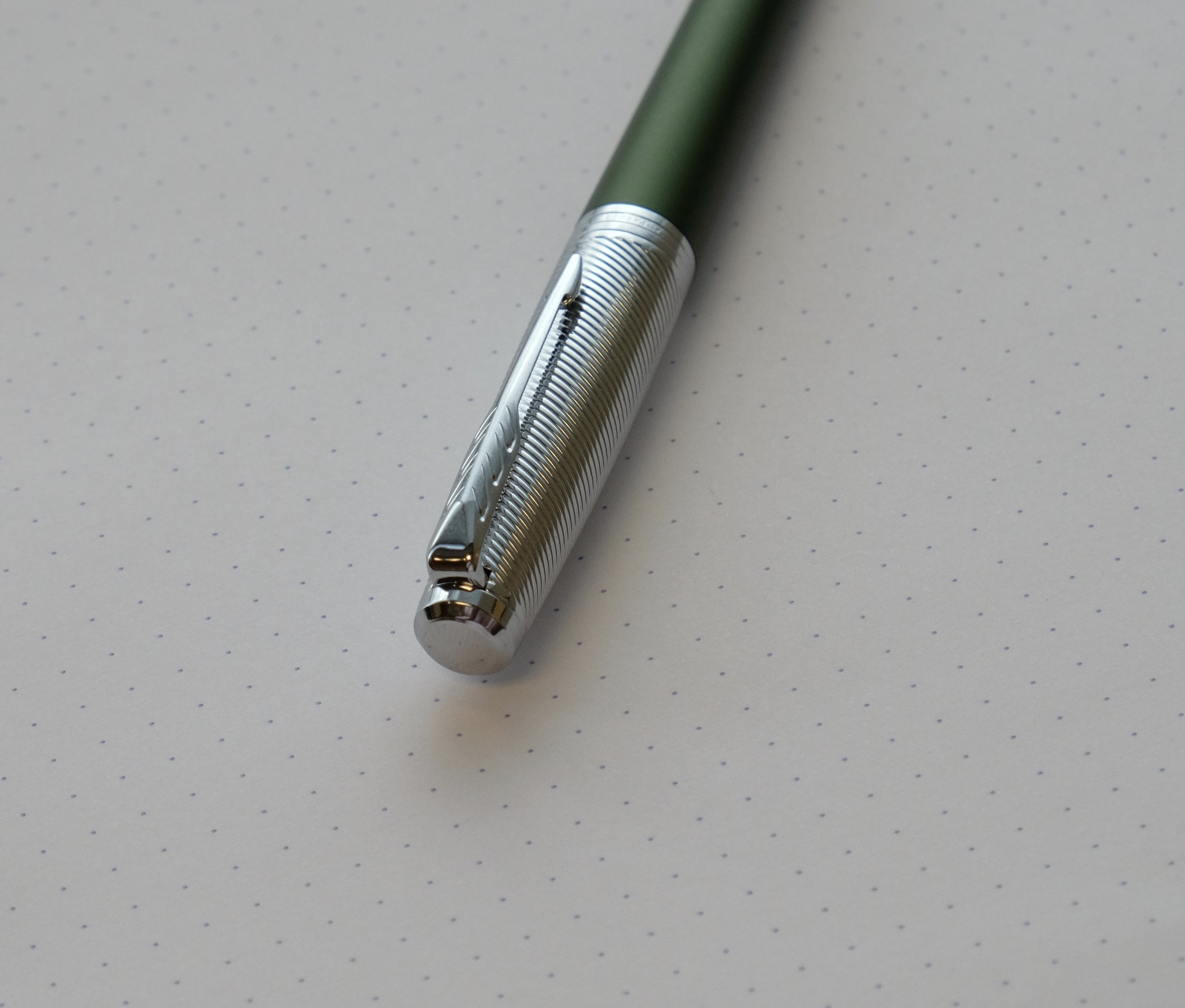
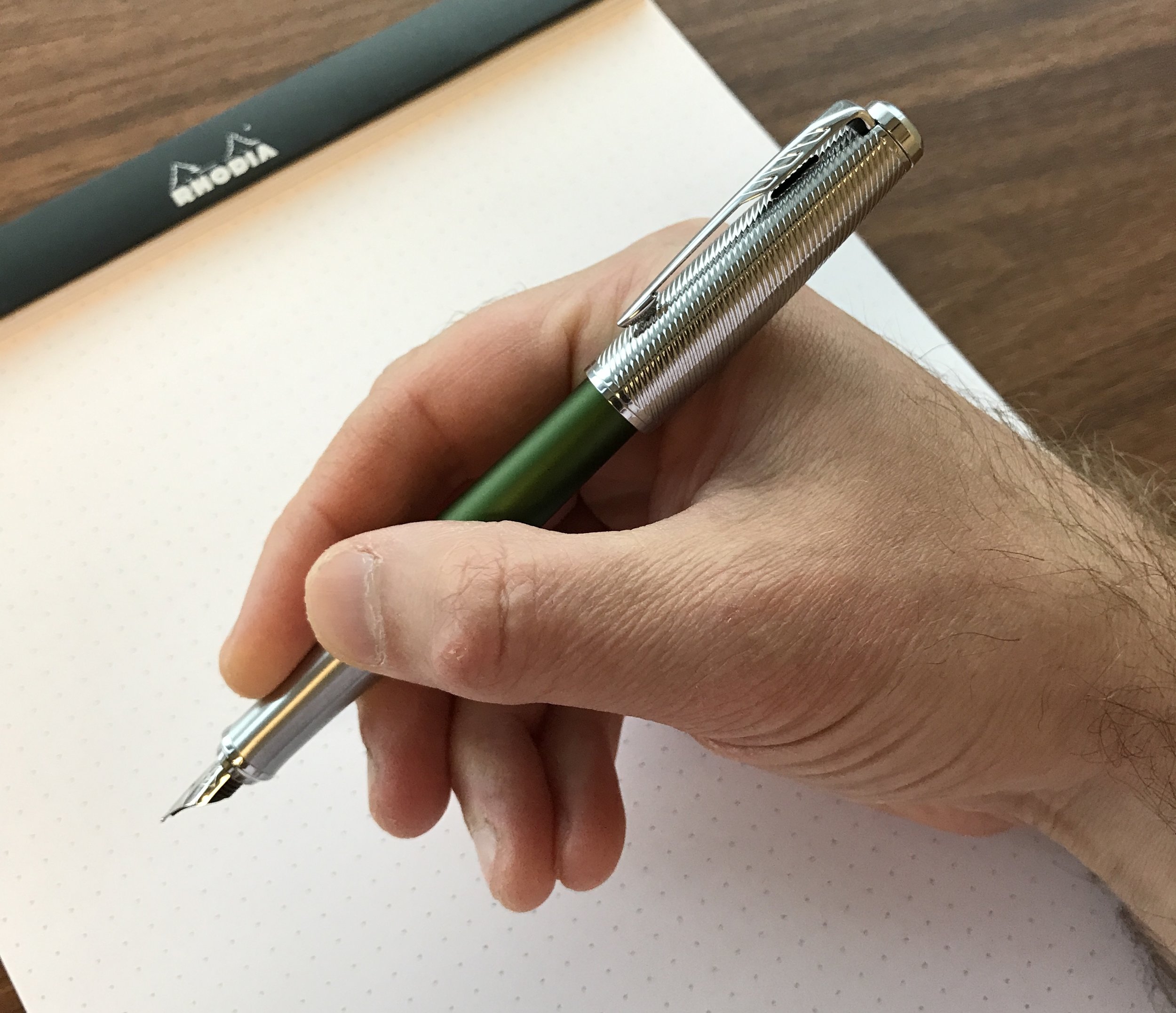
The new redesigned nib on the Parker Urban. Parker chose to ditch the tubular-style nib and go with something closer to the Sonnet. I like it, and it writes much better than the old pens. 

Pros and Cons

Short answer: I like the new Parker Urban much better than the old one.  This is a good fountain pen, but the current price point is going to hurt its market share.  I'll break it down further.

What I like: 

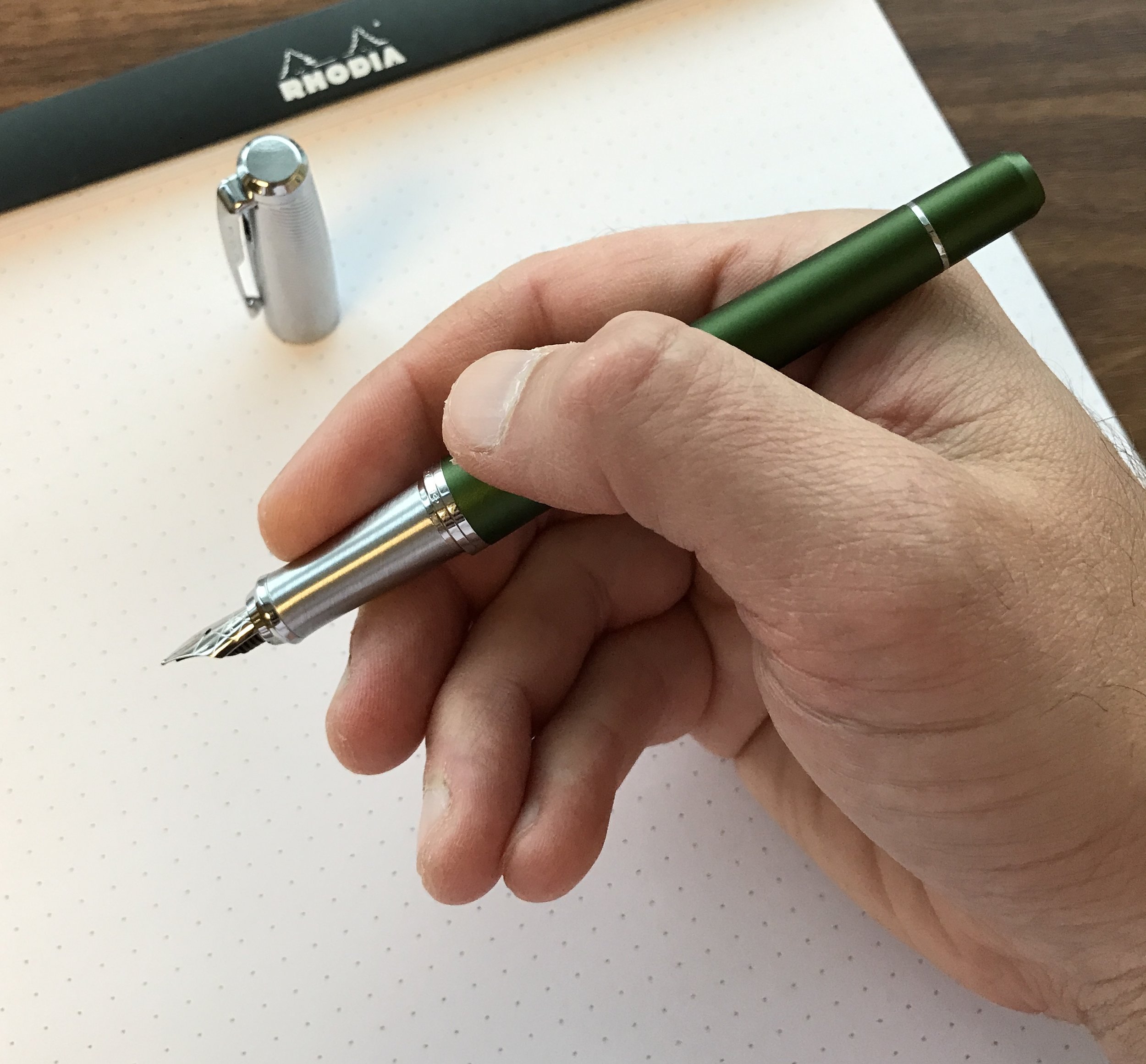
  • New Nib. Parker has abandoned the tubular-style nib on the old Urban for what looks like a standard No. 4 or No. 5. The nib on my Urban Premium has a cross-hatching pattern etched into it, and writes what I would call a fine-medium line. (The nib is labeled a fine.) It's a smooth, fairly wet writer - the direct opposite of the old Urban.
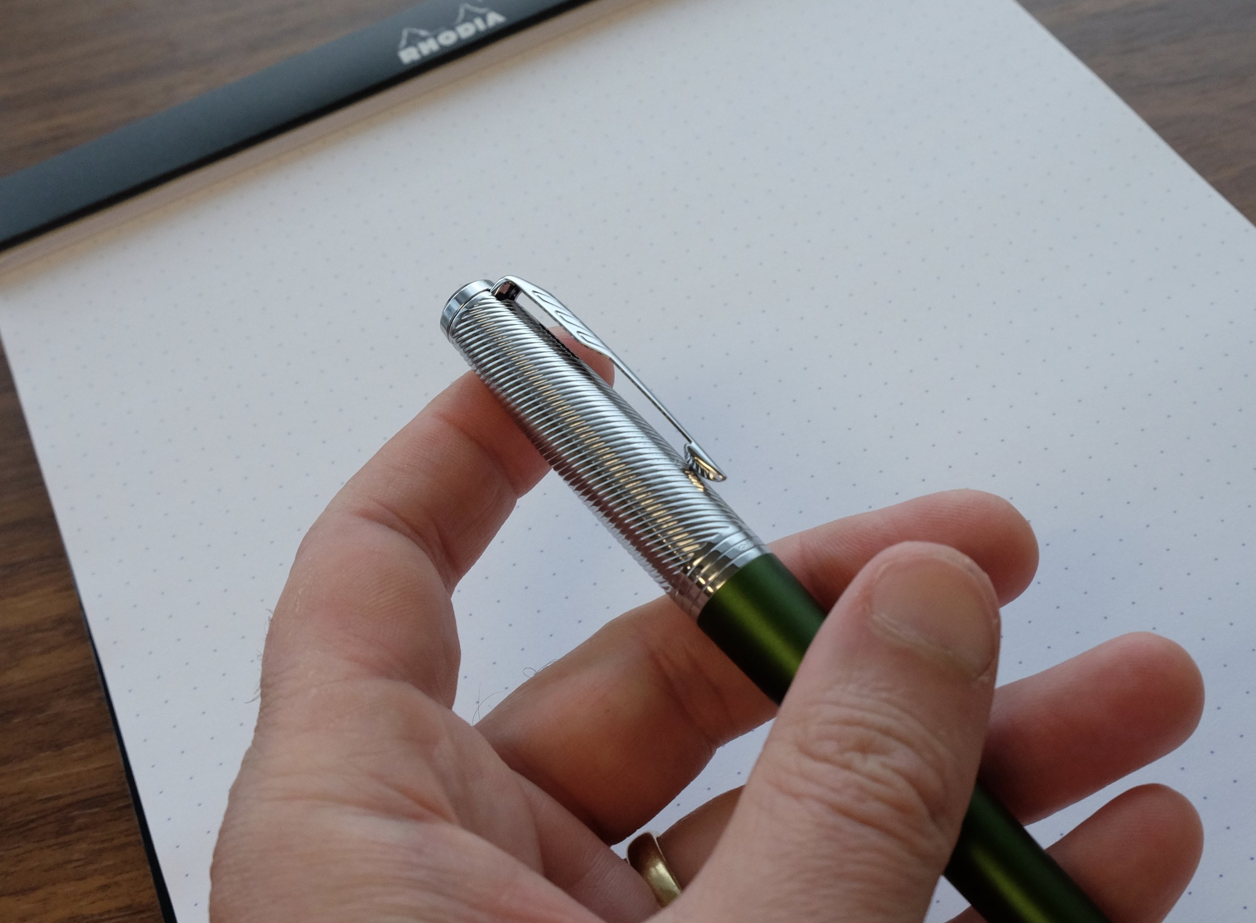
  • Solid Cap. At least with respect to the Urban Premium, this isn't a flimsy pen with a thin aluminum cap that will warp and dent from the slightest knock or drop. I'm not sure what the material is (probably still aluminum) but it's got a nice weight to it and feels substantial. The cap posts easily, and is friction fit with very little wiggle.  The clip is tight.  
  • Overall Redesign. Parker ditched the "hourglass" shape of the old pen in favor of a tapered design that sits very comfortably in your hand, posted or unposted.

What I don't like: 

  • The Price Point. This is a good pen, but not a good value.  I've seen the Urban priced at anywhere from $40-50 for the standard pen, to $60-100 for the "Urban Premium" featured here. (The Urban Premium features the chrome cap and section.) The Parker Urban is not a $60+ pen, period, just like the Parker Sonnet is not a $300 pen. It could, however, be a very good to great sub-$50 fountain pen.  I'm curious to see what the street price will be once these pens become more widely available, OR whether the high MSRP combined with Parker's history of QC issues on their cheaper pens will scare retailers away from stocking them in the first place. 
  • No Converter. If you're pricing a pen in the $60-80 range, include a damned converter, especially if the cartridge you're including with the pen is only going to be 1/3 full of ink.
  • Slippery Section. While the brushed metal section has some texture to it, it's still pretty slick. The step between the body and the grip is also sharp, which may cause problems for some people depending on how they grip the pen.   

No converter and an empty cartridge - this thing was literally empty after a page of writing, if that.

View fullsize Parker Arrow Clip
View fullsize Posted in-hand
View fullsize Textured Metal Cap
View fullsize Unposted in-hand

Takeaways and Where to Buy

Given that I went into this review prepared to dislike this pen, you could fairly say that I've been blown away by how well it writes, especially given my past experiences with the Parker Urban. The current price point is way too high, in my opinion, but pricing can change, and if that's the cost of improving Parker's quality, it's probably better for them to have an overpriced $60-80 fountain pen that writes well and functions as intended than to sell a $40-50 piece of junk that makes people write off your brand (or worse, never want to pick up a fountain pen again). The new Urban has placed Parker back on my radar and has me thinking of moving outside my Sonnet comfort zone. (That new "Big Red" vintage-inspired Duofold is calling my name....)  

The textured cap and a brushed metal section lend the new Parker Urban Premiere a classy look. I just wish the price point were slightly lower. 

So far, Parker's new lineup appears to be regularly available only from non-U.S. retailers and Amazon, with U.S. retailers still stocking the old product line. Even Parker's U.S. online store shows only the old offerings. I assume they're trying to sell off old stock before introducing the updated lineup, but I'm still surprised that it's taken this long. For now, taking into account shipping costs on a pen at this price point, Amazon is probably your best bet, and certain colors are less expensive than others.   

Further Reading

The Parker Sonnet is still my favorite pen in Parker's current lineup, and I've done a couple reviews of different models. Here are some links to my reviews of the "Great Expectations" edition, as well as the Chiseled Sterling Silver version. 

Disclaimer: I was sent the pen featured in this review free of charge by Massdrop, which is not currently running a drop for the Urban. This post contains affiliate links. Any discussion of price and availability is current as of the time of publication of this review, and subject to change. 

In Pens Tags Parker Urban, Parker, Pen Review
1 Comment
fullsizeoutput_2671.jpeg

Limited Edition Alert: Baron Fig Confidant "Metamorphosis"

April 17, 2017

The Spring limited editions are starting to drop, including the quarterly entry in Baron Fig's Confidant subscription service. This quarter's theme is "Metamorphosis," which features a peach/pink cover, a bright blue bookmark, and dot grid paper. 

“Great ideas don’t materialize all at once, but rather as a series of thoughts that come together to create something bigger. Metamorphosis reminds us to start small and keep going.”
— Baron Fig

Where to Buy

I'm really digging the peach color, and the "Metamorphosis" notebook might be my favorite limited edition Confidant so far. You can purchase "Metamorphosis" directly from Baron Fig. If you'd like to receive the limited edition Confidant notebooks automatically each quarter (and at a small discount), consider purchasing a one-year subscription.   

Disclaimer: The product featured in this post was sent to me by Baron Fig at no charge. I was not otherwise compensated for this review.  

In Notebook Review Tags Baron Fig, Baron Fig Metamorphosis, Limited Edition, Notebook
1 Comment

Stock Stubs: Exploring Specialty Nibs

April 15, 2017

I've written before on nib customization, and how much fun it can be to attend a pen show and have a nib technician (or "nibmeister") grind a nib into something more unique than your standard fine, medium, or broad. But what if you can't get to a pen show, or you don't know that you want to spend $40-70 to have the nib on one of your pens irreversibly modified? If you're interested in trying something different, I'd recommend that you start with a stock stub, available at price points as low as $15. 

What is a stub nib? 

Two of my favorite stock stub nibs: left, the Pilot Metropolitan, and right, the TWSBI Eco 1.1mm. 

A stub is an italic-style nib that will give you the line variation of a formal italic (i.e., thick downstrokes and thinner horizontal cross-strokes - see pictures below) but isn't so sharp that you can't use the nib as a daily writer. A stub nib is squared off, like an italic, but with more tipping material and rounded edges to help the nib write smoothly. While I personally can tolerate a bit more "crispness" in my italic nibs, when I first started out in the pen hobby I used a lot of stubs because they are so easy/pleasant to write with, and still break them out from time to time. 

View fullsize TWSBI 1.1mm Stub
View fullsize Pilot Metropolitan 1.0mm Stub
View fullsize TWSBI - Pilot Stub Comparison
View fullsize TWSBI - Pilot Line Variation

Note: Most stock steel stubs are technically better described as a hybrid between a stub and an italic - they don't have much, if any tipping material, though their edges have been smoothed significantly, to the point where I don't have a problem referring to them as "stubs."  

Best Standard Stock Stub Nibs

Those interested in trying a stub-nib fountain pen have a lot of low-cost options to choose from. Here I'm going to limit myself to four recommendations, though others do exist. Some of these pens even feature interchangeable nibs and screw-in nib units, so if you end up not liking the stub nib, you can swap it out for something more to your liking. 

  • Pilot Metropolitan. Pilot recently released its $15 Metropolitan with a 1.0mm steel stub nib. Previously, if you wanted a steel stub by Pilot, you had to purchase a Plumix calligraphy pen and swap the nib on the Plumix into the Metropolitan. While this stub probably falls more on the "italic" end of the spectrum - there's not a lot of tipping material at all and it's crisper than the TWSBI - it's still a smooth nib that's not too wet. I've been using this off and on for the past couple of weeks at work without any major issues even on the cheapest of paper. (My review of the Metropolitan)
  • TWSBI Eco 1.1mm Stub Nib. At the $30 price point, you can purchase the piston-filling TWSBI Eco with a stub option. TWSBI stubs are also very smooth, and I find them rather wet, depending on the ink you choose. If you'd like the ability to change nibs more easily, consider the TWSBI 580, Diamond Mini, or Vac Mini, which are more expensive but allow you to purchase aftermarket interchangeable nib units. You can change the nib on a TWSBI Eco, but the nibs aren't sold separately - you'd have to purchase a new pen and pull the nib (or trade nibs with someone else you know). (My review of the TWSBI Eco) 
  • Conklin Stub Nibs. A couple months ago I had the opportunity to try out a Conklin Mark Twain Crescent Filler with a stub nib, and came away very impressed. Conklin pens are manufactured by Stipula in Italy, and you can find them at price points as low as $52 (or even below that with a discount code). If you like Conklin's designs, their stub is a great option. (My Review of the Conklin Mark Twain)    
  • Lamy Italic Nibs. Finally, Lamy sells stub/italic nibs in widths ranging from 1.1mm to 1.9mm, that fit the Safari, Studio, and AL-Star line of pens. (Links are to my reviews of those pens.) These nibs are typically sold separately - Lamy nibs feature a proprietary design that allows you to easily slide them on/off the pen. I've had mixed experiences with Lamy nibs, so I'm hesitant to give them a glowing recommendation since they can be somewhat sharp writers and a bit drier than the other recommendations on here.    

As I mentioned, this post is not intended to serve as a comprehensive guide to stock specialty nib options - just a starting point.  Many pen companies such as Pelikan, Montblanc, Aurora, etc. offer stock stub, oblique, and italic options, albeit at a much higher price point than the pens discussed here. If you own a pen that accepts JoWo nib units (like many custom pens from Edison, Shawn Newton, etc.), you may also want to consider Franklin-Christoph specialty nib units, many of which are hand-ground by Mike Masuyama. Again, they will run you a bit more, but the quality and variety is exceptional. I may do a stand-alone post discussing these nibs in the future! 

Disclaimer: The Pilot and TWSBI pens featured in this review were purchased with my own funds, for my own collection, from Anderson Pens, a sponsor of this blog. This post also contains affiliate links.    

In Guide Tags Stub Nibs, Specialty Nibs, Guide
8 Comments

Pen Review: Sailor Pro Gear Realo "Soleil" Limited Edition

April 12, 2017

The Sailor Professional Gear - known to most pen nerds as simply the "Pro Gear" - is my favorite fountain pen of all time. I appreciate it's compact form factor, comfortable shape, and excellent 21k nibs. As of the time of writing, I own four Sailor Pro Gears, and I usually keep two inked. My collection includes the Pro Gear Imperial Black Edition, the Pro Gear "Sky" Limited Edition, a Pro Gear Classic in yellow, and the pen I'm reviewing here, the Pro Gear Realo "Soleil," a limited edition pen that Sailor made specially for retailer Bungubox (or Bung Box) in Hamamatsu, Japan.

Comments on the Soleil

Yellow pens are one of "my things," and this is an especially bright, sunny shade (hence the name). The color stops just short of Lamy Safari/AL-Star neon - which is a good thing - and the yellow gold trim complements the material nicely. I could do without the "Soleil" engraving on the barrel, but this is such a unique piece I don't really mind. 

This special edition Pro Gear Realo has "Soleil" engraved on the barrel. 

This particular pen sports a H-F, or "Hard Fine," nib. If you prefer stiff, slightly dry writers, then the Sailor HF will probably work for you right out of the box. I tend to prefer pens with slightly wetter ink flow, so this one will probably take a trip to Mike Masuyama at the Atlanta Pen Show for a tuning. It's also a touch toothy for my taste and can hard start every once in a while, but nothing that keeps me from regularly cycling this pen through my rotation.

The Pro Gear Realo Soleil comes with the standard 21K Sailor Gold Nib, with the typical Sailor "1911" engravings.   

Side Note: In general, I've noticed that the rhodium plated and black coated Sailor nibs tend to write a bit smoother and, at least in the case of the black nibs on the Pro Gear Imperial Black and 1911 Black Luster editions, write a bit softer than the standard yellow gold nibs. I assume this has something to do with the fact that these nibs are plated/coated.   

I've always kept this pen loaded up with an orange ink - fitting, no? The ink featured here is the now-discontinued Sailor Jentle Apricot. For a similar color in Sailor's current ink lineup, check out Sailor Jentle Kin-Mokusei, 

Realo vs. Pro Gear Classic

So what about the bigger question: if you're looking to buy a Sailor Pro Gear, do you go for the "Classic" model or the Realo? If you prefer piston-filling fountain pens, then you really only have one choice: the Realo. The Pro Gear Classic is a cartridge-converter pen. Some people quibble with the quality of Sailor converters - and I agree they're not great - but I also hesitate to recommend that people pay nearly $100 extra just to get the piston filler on the Realo, especially given the limited range of colors in which the pen is available. 

A shot of the Pro Gear Realo Soleil Compared to my yellow Pro Gear from the Classic "Color" Series. I like both pens, but overall I prefer the shade of yellow on the Classic. Sort of like the vintage Parker Duofold Mandarin.

While the Realo is a good pen, with a quality piston and a convenient ink window, I think the Classic has a cleaner, more balanced look overall. The Realo also tapers more towards the piston knob, which makes it look "pinched," in my opinion. That said, I post my pens when I write, so I don't really notice.

Where to Buy

Sorry, but you can't buy this particular version of the Realo anymore, at least not from a retailer. Like many of Bung Box's other Limited Editions, the Soleil sold out relatively quickly and you're now limited to whatever shows up on the secondary market. I picked this one up secondhand from an eBay seller, and jumped on it the minute I saw the listing.

That said, if what you're looking for is a piston-filling version of the Pro Gear, most Sailor retailers (such as sponsor Pen Chalet) carry the standard Realo model, but the color/trim combinations are few outside of the periodic limited editions. The standard Pro Gear Realo comes in two colors: black or burgundy, both with gold trim, priced at around $330. Currently, Classic Fountain Pens (nibs.com) is offering a 22nd Anniversary Yellow and Black Limited Edition, but it's pricey at $520. I love my Pro Gears, but I'm not sure it justifies that sort of expenditure.

Further Reading

I've reviewed a few other versions of the Sailor Pro Gear. If you're interested, check out my reviews of the Pro Gear Imperial Black Edition, and the Pro Gear Sky Limited Edition.

Disclaimer: I purchased this pen with my own funds, for my own collection. This post contains affiliate links.       

In Pens Tags Sailor, Sailor Pro Gear, Bungubox, Bung Box, Sailor Pro Gear Soleil, Pen Review
Comment

Robert Oster Inks come in a unique tall, slender plastic bottle, which makes the inks both easier to ship and to store. 

Ink Review: Robert Oster Melon Tea and Fire and Ice

April 8, 2017

Many thanks to Lisa and Mike at Vanness Pens for providing me with some more samples of excellent Robert Oster Inks to test out! The two I'm reviewing today are Melon Tea, a brownish green (or greenish brown, depending on how you look at it), and this year's new hotness, Fire and Ice, which as you might expect from the name is a teal blue with a red sheen. I thoroughly enjoyed both of these inks, and look forward to picking up a bottle of Fire and Ice soon. (I already bought a full bottle of Melon Tea at the Baltimore Pen Show.)

Melon Tea

A writing sample on Tomoe River paper from my Hobonichi Planner. The pen used here was my Kanilea Pen Co. Mauna Kea with a medium nib. 

I'm a big fan of green ink, especially darker shades of green-black or "racing green" inks. Robert Oster Melon Tea undergoes a bit of a color shift as it dries. When I was writing with this ink, I found that it appeared more green when wet, but as it dried the ink darkened and the brown shades became much more apparent. This ink was well-behaved and gave me no trouble whatsoever. It flowed well in the pen, dried quickly, and I didn't experience any smearing or bleed-through on any paper, other than the cheapest of recycled office garbage. 

Fire and Ice 

A shot of Robert Oster Fire and Ice "straight on" without the sheen showing. Note the dark areas of shading in this picture. 

One thing that I love about Robert Oster inks is the fact that the company has been able to achieve such vibrant colors without oversaturating the inks with dye, which typically leads to problems with smearing, slow dry times, bleedthrough, etc. I'd ordinarily be hesitant to try a "crazy" color like Fire and Ice, but this ink received such rave reviews that I had to go ahead and try it for myself.

Another writing sample, this time photographed in the light and from the side. Check out the sheen! 

Fire and Ice is usually described as a dark teal or turquoise that is famous for its red "sheen," which in fountain pen ink terms refers to a layer of color (usually red) that appears on top of an ink as it dries. Other famously "sheen-y" inks include the legendary Parker Penman Sapphire, J. Herbin Emerald of Chivor, and Diamine Majestic Blue (at least in the old formulation). Robert Oster Fire and Ice doesn't disappoint, and is one of those rare hyped inks that functions perfectly well as a daily writer, in addition to having a little something extra to keep things interesting. Like Melon Tea, this ink dries very quickly and doesn't smear at all. I was somewhat shocked at how low-maintenance this ink was. 

Where to Buy

You can purchase both Melon Tea and Fire and Ice, along with many other colors of Robert Oster inks, from Vanness Pens. Robert Oster Inks are reasonably priced at $16 for 50ml, which is a bargain for ink of this quality. As I mentioned earlier, I love the form factor of the Robert Oster bottles, which are tall and skinny and make for easy storage in a drawer. They even include a label and color swatch on top of the cap!

If you missed my previous review of some other Robert Oster colors, check them out here! 

Disclaimer: Thanks to Vanness Pens for providing me with the inks featured in this review. I was not otherwise compensated for this post in any way. 

In Ink Reviews Tags Robert Oster, Ink Review, Vanness, Melon Tea, Fire and Ice
Comment
← Newer Posts Older Posts →
Store Hours and Location
Visit the T.G.S. Curated SHOP
*New* Updated "Best Pens" Guide (2025)
TGS x Hinze Pens Violet Tendencies Taschenstift Fountain Pen
Hierarchies of Fountain Pen Friendly Paper
Allex Scissors arrayed on a desk showing link to desk accessories

Join Our Patreon!
Subscribe to the TGS E-mail List

Featured Posts

Featured
Levenger-Annotation-Pad.jpeg
Sep 20, 2025
Five Boutique Paper Brands I'm Watching Closely and Why
Sep 20, 2025
Sep 20, 2025
Playing-ink-MD-Cotton-Glass-Pens.jpeg
Sep 17, 2025
What's On Your Desk? My Personal Favorite Papers for Fountain Pens, 2025
Sep 17, 2025
Sep 17, 2025
San-Francisco-Pen-Show-Hotel-view.jpeg
Sep 3, 2025
2025 San Francisco Pen Show Recap: Still The Best "Big" Show!
Sep 3, 2025
Sep 3, 2025
The Gentleman Stationer RSS

© Digital Divide Media, LLC, 2014-present.

All content is the exclusive property of Digital Divide Media, LLC, d/b/a The Gentleman Stationer, including “The Gentleman Stationer” website and trademark, and should not be reproduced without express written permission.  All rights reserved.

All content containing paid advertising, affiliate links, or sponsored content will be plainly disclosed by a disclaimer when/if featured.

Contact Information

Store Shipping Policy and Return Policy

Privacy Policy

Cookie Policy

Terms and Conditions

Powered by Squarespace