I firmly believe that Graf von Faber-Castell makes some of the most beautiful stationery items in the world. The high-end, luxury arm of the global Faber-Castell stationery empire, their stated goal is to “embody ‘Luxury in Simplicity’ by combining selected materials, functionality and superb aesthetics.” While I’m not yet sure that the overall design of their pens works for me from a purely functional perspective, I can’t argue with the beauty and the quality.
At first I wasn’t sure how I felt about the two-toned gold nib, but ultimately I think it works paired with the dark brown wood.
The GvFC Classic, which I’ll review here, is the company’s flagship pen. I wouldn’t call the design “simple” - there’s a lot of different design elements going on - but at the same time GvFC has made an elegant writing instrument that doesn’t lose its functionality as a pen that you could use every day. And the nib… I’ve written before about how I think Faber-Castell makes some of the best stainless steel nibs available, including at relatively low price points. The 18k gold fine nib on the pen I tested writes even better, and has a surprising bit of spring to it. You won’t get much line variation, as it’s still a relatively stiff 18k nib, but a touch of bounce makes for a smooth and comfortable writing experience.
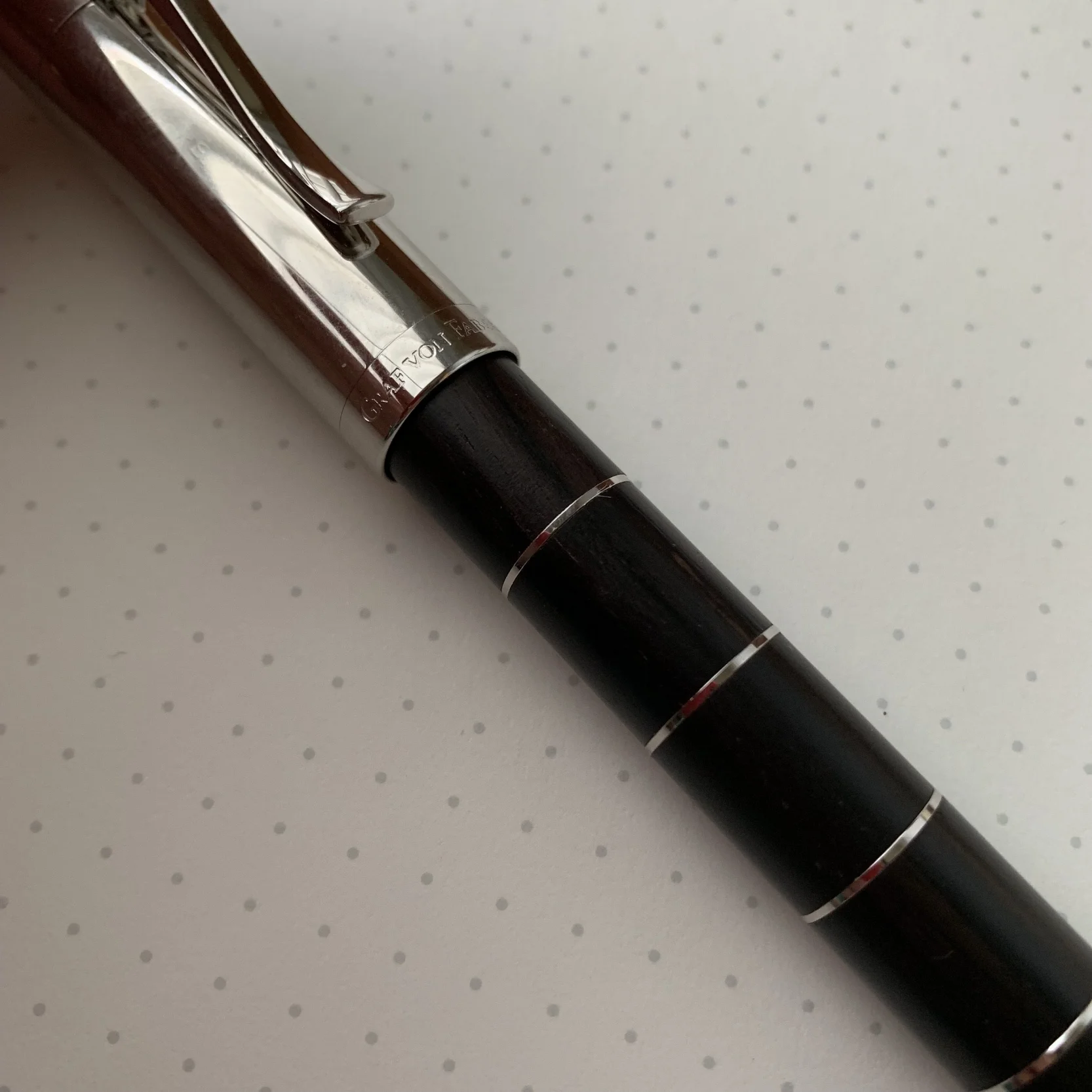
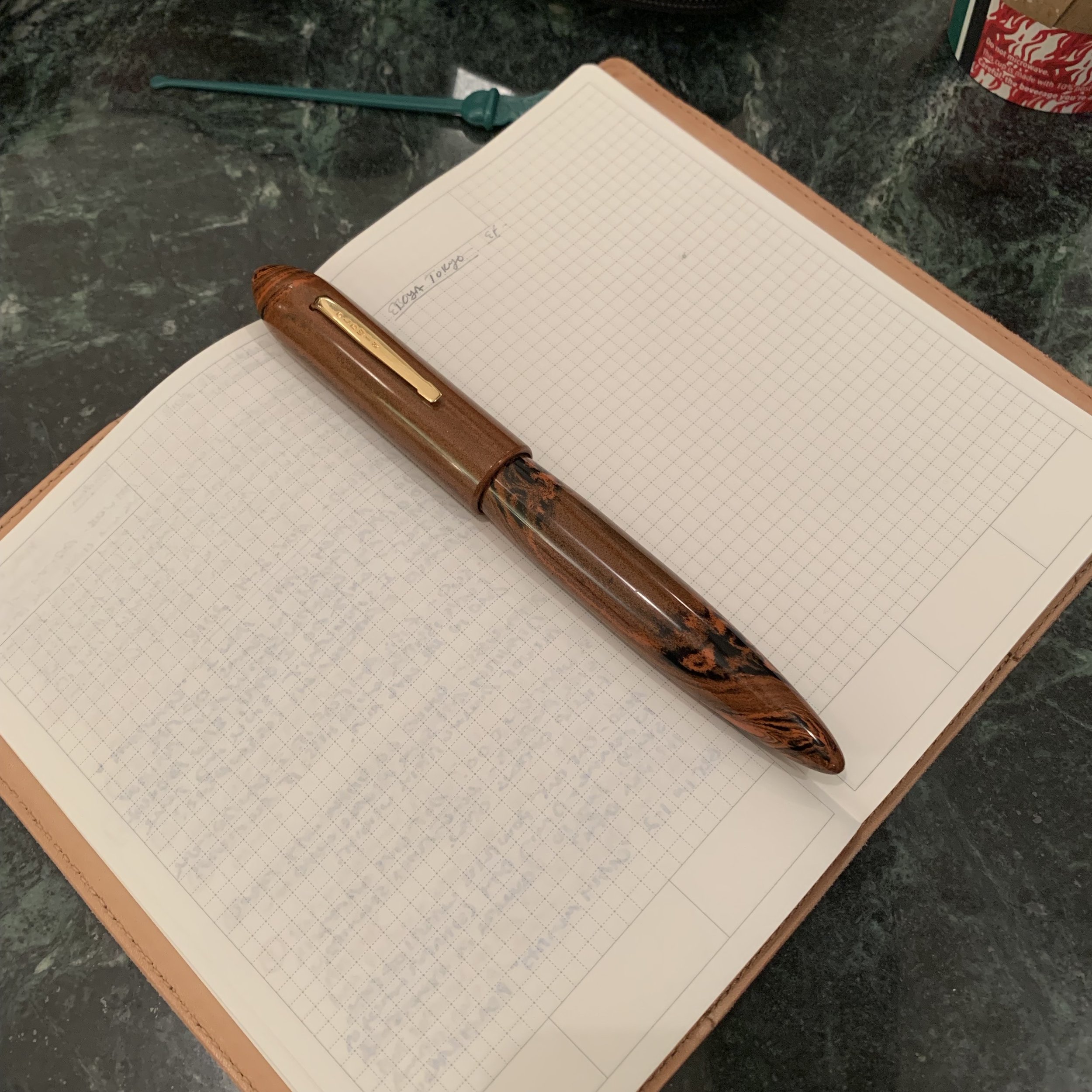
As with most pens made from wood, each Graf von Faber-Castell Classic and Classic Anello is going to show variations in the wood grain, making each pen unique.
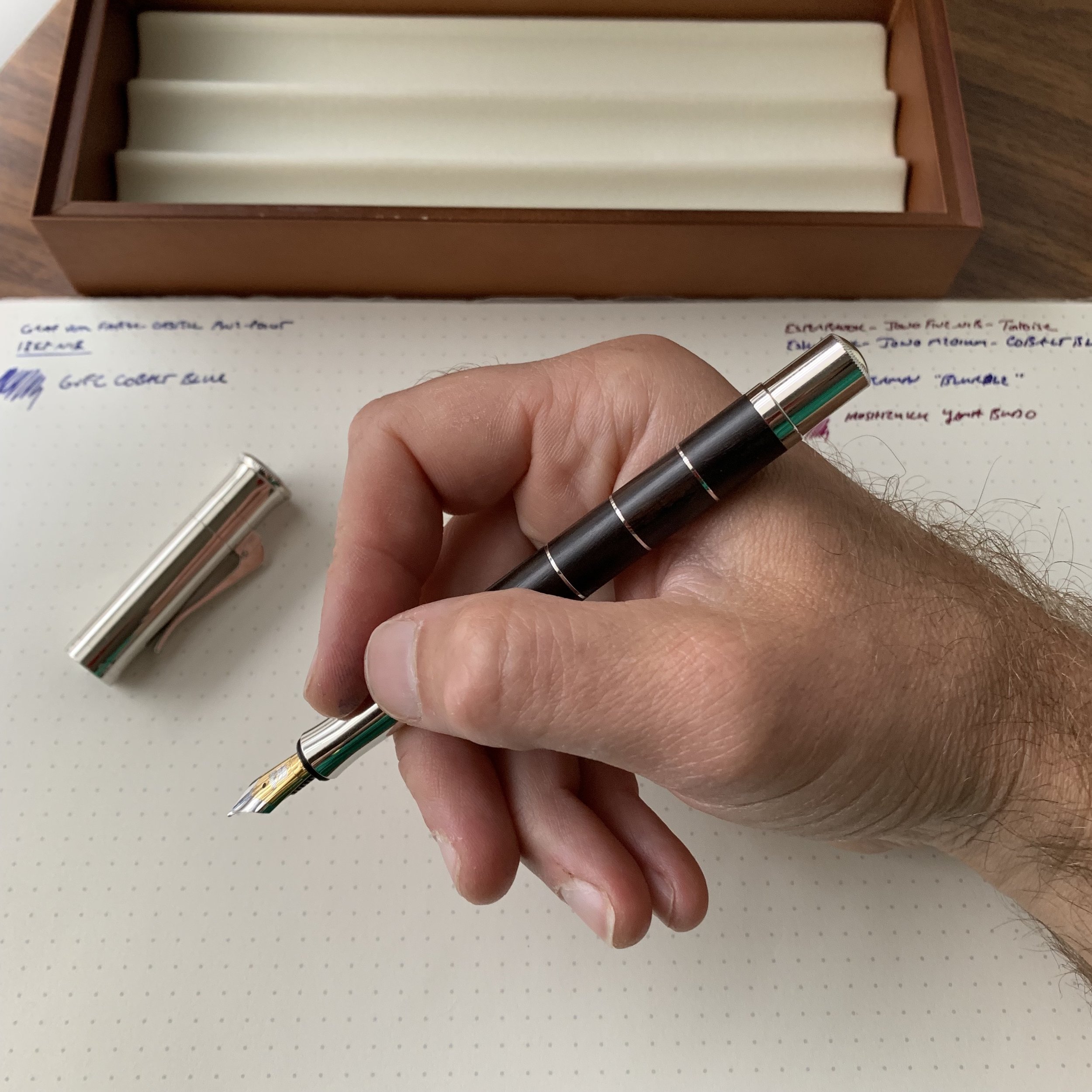
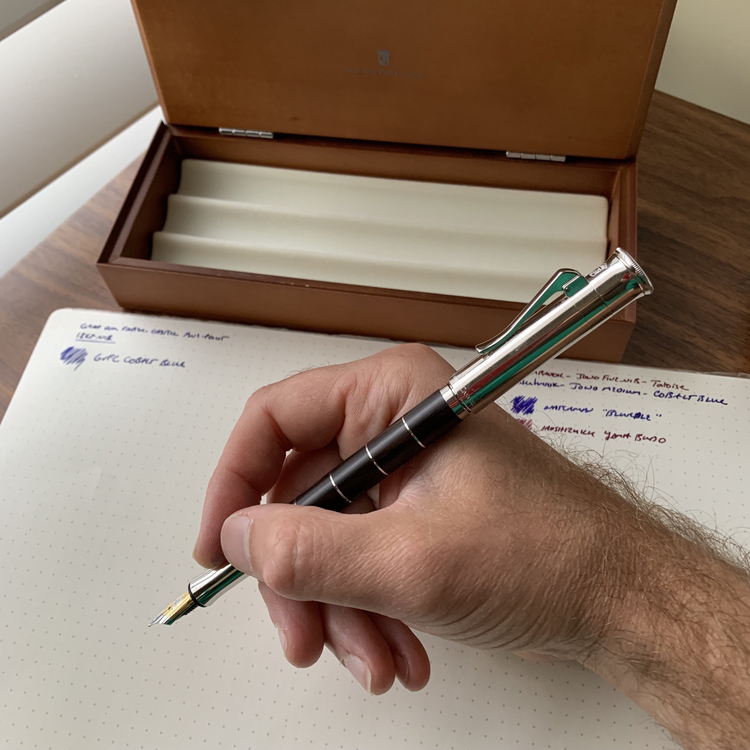
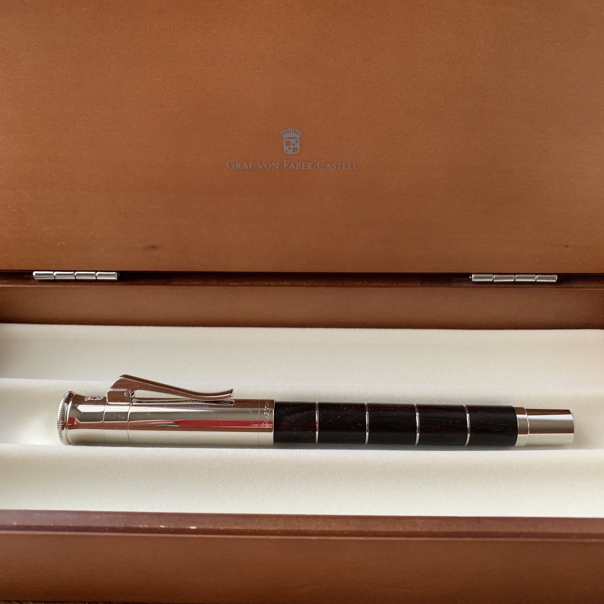
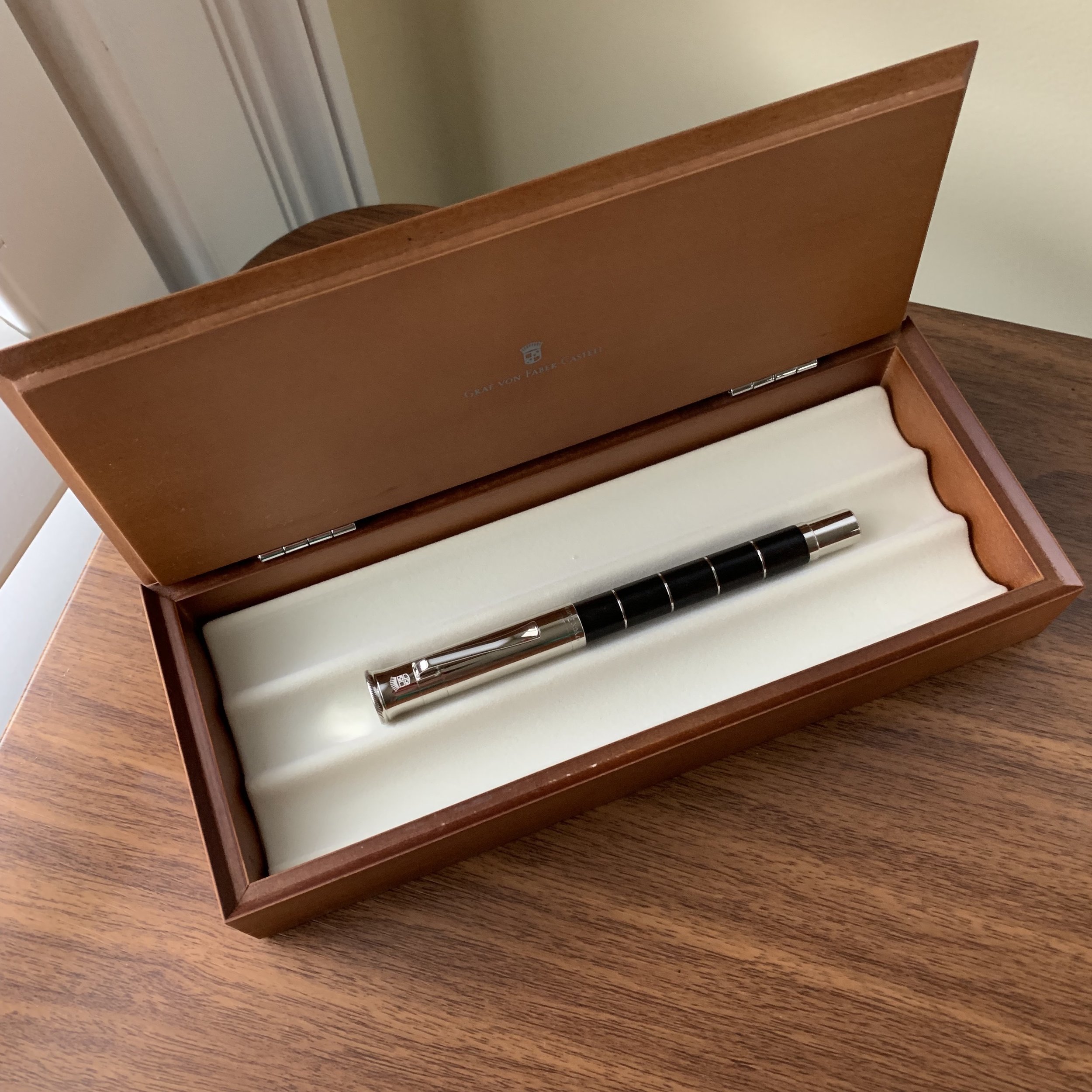
The two core elements of the Classic are Graf von Faber-Castell’s signature cap and the wood used to make the barrel. The different versions of the Classic are named to reflect the various woods used, including ebony, pernambuco, snakewood, grenadilla, and macassar. The standard Faber-Castell Classic features solid wood barrels with a ribbed texture, while the “Classic Anello” model, pictured here, features wooden barrels with inlaid metal rings.
The coin-edging on the top of the cap is one of my favorite details on this pen.
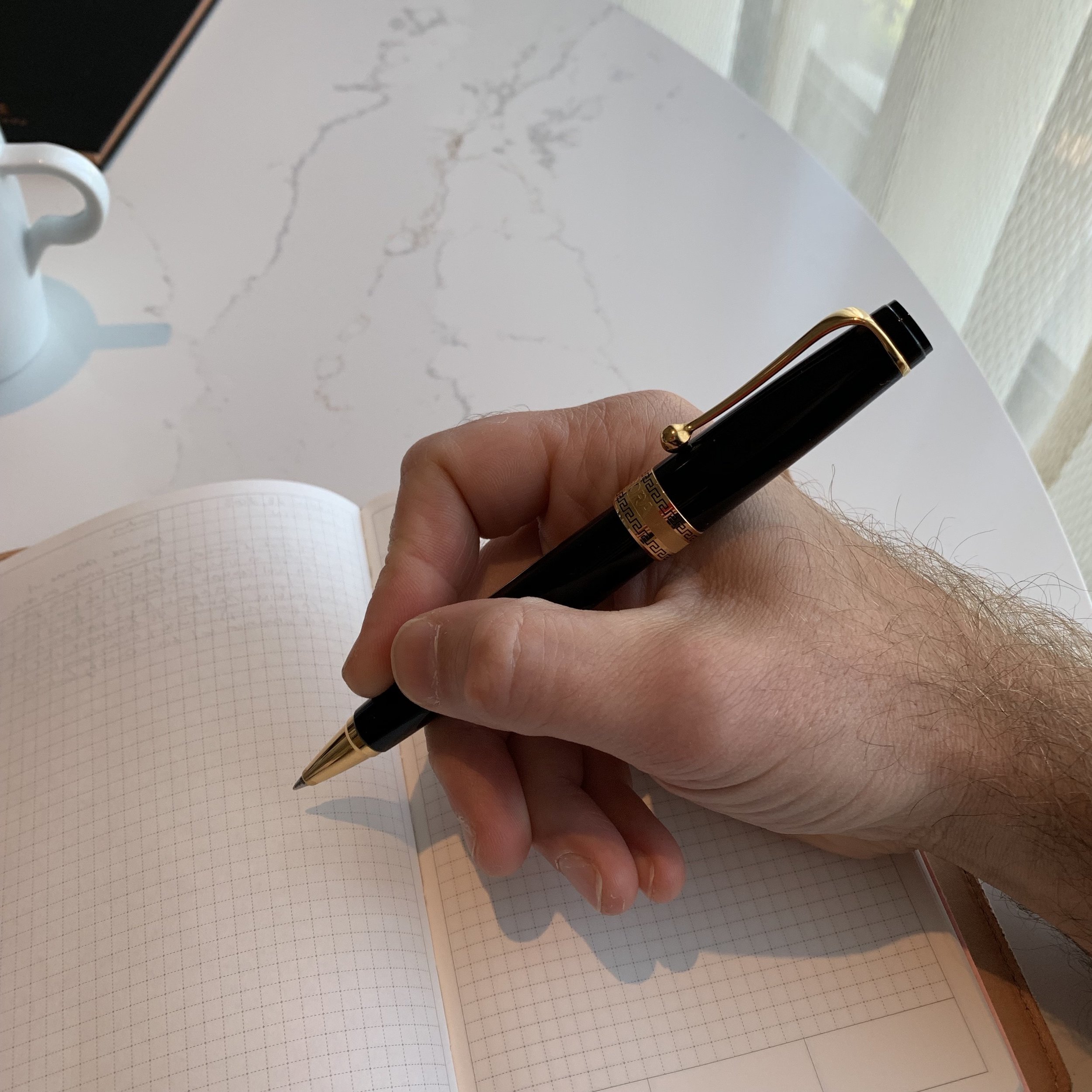
In my opinion, along with the nibs, the caps on Faber-Castell pens set them apart. The Graf von Faber-Castell Classic features a platinum-plated, solid metal cap that looks sort of like a chimney or old-fashioned smokestack that flares out at the top with coin edging. It’s similar, but not identical, to the cap used on Graf von Faber-Castell’s iconic - and somewhat ridiculous - “Perfect Pencil”. Even on most of their lower-end pens, Faber-Castell uses sturdy, spring-loaded clips that attach well to pen cases, bags, and shirt pockets. (Yet another sign that these pens aren’t just eye candy, but meant to be used.) The downside to these caps, however, is the weight, which brings me to….
What About Posting…?
Finally, the big potential drawback for me, and the reason why, at least to date, I don’t have a Graf von Faber-Castell Classic in my collection: this pen doesn’t post. (Technically, the pen will post, but the weight of the metal cap on the back end renders the pen far too heavy to make posting comfortable for even short writing sessions.) On the flip side, for such a slender pen, the Classic feels perfectly balanced and comfortable unposted. The combination of wood/metal construction, a long grip section, and a bit of added length helps in this regard. Prior to an extended test-run with the Classic, I had thought that the Classic would be too slim, and that I’d ultimately conclude “nice pen; not for me.” That’s not the case. I’m still considering this pen, especially now that I know they have a dark-trim Macassar version, but I need to get comfortable with the fact that I won’t be able to post it.
Takeaways and Where to Buy
I’m a huge fan of standard Faber-Castell products, and, as I expected, I also enjoyed my first experience with the Graf von Faber-Castell Classic. In fact, I would say that if the ability to post your pens is not a must-have feature, a Classic is a no-brainer addition to any high-end pen collection. The 18k nib writes exceptionally well, and the intricate combination of wood and metal in the design, especially the GvFC signature clip and cap, render Graf von Faber-Castell pens unlike anything else on the market.
Pricing on the Graf von Faber-Castell Classic typically runs from $400-500. The Classic Anello Grenadilla, as pictured here, is priced at $458 at Appelboom, based on the current exchange rate. While certainly an expensive pen, the Classic sits on the lower end of the pricing spectrum for luxury brands of this quality. Site sponsor Appelboom, who loaned me this pen for review, carries the full range of Graf von Faber-Castell products.
Did I mention that the packaging and presentation on GvFC products are top notch? A few more pictures are shown below, including the presentation box which doubles as a three-slot pen case.

Further Reading
I’ve recently reviewed several Faber-Castell pens, including the E-motion Pure Black and the Loom, and both pens have remained fixtures in my rotation. They are also significantly less expensive than the Graf von Faber-Castell pens, demonstrating that you can get the same Faber-Castell quality for less money. Their ink is also excellent.
Disclaimer: The pen featured in this review was loaned to me by Appelboom for review purposes. This post contains affiliate links.