Ten years ago, I never would have imagined the size and scope of today’s stationery marketplace, much less the depth of the community surrounding it. Indeed, there were times when I was convinced I had picked a hobby that wouldn’t even exist in ten years, much less have expanded so much. While this is mostly a good thing - and a topic I plan to explore in depth in future posts - I sometimes find myself experiencing a sense of overwhelm and paralysis-by-choice. There are simply so many different brands and models of pens, inks, pencils, and paper out there that I can only imagine how confusing it must be to someone diving in for the first time, especially when it comes to fountain pens and fountain pen ink.
In all of our enthusiasm for chasing the next hot thing, I don’t want people to lose sight of the fact that you can always go back to the basics and still have a great experience. When you just want to enjoy a long writing session with a new pen or an old favorite, sometimes the best thing you can do is stop worrying about which ink would make the “perfect pairing,” ditch chasing “shimmer” and “sheen,” and ink up a basic blue or black ink. A few weeks ago I wrote about how I’ve grown to appreciate Lamy’s standard Black and Blue-Black offerings. Not only have I continued to use those two warhorses, but I’ve reached back into my ink cabinet and pulled out a few more favorites, namely some basic blue inks.
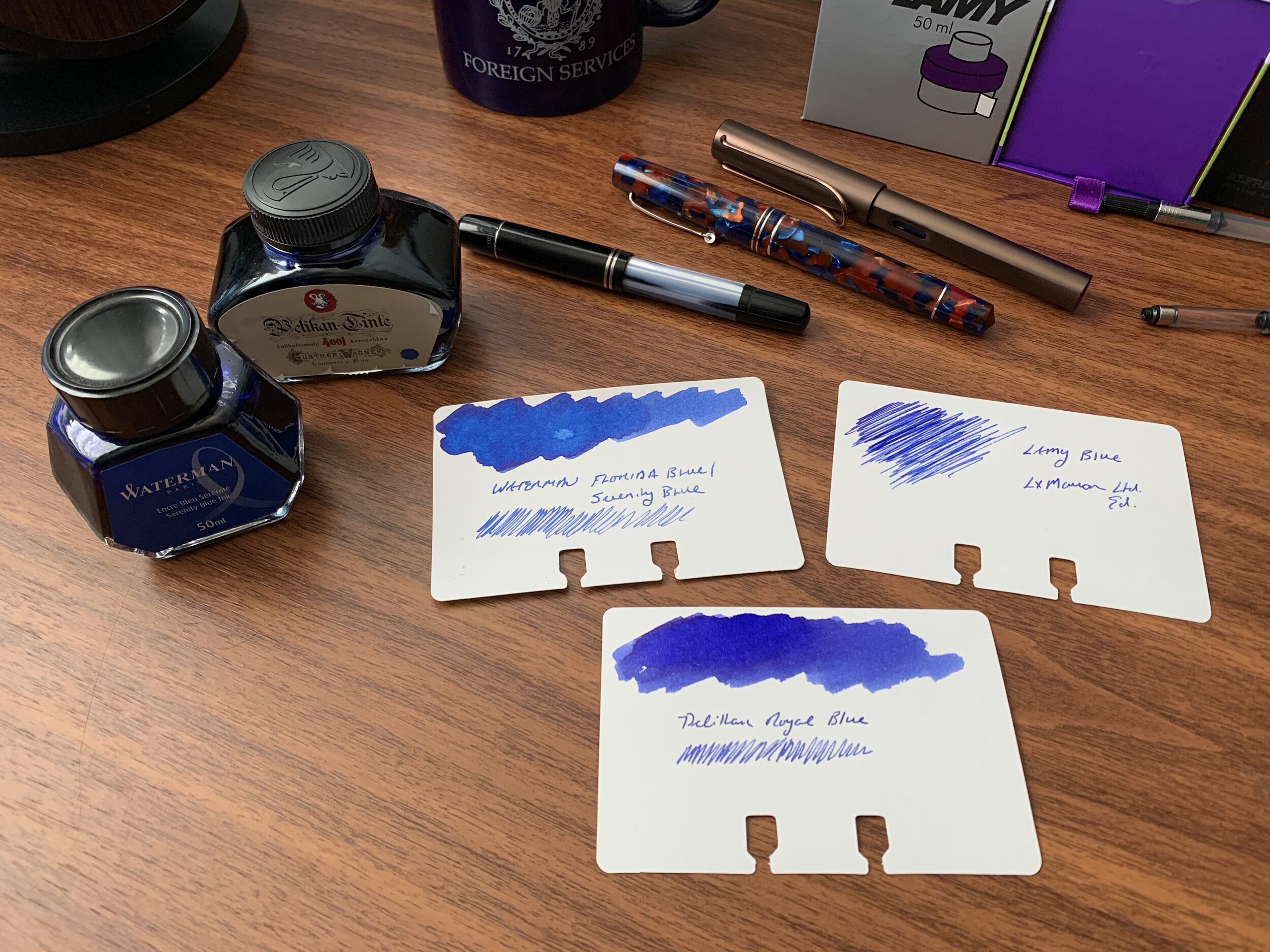
Waterman Serenity Blue
My number one work-friendly ink of all time, Waterman “Serenity Blue” (formerly “Florida Blue”) might be the best all-around fountain pen ink ever made. That’s a pretty big claim, but it’s not hard to support. Waterman ink (1) can be found at $12 or less per bottle at retail; (2) is widely regarded as one of the safest fountain pen inks available for use in vintage pens and materials prone to staining, like celluloid; and (3) works well on nearly all types of paper, making it a versatile ink suitable for pretty much any use case. Waterman ink bottles are also extremely functional: the faceted design lets you tilt the bottle for easier filling once the ink level gets low.
Pelikan 4001 Royal Blue
Slightly darker than Waterman Serenity Blue, Pelikan 4001 Royal Blue has its own group of devotees, some of whom love this ink so much that Pelikan sells it in massive 1 liter bottles (though recently I’ve currently only been able to find this size available in Pelikan Brilliant Black in the U.S.). While I personally prefer Waterman’s brighter tone, Pelikan Royal Blue likewise performs well on most papers and is a “safe” ink to use in nearly all pens. Pelikan inks come in a wider variety of bottle sizes than Waterman, with a few more reasonable options than the liter jug: around $11 for a 30ml bottle, or $14 for a 62.5ml bottle. The “historic” bottle of Royal Blue (same ink, different packaging) is priced at $12 for 60ml.
Lamy Blue
Finally, the last of the three basic blue inks that I use on a regular basis is standard Lamy Blue. If you’ve purchased a Lamy cartridge-converter pen, you have a sample of this ink on hand, since Lamy includes a blue cartridge with every pen sold. Though I still use it fairly regularly - mainly for the convenience of cartridge form - Lamy Blue is my least favorite of the three inks discussed here. It’s less vibrant than both Waterman Serenity Blue and Pelikan Royal Blue, with a tendency to take on a washed-out tone and fade after the ink dries. What this ink does have going for it is Lamy’s excellent ink bottle (complete with blotting paper) as well as the fact that it’s erasable using one of Lamy’s Ink Eraser Pens.
Takeaways and Where to Buy
You can’t go wrong with any of these three blue inks, all of which are inexpensive, reliable, and widely available. While nothing is certain, you probably don’t have to worry about getting attached to any of these three inks, only to have the formulation change or the ink disappear from the market. Waterman, Pelikan, and Lamy inks have all been around forever and I haven’t seen any signs that is about to change.
The one drawback is impermanence: none of these inks are waterproof, so if you’re looking for that you should go elsewhere (Pilot Blue-Black is an exceptional ink with decent water resistance, also available in large quantities).
You can purchase these three inks from nearly all major pen retailers, including site sponsors Pen Chalet and Vanness Pens.
Disclaimer: This post contains links to paid sponsors and affiliates. I believe that I purchased the inks featured in this review with my own funds, for my own use, though it’s possible I used store credit generated through affiliate programs in which I participate. I’ve gone through multiple bottles of Waterman Blue over the years so I can’t be sure.