• Blog
  • Shop
  • Resources
  • FAQ (Ask TGS)
  • About
  • Archive
  • Contact
  • Sign In My Account
Menu

The Gentleman Stationer

Vintage Living in the Modern World.
  • Blog
  • Shop
  • Resources
  • FAQ (Ask TGS)
  • About
  • Archive
  • Contact
  • Sign In My Account

Pen Review: Montegrappa Fortuna in White, Silver, and "The Mule"

July 8, 2017

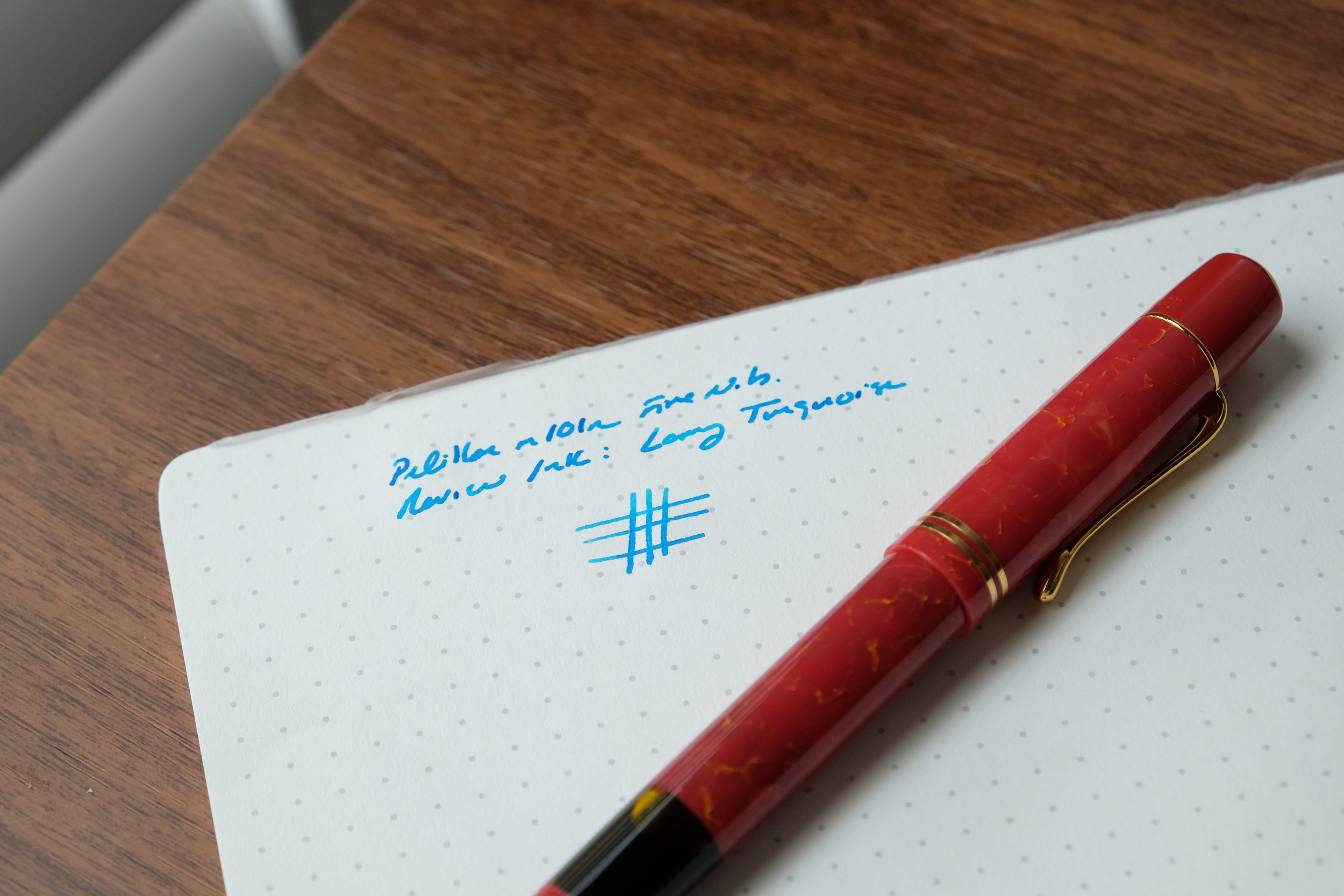
Montegrappa is one of those brands that didn't make it onto my radar until relatively recently, when I was offered the opportunity to borrow one of their higher-end Passione pens in a stunning red celluloid. My positive experience with that pen got me interested in learning more about the brand, so I placed an order for a Montegrappa Fortuna in white with ruthenium trim. At the same time, Cary at Kenro Industries (Montegrappa's U.S. distributor) loaned me two additional pens: the recently released Fortuna Silver and one of last year's "it" pens, the Montegrappa Mule, which is essentially a copper and steel Fortuna. (You may recall seeing photographs from "Mule parties" on the pen show circuit.)

First Impressions

Aesthetically, the Fortuna ticks all the right boxes for me. I love the shape of this pen, which is a variant of the classic cigar shape and fits into my hand nicely. I also appreciate the classic, understated design - not always something that I can say about Montegrappa pens, especially on some of their more elaborate creations.

The coating on the brushed stainless steel Fortuna Silver reflects the light in a way that makes the pen appear to have varying shades of light and dark. The effect is very attractive and gives what would otherwise be a relatively plain stainless steel pen a more unique look. 

The build on these pens is quite sturdy - you don't have to worry about the Fortuna (and certainly not the copper and steel versions) holding up to the rigors of everyday use.  All feature very tight "rollerball" clips, and if I had one critique on the build it would be that the clips are too tight - it's often hard to get this pen to clip to a shirt pocket or a pen slot in one of my bags. 

Montegrappa Fortuna engraved cap band and "roller" clip

These pens also feature metal threads, which is likely a good thing for durability, but at least on my white Fortuna causes the threads to "squeak" a little bit when capping/uncapping. The noise is less pronounced on the all-metal pens, so it may have something to do with the black coating on the trim.  One thing I do appreciate is that while the barrel threads are metal, the internal threads (on the inside of the cap) are plastic, even on the Mule and Fortuna Silver. That way, when you post the pen the threads won't scratch the barrel, as pretty much always happens to any other pen with a metal cap. (Montblanc, take a hint here.)  

Writing Experience

All three of the Fortunas were extremely comfortable writers. The acrylic pen is a fairly light pen, and the easiest to write with for an extended period of time.  The metal threads at the front of the pen give it a nice forward balance with good control. Even the (much) heavier Fortuna Silver (made of stainless steel) and the Mule (made of copper) don't feel too heavy, due to the shape of the pen and how the weight is distributed.  I could use any of these three pens posted or unposted, which surprised me a bit because all-metal pens typically tire my hand out after about a page. Montegrappa did an excellent job of designing around an issue which could potentially make the Mule and the Fortuna Silver unusable for a lot of people. 

View fullsize Montegrappa Fortuna Unposted
View fullsize Montegrappa Fortuna Posted

While some have experienced flow issues with the Fortuna nibs, these three pens all wrote well without any hard starting or skipping.  Should you experience problems with your nib, I'd first clean the pen with a bit of soapy water (use diluted dish soap) or pen flush to rinse out any manufacturing residue (oils, debris, etc.), and if the problems continue notify your retailer or Kenro, who will take care of you.  I've not heard much about this recently, so Montegrappa may have resolved any production issues.   

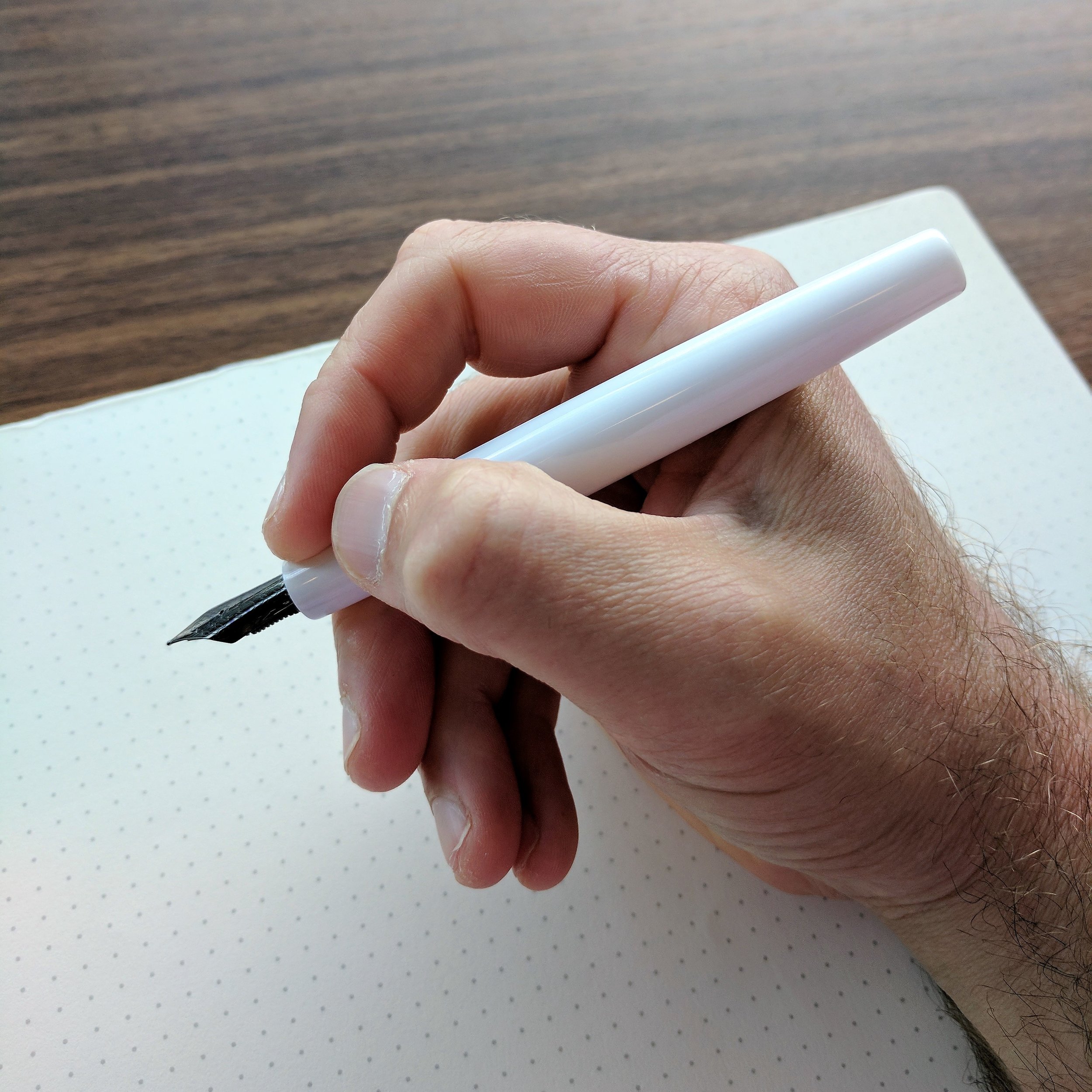
Of these three pens, the white is my favorite, mainly because of the nib.  For some reason that I've not (yet) taken the time to research, black ion or ruthenium-plated nibs tend to be a touch softer than standard gold or steel nibs.  They're not "flexible" by any means, but they do have a bit more bounce to them. The standard steel nib on the Fortuna Silver and the Mule was definitely drier and stiffer than the black plated nib on the white acrylic pen.  I've noticed the same thing on my black ion-plated Sailor Professional Gear Imperial Black and Sailor 1911 Black Luster fountain pens - they're both softer than the standard Sailor gold nibs, which are notorious nails. 

Another note on the plated nibs - they have a tendency to corrode when used with inks containing iron gall.  I made the mistake of using Montblanc Midnight Blue (old formulation) and Montegrappa Blue Black with this nib, which resulted in the plating wearing away around the nib slit and at the base of the nib. Be warned. 

Montegrappa nibs, in my experience, also write narrower than their designation. The Mule and the Fortuna Silver both had broad nibs that to me were really classic mediums. I'm typically not a "broad nib" person because I do a lot of copy editing and margin annotations at work and need to write fairly small, but I could use this Montegrappa broad nib easily. Even so, I still preferred the medium nib on the white/ruthenium pen. It wrote a consistently wet line and even offered some stub-like line variation on the cross strokes.    

Takeaways and Where to Buy

Most Montegrappa retailers such as Vanness Pens and Pen Chalet will carry the Fortuna, especially since Montegrappa seems to be making the Fortuna line its primary - and certainly its most accessible - line of pens. That said, "accessibility" is relative, and these pens still come with a luxury premium on the price. The White/Ruthenium Fortuna retails for $290, and the Mule sells for $375.  The recently released Fortuna Silver is priced at $395.  Montegrappa is fairly insistent on retailers adhering to their standard pricing, and while you can sometimes find a slight discount off of MSRP, it's rare.

Are these pens worth the money? As always, it depends on what you are looking for. You can certainly find excellent writers with gold nibs for less money, and I'd personally be hard-pressed to choose the Fortuna over a Sailor Pro Gear, which can be less expensive and is possibly my favorite pen of all time. Price notwithstanding, the size and feel of the Fortuna make it an extremely comfortable pen to use, and Montegrappa has released this pen in some unique, beautiful designs and color schemes, which is the real value here. I highly encourage you to check out the Mosaico Marrakech, as well as the upcoming Fortuna "Heartwood" line.

A big thank you to Kenro Industries for making this review possible, and I look forward to seeing what else Montegrappa has in store for the Fortuna line.  

Disclaimer: I received a discount on my purchase of the White Fortuna directly from Kenro, who also loaned me the Montegrappa Mule and Silver Fortuna for review purposes. This post contains links to affiliates and sponsors.       

In Pens Tags Pen Review, Montegrappa, Montegrappa Fortuna
Comment

Ink Review: Montblanc Lucky Orange and William Shakespeare Velvet Red

July 5, 2017

I have two more Montblanc inks for you this week, both of which I picked up at the Atlanta Pen Show back in April. While Montblanc's lineup of "standard" fountain pen inks is pretty limited, they release roughly four limited edition colors per year that typically correspond to special edition pens. For example, UNICEF Blue for the Montblanc for UNICEF pens and Miles Davis Jazz Blue for the Miles Davis pen. I recently reviewed the excellent UNICEF Blue, and now I can highly recommend two more great colors: Lucky Orange and William Shakespeare Velvet Red. 

Montblanc's limited edition packaging is always worth checking out, even if you don't keep boxes. 

Highly Usable, Offbeat Colors

What I love about Montblanc inks is that they remain interesting while never straying too far from the standard color palette. For example, Lucky Orange appears to be a basic orange ink - it actually looks very plain "ink swatch" photographs you see online, but once you get this ink on paper it's much more vibrant than, say, Monteverde Mandarin Orange, and even the lighter and yellower Sailor Jentle Apricot. The William Shakespeare Ink isn't quite as unique, but I'm still a sucker for a dark red and it's somewhat close to Hitchcock, though a touch brighter and lacking the darker "blood red" undertones. 

View fullsize William Shakespeare Velvet Red Writing Sample
View fullsize Montblanc Lucky Orange Writing Sample

I've reviewed so many Montblanc inks now that I won't bore you all with an extended "review" of their properties, etc., but suffice to say performance-wise these are as good as any other Montblanc inks I've used. I've tested them out on-and-off at work for the past few months and have not had any problems with these inks bleeding through paper or feathering, extended dry times, or hard-starting in pens.  

Are These Inks Worth the Money? 

It's easy to get caught up in the hype over limited-edition-anything and the associated FOMO. Montblanc started this trend in the stationery world around 2011-2012 when it first began releasing special inks in limited quantities - Alfred Hitchcock is the first that I recall provoking ink hoarding, but I'm sure there were some others that I missed before that. Most of Montblanc's limited edition inks are priced at $19 for a 30ml bottle, but now it appears that they are moving to a $40/50ml price point. That's a pretty steep premium over the regular Montblanc ink, which sells for $22/60ml - roughly twice as expensive. 

If you're someone who burns through a lot of ink or are otherwise on a budget, there are definitely more cost-effective alternatives with equivalent quality. If you're looking for a unique color, however, or simply like the idea of owning a bottle of ink that features your favorite author or public figure as the theme, then you may be willing to pay a premium. Others hoard (or "collect") in the hope that the inks appreciate, and can be sold at a markup later once they are no longer available at retail. Whatever the reason, Montblanc seemingly has no trouble selling out their stock with each new release. 

I write a fair bit, but I change inks often, so if a limited edition piques my interest, I'll purchase a single bottle that will take me years to get through. Back in 2012, I bought four bottles of Alfred Hitchcock and ended up selling two of them because I'm only now getting near the bottom of my first. I advise people to buy the ink if they like it, but remember that with so many companies making high quality fountain pen inks these days, and the range of available colors increasing weekly, the odds that you won't be able to find something comparable somewhere else are low.

Where to Buy

Anderson Pens currently has both Lucky Orange and William Shakespeare Velvet Red in stock, but given that these are both limited runs, availability is subject to change. Both inks are priced at $19 - Lucky Orange comes in the 30ml square crystal bottle, and William Shakespeare comes in the slightly larger round 35ml Writer's Edition bottle. Anderson Pens also carries the full range of standard Montblanc Ink, and a wide selection of Montblanc Pens.     

Disclaimer: Anderson Pens provided these two inks to me at a discount as part of their sponsorship of this blog. I was not otherwise compensated for this review. All thoughts expressed here are my own. 

In Ink Reviews Tags Ink Review, Montblanc
Comment

Introducing My Guide to Pocket Pens

July 1, 2017

Sometimes you just have to get it out there.  After working on this for the better part of a year, I finally just decided to publish it, admitting that it likely will never be "complete" and will be a perpetual work in progress. Check out my new Guide to Pocket Pens, live now, and major thanks to Thomas for loaning me so many pens! 

In Guide Tags Guide, Pocket Pens
4 Comments

Image courtesy of Baron Fig.

Pencil Review: The Baron Fig Archer "Prismatic" Edition

June 28, 2017

It's that time again! For what's become an at-least-monthly event:  The release of a new limited edition from Baron Fig. The last version of Baron Fig's Archer pencil, the "Snakes & Ladders" edition, drew some criticism because Baron Fig changed the graphite formula to a softer, 2B-ish core. While I enjoy soft pencils, and really liked the look of the Snakes & Ladders, Baron Fig returned to their firmer, standard Archer core for the next limited edition pencil, the Prismatic. 

The three Archers, from left: Prismatic, Snakes & Ladders, and the standard pencil. 

“Prisms come in myriad shapes and break up light into a beautiful spectrum of colors. Ideas can be viewed in the same light (pun intended) - they come in all shapes, sizes, and colors. Prismatic - what will you think up?”
— Baron Fig

Each pack of Prismatic Archer pencils includes four red, yellow, and blue pencils, each with a dipped purple end cap. I like the look of these pencils, and somewhat surprisingly, the red and the blue pencils are my favorite. When I first received the promotional photographs, I expected to love the yellows, but the finish on my yellow pencils is thin and shows cracking and flaking on one or two of them. I'm not going to knock Baron Fig too hard for this. When you're producing a large volume of woodcase pencils - a consumable good that's sold in packs of a dozen and meant to be used up - its not going to receive the same level of individual quality control that say, a $60 Squire pen might receive. I've had cracked finishes in $22 boxes of Blackwings. That said, this isn't a $4 per dozen box of pencils, so it's still a bit annoying.

Some of the finish on my yellow Prismatics is a bit thin and bubbly, to the point where you can almost see the underlying wood. 

Some of the finish on my yellow Prismatics is a bit thin and bubbly, to the point where you can almost see the underlying wood. 

Writing Experience

The standard Archer has been in regular use since it was first released back in October.  I keep a couple sharpened at my desk and others tucked into various books that I'm reading. If you're a fan of graphite cores just slightly on the harder side of HB, then the Archer should be on your radar, especially if you like to write on toothier paper like Baron Fig which can wear down softer pencils fairly quickly. The standard Archer core is surprisingly dark for how good the point retention is. Baron Fig's pencils remind me of "European HB" pencils like the Staedtler Noris or Staedtler Tradition. That's probably not a coincidence - the Archers are manufactured in Portugal.

Before I received my first pack of Archers, I wasn't a fan eraserless pencils. I thought that I needed the eraser in order for the pencil to balance better in my hand. As it turns out, this isn't the case, and I've come to enjoy writing with the lighter "end-dipped" pencil. In the U.S., end-dipped pencils are somewhat harder to find than they are in Europe or Japan, at least outside of the "art pencil" market.  

Where to Buy

You can purchase the standard Archer, the Prismatics, and even Snakes and Ladders directly from Baron Fig's online store. Limited edition versions of all of Baron Fig's products, including the Archer, the Squire, the Confidant, and the Vanguard, are released on a quarterly basis. 

Disclaimer: Baron Fig sent me these pencils free of charge for review purposes. I was not otherwise compensated for this review. 

In Pencil Review Tags Baron Fig, Baron Fig Archer, Archer Prismatic
Comment

Pen Review: Pelikan M101N Bright Red

June 24, 2017

Pelikan's annual release of its vintage-inspired special edition M101N fountain pen has become a bit of an event, with collectors anxiously awaiting each announcement. Pens in the series have included the M101N Tortoiseshell Red, the M101N Tortoiseshell Brown, and the M101N Lizard. All recreate the look and feel of vintage Pelikan pens from the 1930s. Many thanks to Appelboom for loaning me this year's model, the M101N Bright Red. 

The Bright Red acrylic does a fairly nice job of mimicking the appearance of vintage celluloid.

Appearance and First Impressions

The Pelikan M101N is larger than I originally anticipated. For some reason, I expected this to be a smaller, almost "pocket-sized" fountain pen. That's not the case - it's a decent sized pen at 4.5" unposted and 6.2" posted. Pelikan packages each pen with its customary white "penvelope," and includes a special bottle of Pelikan 4001 blue "Konigsblau" ink with a vintage-inspired label. It's very attractive packaging, and certainly complements the pen. 

A nice bonus - this Pelikan 4001 vintage-style "Konigsblau" ink bottle.

To me, two things make the M101N's design distinctive: the cap and the ink window. The cap features an elongated "cap head," with the clip set lower on the cap than you would ordinarily see. It's an interesting look - again, vintage-inspired - but it's not really my thing. The pen also sports 24kt gold trim, and I do appreciate the double cap band. The yellow ink window offers nice visibility, and on this particular pen it provides some variety to what would otherwise be a solid red pen.  

A close up of the nib, ink window, and "Bright Red" acrylic

You all know that I'm a sucker for red pens, and Pelikan did a nice job with the marbled acrylic. You can tell that they tried to mimic the look of vintage celluloid, and pull it off fairly well (at least to the casual observer). The acrylic doesn't have the camphor smell or warmth of real celluloid, but it's still visually attractive. Both the piston knob and the "cap head" (Pelikan's term) are made from synthetic resin, which supposedly "polishes itself as it is used - meaning that Bright Red continues to shine." Huh. I've never heard that one before, but the material is shiny. Take it for what it's worth. 

Writing Experience

Like nearly all Pelikan pens, the M101N is a piston-filler. And like nearly every Pelikan pen that I've written with, the piston mechanism worked smoothly without a hitch and held a fair amount of ink. The 14kt gold fine nib was moderately wet and wrote what I would characterize as a traditional medium line. Again, this is something I notice with every Pelikan pen out there, and generally recommend that readers purchase one Pelikan nib size down from the size they actually want, if they haven't had the opportunity to try the pen themselves at a pen show. To get a truly extra-fine nib, you'll likely need to have the nib ground.

Vintage-inspired engraving on the Pelikan M101N Bright Red

The M101N is a very light pen, and would serve nicely as an everyday writing instrument. Posted or unposted, it was comfortable to use, though I found the length a bit too "in-between" for me. The pen was slightly too short unposted, and slightly too long posted. Keep in mind that this reflects my personal preferences more than anything else, but I'd say that this is a pen you'd want to "try before you buy," especially at the price point.  

View fullsize Pelikan M101N Capped
View fullsize Pelikan M101N Unposted
View fullsize Pelikan M101N Writing Sample (Fine Nib)

Takeaways and Where to Buy

The Pelikan M101N is a solid pen, and provides an outlet for those people who appreciate the style of early vintage Pelikan, but may prefer to stick to modern writing instruments as their daily users. Though I'm one of those people, this particular model doesn't really speak to me aesthetically, and if I was to purchase an M101N my personal tastes gravitate more towards the Brown or Red Tortoiseshell models than the Bright Red. If you like the look of this pen, however, it's a Pelikan, and Pelikan's are great writers that should provide you with years of reliable service. 

You can purchase the Pelikan M101N from Appelboom for around $450 (excluding VAT). The M101N pens sit at a high price point, but they are special editions made in smaller production runs, and in any event the pricing is fairly consistent with Pelikan's other high-end piston fillers with a gold nib. While it's a special edition that won't be around forever, as a practical matter these M101N pens tend to remain in stock for at least a couple years.

Disclaimer: Appelboom loaned me this pen for review purposes, free of charge. Many thanks!


In Pens Tags Pelikan, Pelikan M101N, Special Edition, Limited Edition
Comment
← Newer Posts Older Posts →
Store Location
Visit the T.G.S. Curated SHOP
*New* Updated "Best Pens" Guide (2025)
TGS x Hinze Pens Violet Tendencies Taschenstift Fountain Pen
Hierarchies of Fountain Pen Friendly Paper
Allex Scissors arrayed on a desk showing link to desk accessories

Join Our Patreon!
Subscribe to the TGS E-mail List

Featured Posts

Featured
Pilot-Iroshizuku-Yama-Budo-Writing-Sample.jpeg
May 24, 2025
Joe's Picks: Five Favorite Inks From Pilot's Iroshizuku Lineup
May 24, 2025
May 24, 2025
Yamamoto-Gray-Paper-Sampler-Set.jpeg
May 10, 2025
Discovering Unusual Paper: "Paper Tasting" Sets from Yamamoto Paper
May 10, 2025
May 10, 2025
Four-Micarta-Fountain-Pens.jpeg
Apr 19, 2025
Yes, Micarta for me! I finally got my hands on Some Micarta Pens, Plus My Own Special Edition
Apr 19, 2025
Apr 19, 2025
The Gentleman Stationer RSS

© Digital Divide Media, LLC, 2014-present.

All content is the exclusive property of Digital Divide Media, LLC, d/b/a The Gentleman Stationer, including “The Gentleman Stationer” website and trademark, and should not be reproduced without express written permission.  All rights reserved.

All content containing paid advertising, affiliate links, or sponsored content will be plainly disclosed by a disclaimer when/if featured.

Contact Information

Store Shipping Policy and Return Policy

Privacy Policy

Cookie Policy

Terms and Conditions

Powered by Squarespace